Project: Zhongzhou Peninsula City Sales Center
Architects: MYP Design
Location: Qingdao City, Shandong Province, China
Area: 11,172 sf
Photographs by: Ouyang Yun
“Flowers in spring and autumn moonlight, breeze in the summer and winter snow-white” – Poem from the Song Dynasty. Since ancient times, the city of Qingdao has embraced arts, literature, and nostalgia. Moving forward in history, Wang Tongzhao wrote in the “Qingdao Sketch”: Every detail of the city is a combination of German loftiness, Japanese refinement, and Chinese minimalism. In the same manner, Qingdao is a city that brings out just the right amount of sophistication while cultivating a casual style.
The designer Ma Yiping thinks similarly: Qingdao’s history and modernity are like two pieces of art that go together. Time deconstruction superimposes and reorganizes cultural elements to restructure reality. Such is the case of Zhongzhou Peninsula City, a project developed by MYP Design using a deconstruction approach that reinterprets Qingdao’s traditional and contemporary elements.
The transportation network around the project is convenient. The large green landscape of the interior matches the interior and exterior areas of the riverside park. Such a concept creates a livable and free community sheltered by vast land, green areas, and gorgeous waterscapes.


Design deconstruction is a philosophical process, a worldview level understanding.
Perhaps, another facet of Qingdao’s character hides behind the ultimate design, embellished by history, culture and art; elements deconstructed and reorganized in the present: Zhongzhou Peninsula City.
The design approach reflects the life philosophy of the designer. In such a rich and fertile space, we understand the relationship between people and the world. In the flow of time, we grasp every detail of growth. A deconstructionist approach is observed in the graduation and overlap of structures, materials, and colors, forming a concise spatial aura from the original appeal of the space, stimulating emotions in the viewer.


“You will coexist with the sunlight, the land, and the ocean.”
For Chinese people, the scenery must appeal to their emotions and intentions. It must create a warm mood, full of ambiance, inviting people to think about life.
Through the present and into the future, space nourishes body and mind. It flows in absolute freedom, allowing us to experience nature in the form of timely rain and green mountains and civilization as the distant bell sounds in the quiet of the night.
Not disturbed by prosperity or adversity, I witnessed flowers blossom and wither. Not minding to stay or to leave, I watched the scudding and clearing of clouds.
The love for Qingdao in Kang Youwei’s description of the city is evident. “Water” is more than the essence of the majestic ocean; it represents the refreshing emotions that come from living in the city. Moreover, the designer uses elements taken from the sailing capital of China like “water” and “sailboats” to define the cultural heritage of the project.
The ceiling presents stainless steel mirror-like surfaces that interact with changing light to portray the dynamic nature of water. The art installations and architectural models take the shape of sails. These elements permeate an aesthetic sense and a positive atmosphere into the project, just like setting sail in the ocean.
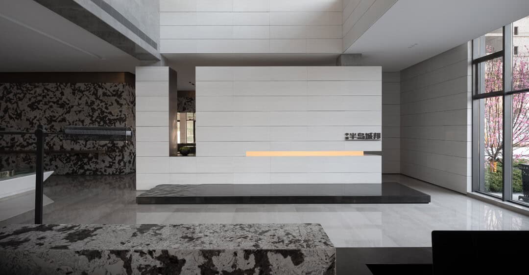
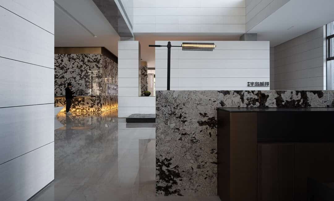
Stone materials run through the interiors, expanding across large areas. Their bold lines and strong textures stimulate mental associations with nature, sometimes creating a dynamic visual rhythm, sometimes providing a finishing touch. Intermittently present through the entire space, this feature evokes a calm yet strong sense of tension.
The highest level of aesthetics is also the highest ideal of life. Looking at the surroundings, people feel immersed in a poetic and artistic environment.
Materials are an essential carrier of design expression, as they shape the spatial atmosphere. Aware of this, the designer implements a precise and consistent approach to materials that fully harnesses all architectural stone elements.
Found around every corner of the project, the artistic pieces devoted to the land are a source of inspiration. Upon setting sight on them, we cannot help but think about the harmony between space, home, and nature.
The negotiation area includes a design masterpiece of the 20th century: the Falkland Lamp by the Italian designer Bruno Munari. Its spontaneous shape represents poetic and philosophical intersections. It also demonstrates a purely creative process found in futurism and abstract art.
Creativity cannot be limited by fixed definitions.
“In the sales area, people are the most outstanding element. The colors used on both permanent and aesthetic fixtures are as simple as possible. The selection consists mainly of black, white, and gray tones. Through masterful handling of color gradation and material texture, the three tones achieve a rich structural atmosphere throughout the whole space, improving the overall spatial order.” -said the designer.
The designer procures an effective balance between functionality and aesthetics. With the combination of the most relevant features from the East and the West, the design approach adds a poetic yet natural feeling to the project.
The casual and natural dimensions of the space set an elegant tone, concise yet compelling, creating a peaceful atmosphere. Honesty and grace are reflected in every detail sketching the interiors, resembling dark strokes of ink that add depth to the design, like a traditional Chinese painting.
Design not only shapes spaces but also our experiences in those spaces.
Lin Yutang once wrote: “Seeing the clouds in autumn, it turns out that life shouldn’t be too crowded, leave room for emptiness.” Emptiness is a transparent state of life. When space is blank, there is no void but another kind of expression. Emptiness does not imply loss but a broader possession.
Soft and hard textures touched by delightful day and night light changes generate a comfortable atmosphere of security. Furthermore, the use of soft and gentle tones in the project cultivates a caring and trustworthy sense of community.
The children’s area on the first floor and the resident’s living area on the second floor provide a compatible and interlinked atmosphere of simultaneous distinction and openness.
-Project description and images provided by MYP Design
This website uses cookies.