Project: WHOOSIS Chengdu Store
Architects: FON Studio
Location: Chengdu, China
Area: 2,690 sf
Year: 2023
Photographs by: Courtesy of FON Studio
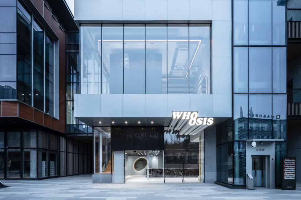
WHOOSIS has always had a unique expression in the street culture – the clothing retail and diverse live events have a distinct customer group effect. The first store in Chengdu demonstrates to their friends a fun and interactive place with the same energy and vision as always.
The airy, tall commercial space is made up of double-story structures of different sizes and surrounding by a range of trendy clothing retailers. Considering the needs of the overall operation, we need to connect the two floors with appropriate traffic lines, which can guide people shopping around the two levels. To deal with complex spaces, the initial idea is to use the most straightforward shape organization to connect and arrange the functions around it.


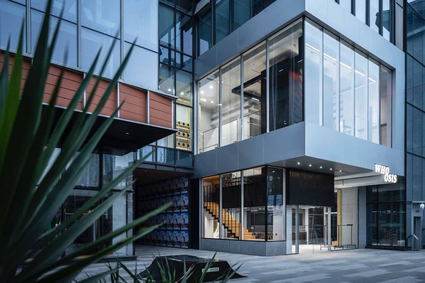
When the black blocks are interspersed with overlapping transparent boxes, a spatial story that integrates with the brand attitude unfolds. We hope the rebellious street spirit is backed by a deep black wood that interacts with the rich expression of color and detailed textures. The vertical and horizontal blocks constructed in the space constitute the abstract street scene to some extent, from the entrance, the layered relationship between the mezzanine and the second floor is shown. This upward traffic organization enables the continuous generation of new conversations and also lets people browse, stand and photograph in different corners of the space.


We strive to have different forms and scales of display areas in this space, but also let the crowd into the store could feel relaxed and have a rich shopping experience. On the first floor, the main displays are scattered at the entrance and under the stairs, while the core cash register area is better for service and consultation. In the background wall, an L-shape LED screen is used as the medium of visual output of the brand to cooperate with the space, and its dynamic information can be seen both from the street or inside the shop.
The mezzanine extends from the entrance to the indoor, forming a neat platform. It is a main display area and a transit to the second floor. The open view on both sides leads people to the space on the second floor. The solid wood staircase matches the purple stone, as a prelude to the space.
When the view comes to the most open space- the second floor, the island bar is centered on a black block that runs through the store, giving the relatively complex floor plan a center point. Meanwhile, the metal hanging poles integrated into the staircase contrast with the heavy wall and display the clothes better. When facing the 5-meter curtain wall, the transparent vision brought by it also affect the display order of the space. We use a group of minimalist mobile-hanging rods arranged under the glass to satisfy the display requirement and communicates with the street scene outside. After passing through a group of ceiling-high wooden cabinets, the innermost space naturally becomes the fitting room and storage area, and a simple physical twist becomes the space finish.
Exquisite, rough, primitive, bright, open, and inclusive form the tone of the space. Whether the superimposed geometric relationship or the rich layout spread horizontally became an interesting attempt for us and WHOOSIS to interpret street culture together.
-Project description and images provided by SIDEVIEW
This website uses cookies.