Project: VTB Arena Park
Architects: Babayants Architects
Location: Moscow, Russia
Area: 1,022 sf
Year: 2022
Photographs by: Sergey Krasyuk
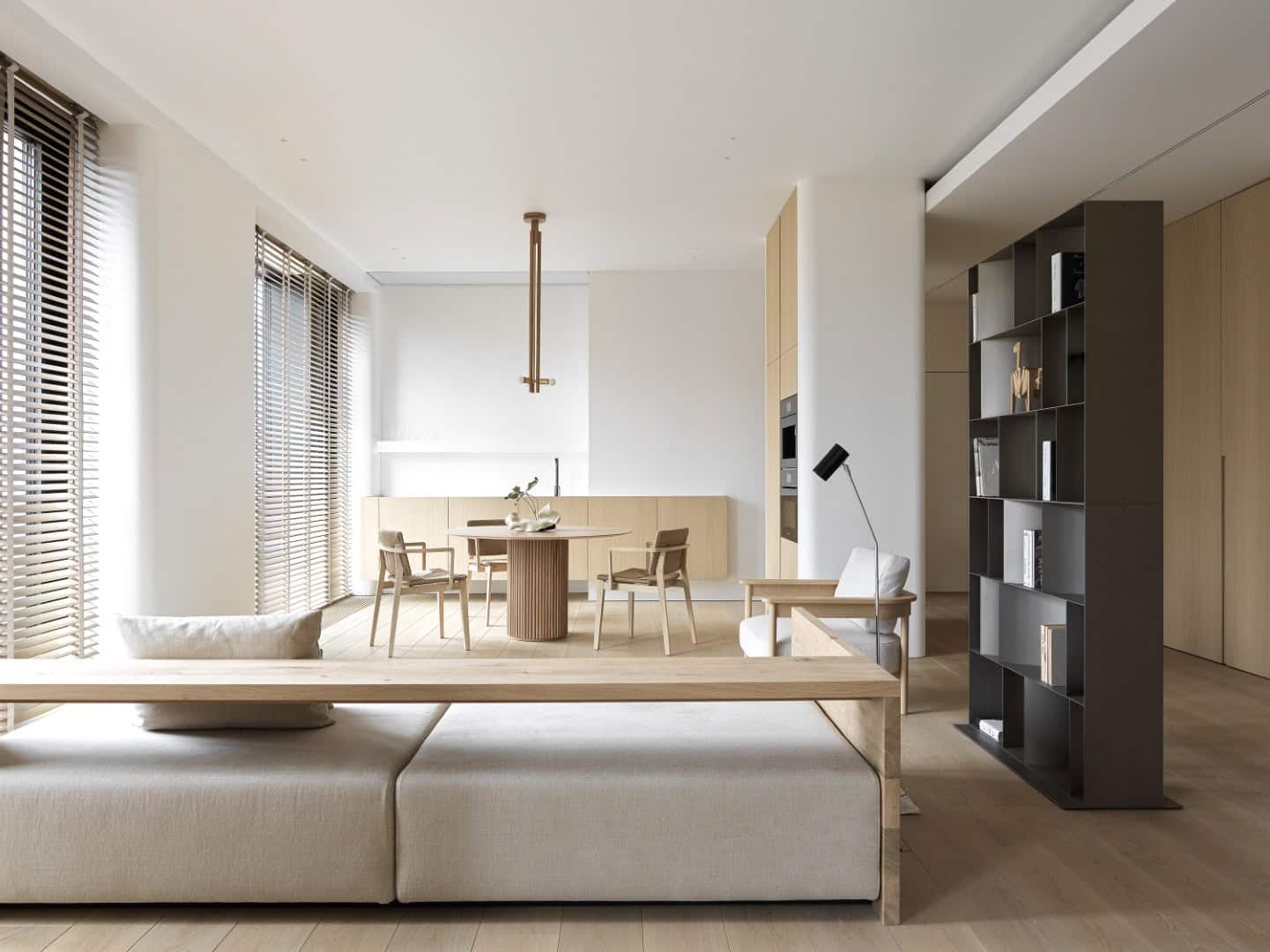
Babayants Architects has designed the interior of an apartment in the residential complex VTB Arena Park. VTB Arena is a neighborhood of high-quality contemporary architecture with a recognizable design code and its own character. From the first visit to the site, architects realized that interior will be a continuation of architecture with its clear geometry and roundish shapes. When architects closely saw the clients’ requests and wishes, the leitmotif of the project was completely formed. It is about smooth lines, visual lightness, relaxation, and a subtle flair of Asia.


This project is often compared with meditation. It truly has something indeed soothing; there is pure calm energy.
At the entrance of the apartment, there are no corridors. All attention is focused on the levitating wooden volume – a cabinet hung between two walls. Behind it, there is a living room has been seen. From the design point of view, this solution causes curiosity to find out what’s next and desire to see all the interior details. From the functional point of view, it allows the natural light to come into the hallway and create an airy interior.


The best point of the project is the large sliding partitions made of wood. They separate the living room from the studio. They bring more variety into the space: one can close them so there will be only a common area; if they are open there will be a monochromatic space full of natural light. Designing and installing these partitions was quite complicated because Babayants Architects admit gaps not more than 2-3 mm in all the projects, and to achieve this demanded great exquisite workmanship.
Another special detail that creates an atmosphere in the interior is the long wooden blinds. This is a nice modern solution that allows the inhabitants to feel cozy with so many windows in the apartment. When the blinds are lowered, it is still bright, when closed, a blackout effect is created. Also, they create a splendid play of light and shadow on sunny days and bring a unique texture of natural wood into the interior.
By the way, the idea of using the blinds belongs to the clients. They had been actively participating in the design process starting with the self-presentation and gave a clear vision of what they liked. This helped a lot because the interiors are always somehow reflecting their owners.
We are very impressed by people who can move away from the habitual filling of living space for the majority and say what they really need and what they don’t. Our clients don’t cook at home, therefore, we made a very compact kitchen that is practically hidden. At first glance, it looks like a levitating wooden ribbon, and only the faucets give away the true destination of this object. All the kitchen appliances are built-in in the two vertical columns which embrace the roundish part of the wall. The dining group with the round dining table, chairs, and a pendant lamp is on the central axis. The soft furniture is absolutely laconic and made in a Japanese-like style.
The studio is furnished with closed cabinets that are almost mimicking the walls, a light bookcase, and two comfortable areas for work.
The bedroom and the bathroom continue the main leitmotifs of the interior such as smooth lines and soaring. The bed, as if grown out of the wall, looks completely weightless.
Working on this project was hard but brought a lot of pleasant moments. When the architects visited the construction site for the first time and saw the roundish walls – it impressed a lot. When the interior is in 3D, it feels one way, but when you see it being completed, it makes a wow effect.
This project is an ideal embodiment of Babayants Architects’ approach to working with lines; it even has an informal name – “Ode to the lines.” The extreme perfectionism and idyllic geometry can be seen in the details: from architecture to joints and technical solutions. Even though a user doesn’t see the difference of how many millimeters is a gap, for example; harmony and correct proportions are in these tiny details.
This interior is refined and delicate. It gently hugs you and comforts you. Each line has precision and harmony. But what is especially pleasant is that the space surprisingly sensitively reflects the clients, and even looks like them.
-Project description and images provided by Babayants Architects
This website uses cookies.