Project: Villa MQ
Architects: Office O Architects
Location: Tremelo, Belgium
Area: 5,274 sq ft
Photographs by: Tim Van de Velde
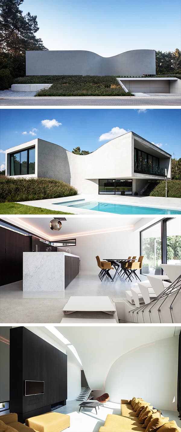
Office O Architects have designed the Villa MQ in Tremelo, Belgium. This minimalist dwelling was designed for a couple with two children who wanted to live a home that is different from the rest. And it most certainly is!
From street level, this home looks like a solid wall that has no obvious entrance, only a series of dramatic curves. But half a level lower than street level, you can reach the entrance by way of a slope within a concrete framework surrounded by landscaped grounds and although it might not look like it, the interior of this home is filled with natural light.


This spacious villa is situated in Tremelo (BE), on a large terrain surrounded by pines. The house was designed for a couple (with two children) that wanted something “special”.
Taking in account the building regulations, we started sculpting the house around the desired programs, playing with the fundamental architectural elements and principles (form, space,…), taking away the usual references by using curved walls, different ceiling heights, light,…The flowing lines of the plan unfold across five split-levels. The entrance of the house, which is half a level lower than street level, is reached by way of a slope within a concrete framework in an artificial landscape. Although the programs blend into each other, natural light provides a unique atmosphere at every level: the continuous dispersion of light on the curved walls emphasizes the impalpable framework. The sloping balustrade that consists of parabolic cables intensifies the interweaving of the different spaces. On the next level we find the kitchen, connected to the garden, and the slope towards the living room. An elongated cupola in the sloping ceiling / roof points the way to the highest zone, that of the children’s rooms. On this level, we also find the bathroom as a natural result of all preceding choices.
The space squeezes itself through the taille (the circulation space), accelerates temporarily (the stairs as connections between the levels), only to expand again, enhancing the dramatic effect. The visual language is characterized by emotion and lively agility. The views that are wrenched away from the fixed grid are nonetheless clearly framed and pushed toward the back. This emphasizes the organic forms.
The seemingly lifted volume causes a feeling of massive zero gravity. Life unfolds, turned away from the street and oriented towards the gardens. The artificial landscape that is created inside is well defined and flows back to the surrounding lawn.
This website uses cookies.