Project: Tourist Information Center
Architects: DIA – Dittel Architekten
Location: Schwäbisch Hall, Southern Germany
Area: 3,229 sqft
Photographs by: Daniel Vieser
DIA – Dittel Architekten – a German studio based in Stuttgart, has designed a new Tourist Information Center for the town of Schwäbisch Hall, located in the German state of Baden-


DIA – Dittel Architekten is responsible for the design concept as well as the planning and execution of the new Tourist Information Centre in Schwäbisch Hall, Southern Germany. The goal of the concept is to use the space to convey the city’s identity and allow this identity to be experienced through digital and analogue contents. Values such as service-orientation and the emerging cultural richness are incorporated into a modern design language, which goes on to form an exciting symbiosis with the traditional nature of the half-timbered building constructed in the 17th century. The area, which is under heritage protection, was completely renovated as part of the new concept. The Tourist Information Centre opened on 06 December 2017.
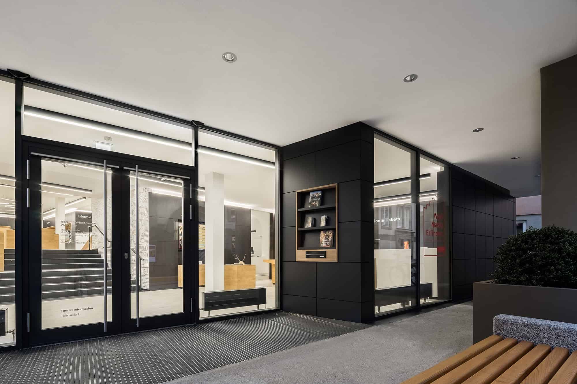
In a competitive tendering process, DIA – Dittel Architekten came out on top with a concept that transforms the Tourist Information Centre into a modern symbol of the culture-rich city. The exceptional look and feel is apparent to tourists and residents even from the outside. The new glass facade in the entrance area represents transparency and gives visitors an exciting look at the reception, products and the digital corporate wall. The 300 m2 space is designed in a service-centric way and divided into the following zones: reception, tourist advice, retail, information and ancillary spaces.
Visitors will get an overview of the space immediately upon entry and are guided through the area intuitively. Looking straight ahead reveals a spacious staircase that serves as the connecting element between the lower and upper retail space. On the right side, visitors can approach the constantly manned reception desk or obtain current information via the screen integrated into the wall. On the left side, a window display, which can be seen from the outside, stretches along the facade, up the staircase, and into an inviting seating area. This display forms the start of a row of cube-shaped wall shelves and merchandise display units for retail and presentation. These shelves and display units are designed and arranged specifically for the products to encourage visitors to browse. The pendant lights used here highlight the merchandise on display and constitute an impressive light installation on their own. The rest of the space is illuminated by black surface-mounted ceiling lights with a graphical appearance to create a neutral atmosphere. There are likewise two pieces of service furniture available on the upper level – including seating furniture where necessary – for providing information and advice.
The colour and material concept revolves around a light-dark contrast and natural colours. The anthracite-coloured corporate wall surrounding the space is a design element that establishes the space’s identity and connects the individual zones together. At the same time, it offers additional uses by providing room for shelves, noticeboards, displays, window displays and storage space as well as functioning as an acoustic barrier. This, in combination with oak furniture, bright flooring and a white suspended ceiling, creates a friendly, modern atmosphere. The colours are reversed in the staircase area, making the backlit line art with motifs of the city of Schwäbisch Hall fully come alive. Multimedia screens, digital panels and high-quality photographic images are placed throughout the entire space and complete the image of the city.
This website uses cookies.