CHASE THE LUMINOSITY
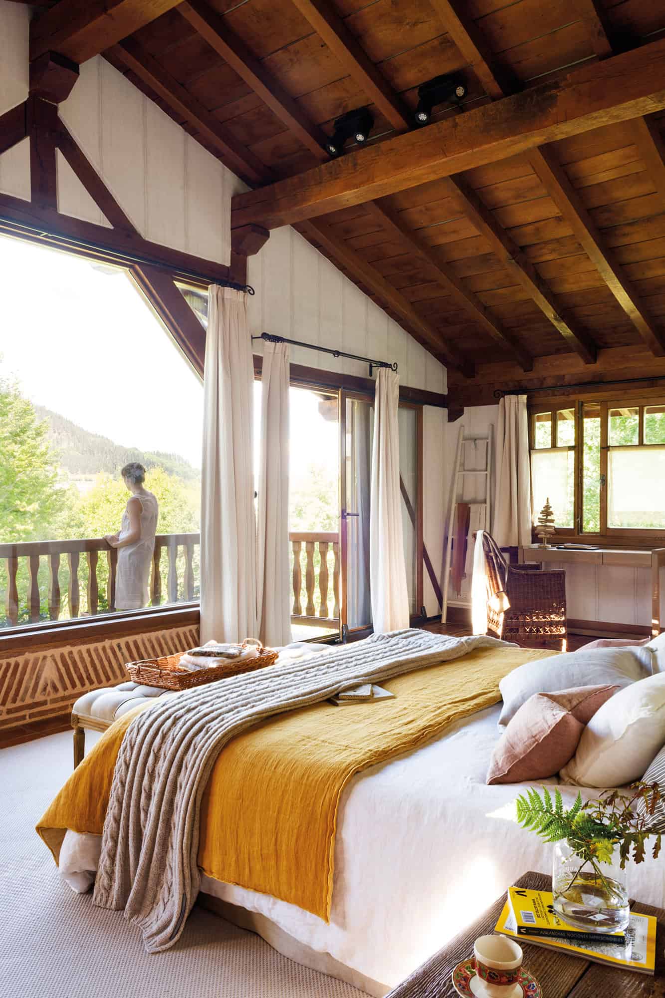
It enhances the entry of natural light and its circulation through all corners of the house. This has the ability to modify from the color to the feeling of spaciousness and warmth of the rooms. In this bedroom, with large windows to the outside, the bench, the carpet, and the desk.
DISPENSES WITH STAYS
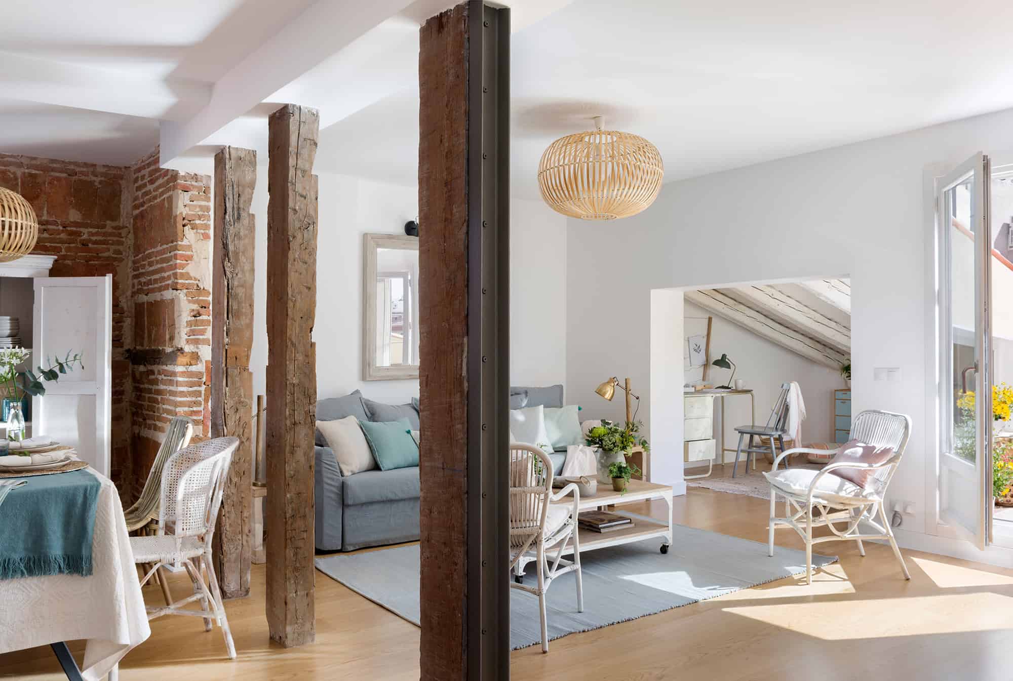
Less is more. It compares the space because it is better to have fewer but generous rooms than many small ones. In addition, you avoid intermediate spaces such as hallways or corridors. Here a common space has been created in which the living room, the dining room, and the study coexist.
DISTRIBUTE TO THE OUTSIDE
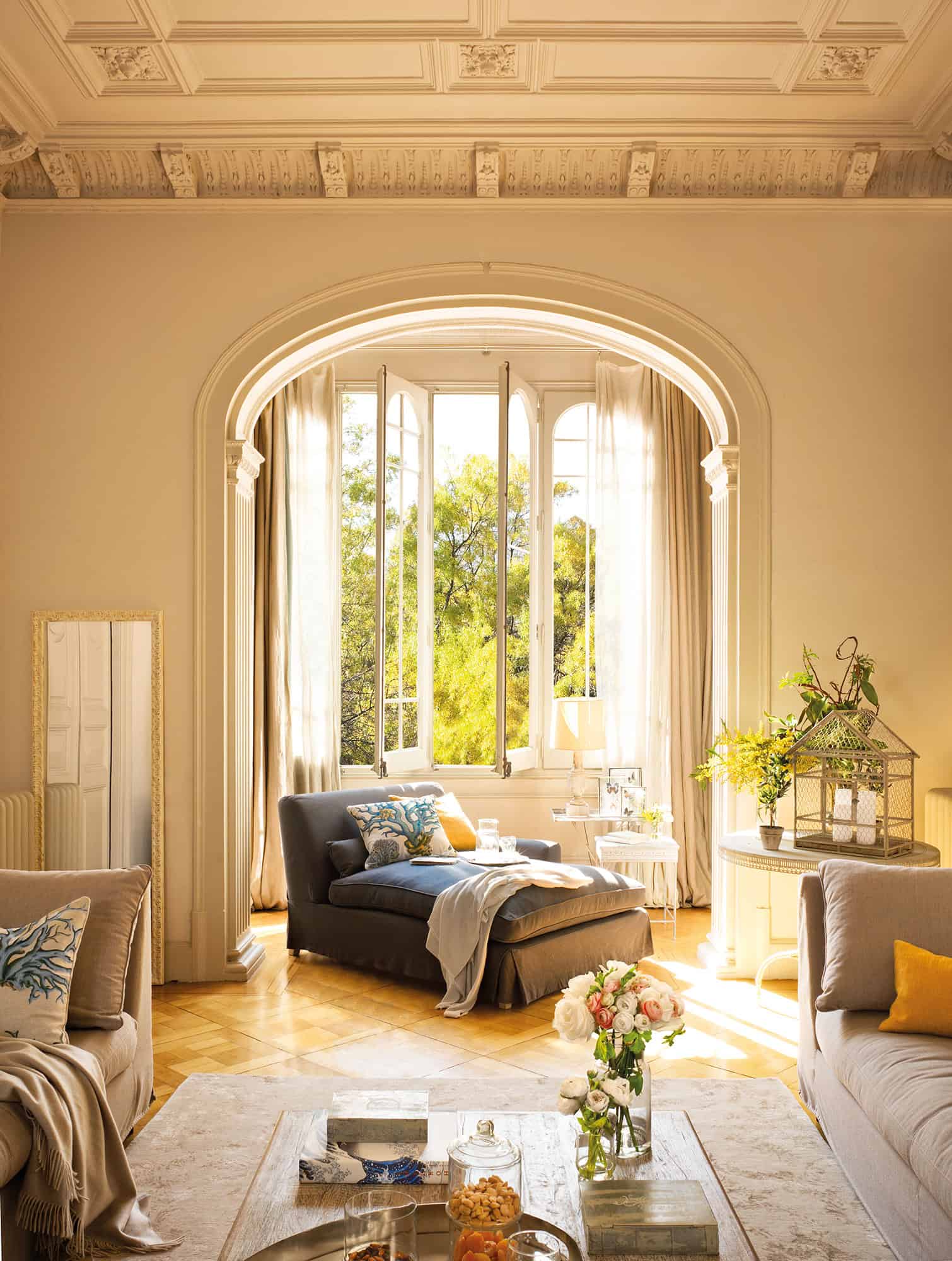
Orient the decoration towards the light sources. Thus, in the living room, he places the living room in front of the window, and in the bedroom, he places the bed parallel to it. Bring the bulkiest to the walls.
DECORATIVE UNIT
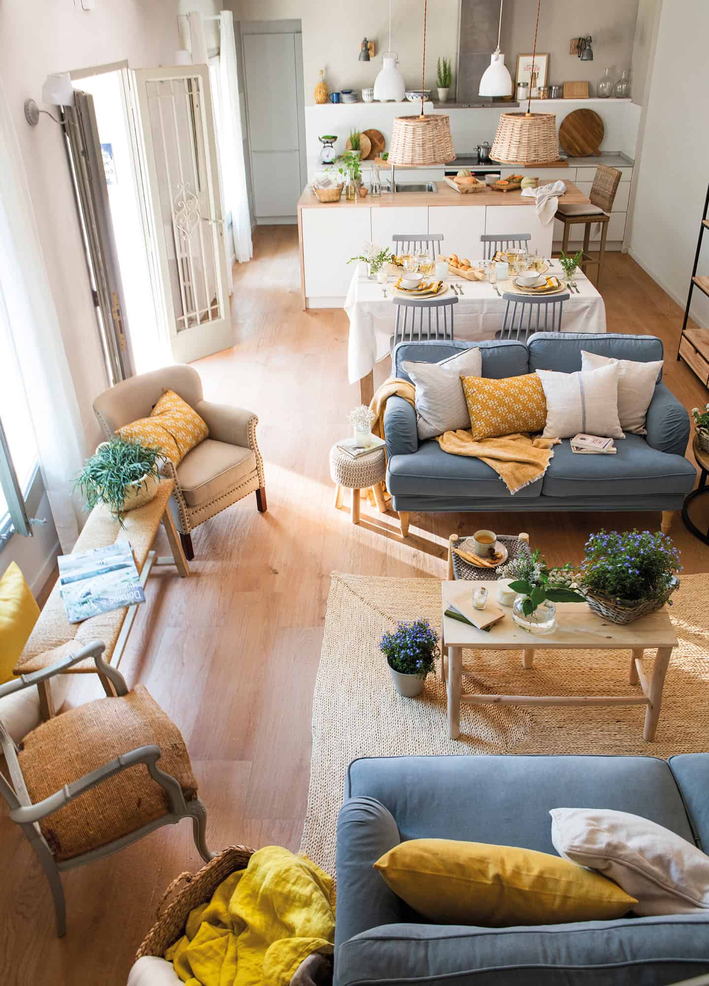
If you are looking for harmony, do not project the rooms individually. Choose a style, coatings, and a base palette and decorate the whole house accordingly by introducing some nuances. Here, the presence of wood, fibers, and pieces of furniture in gray.
FURNITURE IN PROPORTION
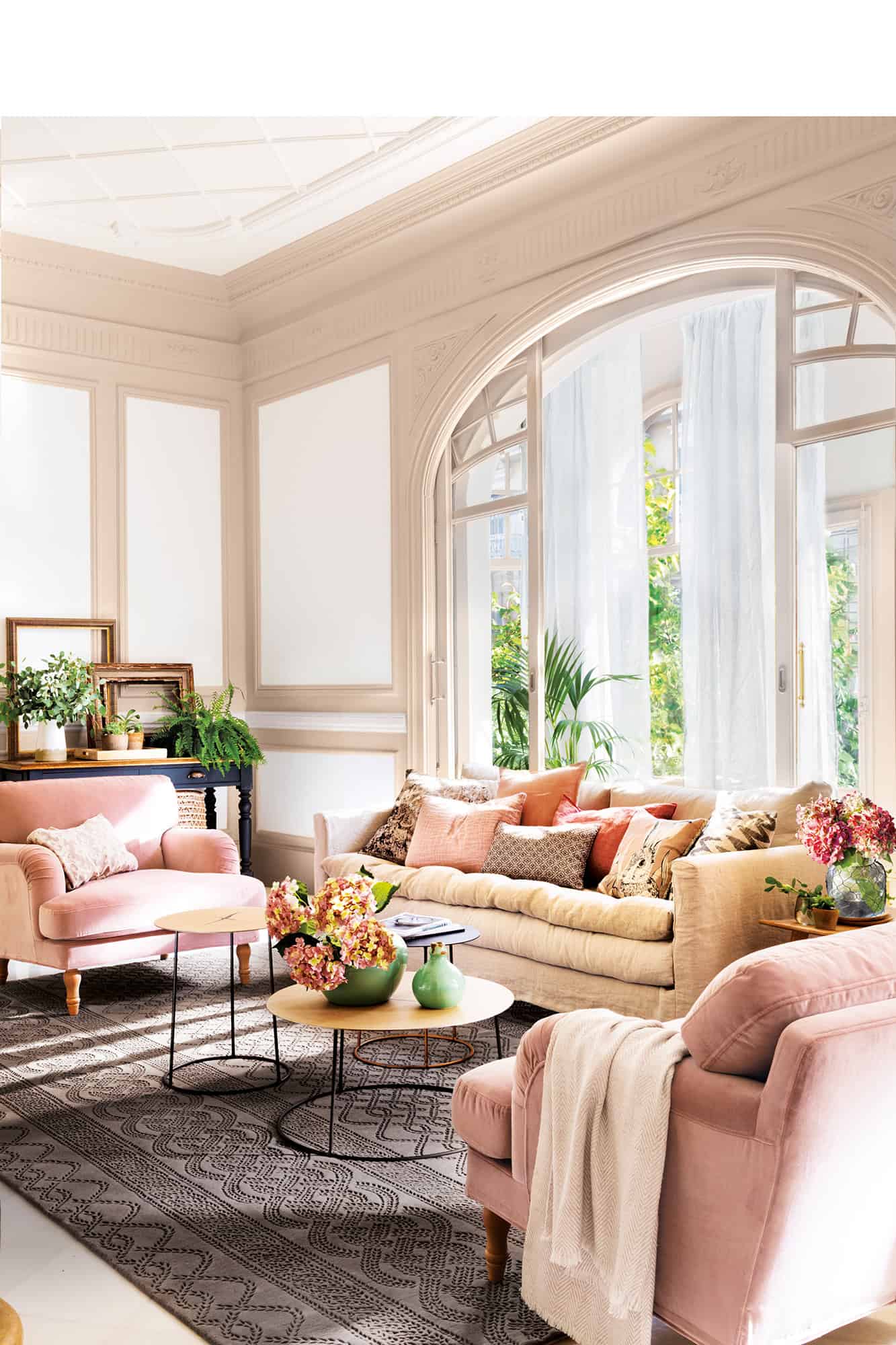
Choose furniture in shapes and sizes proportional to the space. As counterproductive is a very large sofa in a small space as one that is too small in a large environment.
CONTINUOUS FLOORS
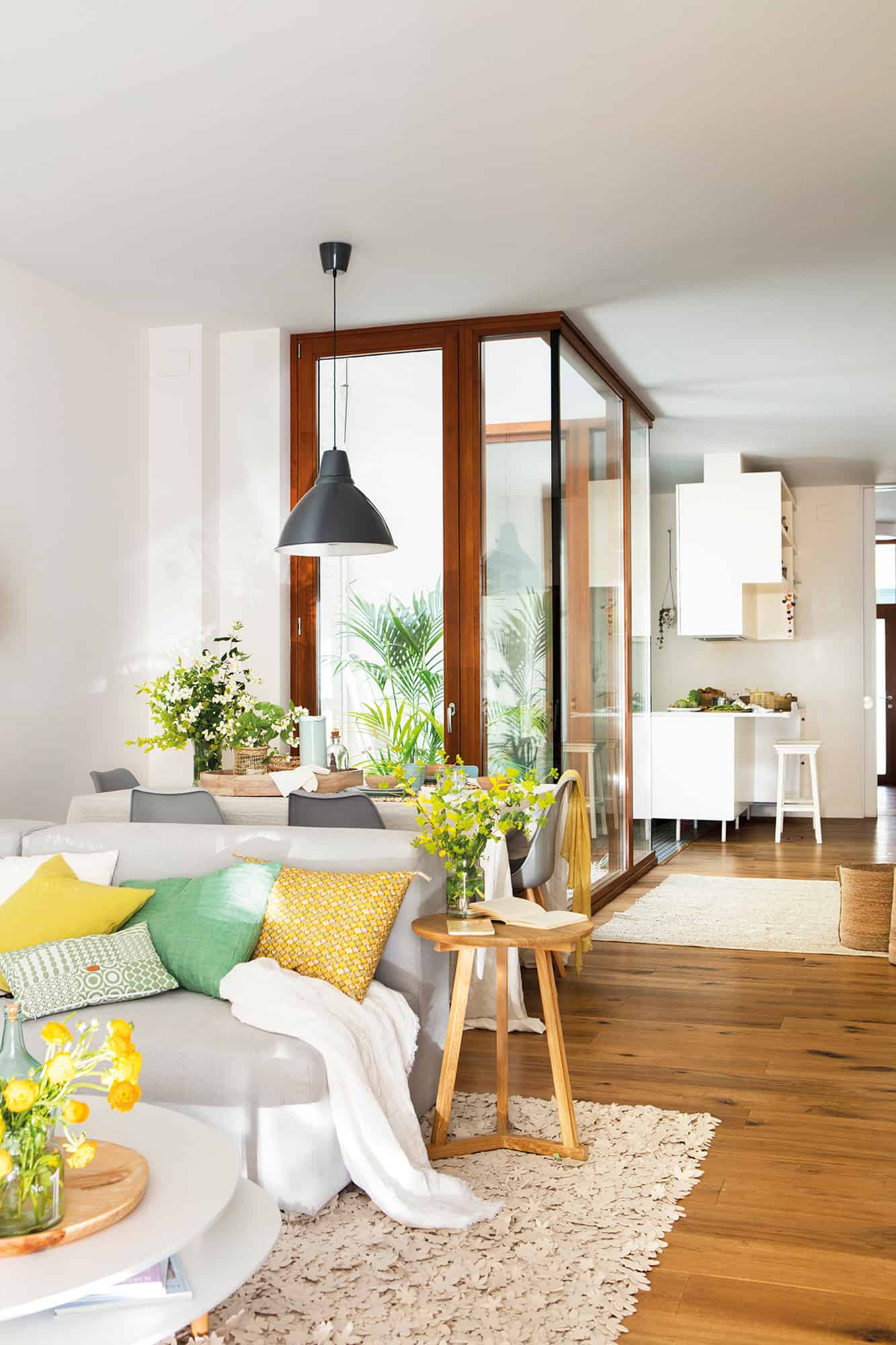
The pavement unit throughout the house gives visual continuity and, incidentally, spaciousness. Keep in mind that smooth coatings in glossy finishes reflect the most light.
PLAN THE LIGHTING
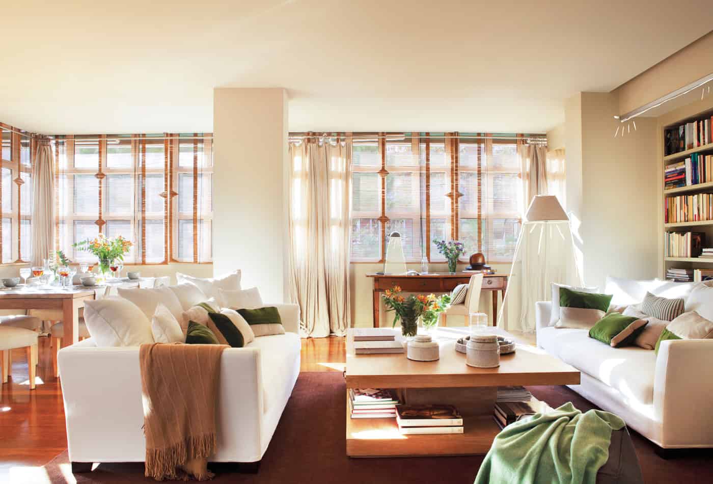
It combines a homogeneous and diffuse general light without shadows and ambient light to create atmospheres and delimit. Use spotlight to reinforce specific areas.
POWER UP THE WINDOWS
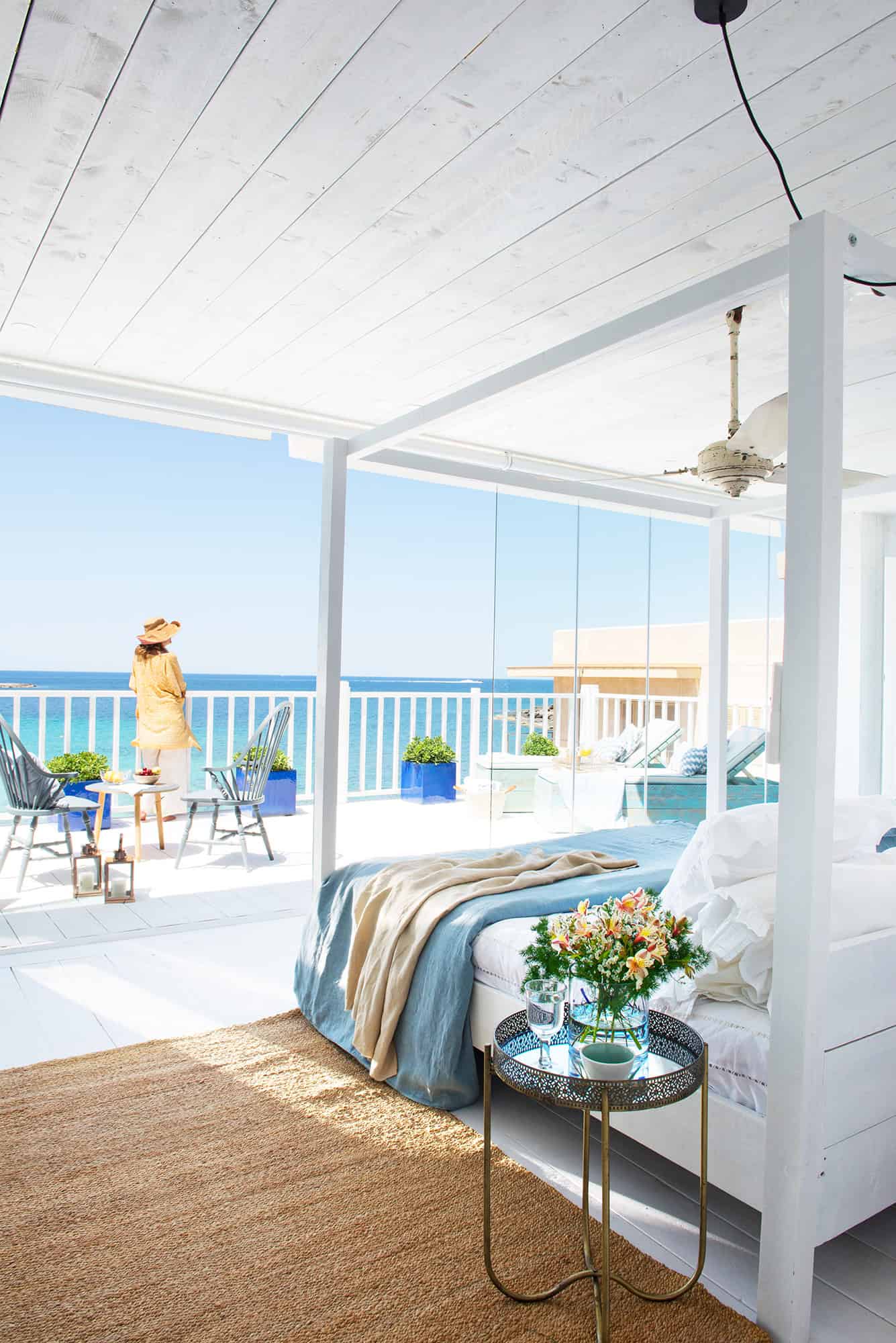
Expand the glazed surface whenever you can, reduce the profiles to a minimum – the finest are aluminum, although they are not the most sustainable – and opt for white finishes that do not interfere with the entry of light. Here, the large window has been closed with slides without profiles that practically disappear, leaving clear views.
DON’T NEGLECT THE EXTERIOR
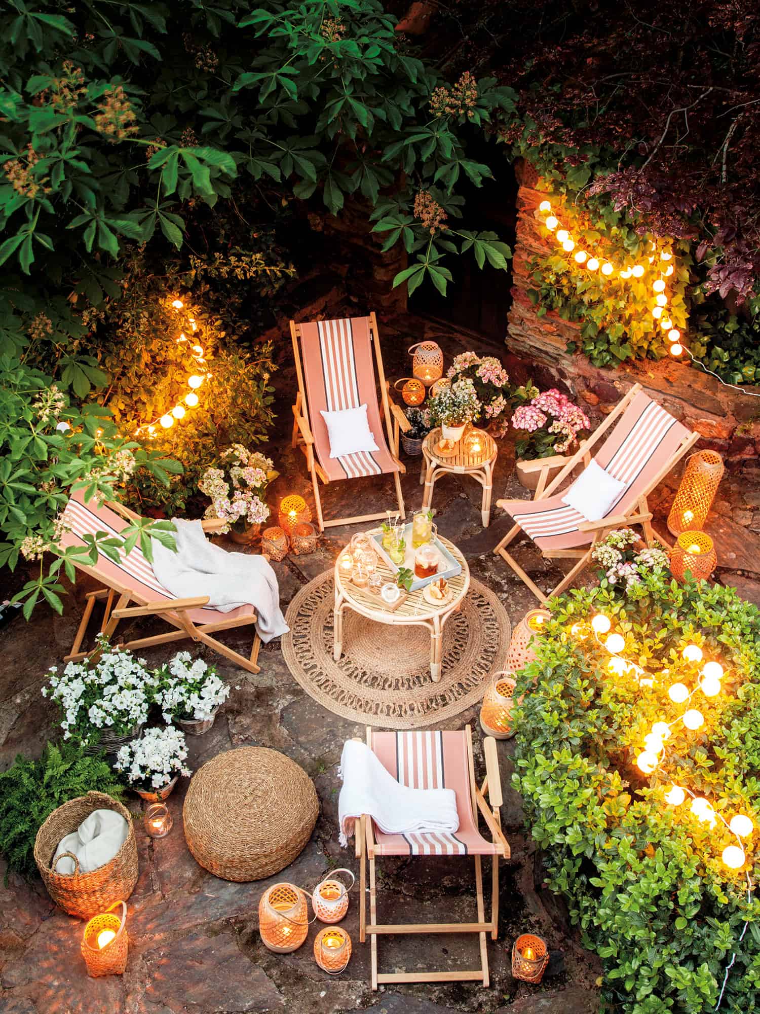
Take care of it throughout the year, not only in summer, as its colors enter the house through the windows.

