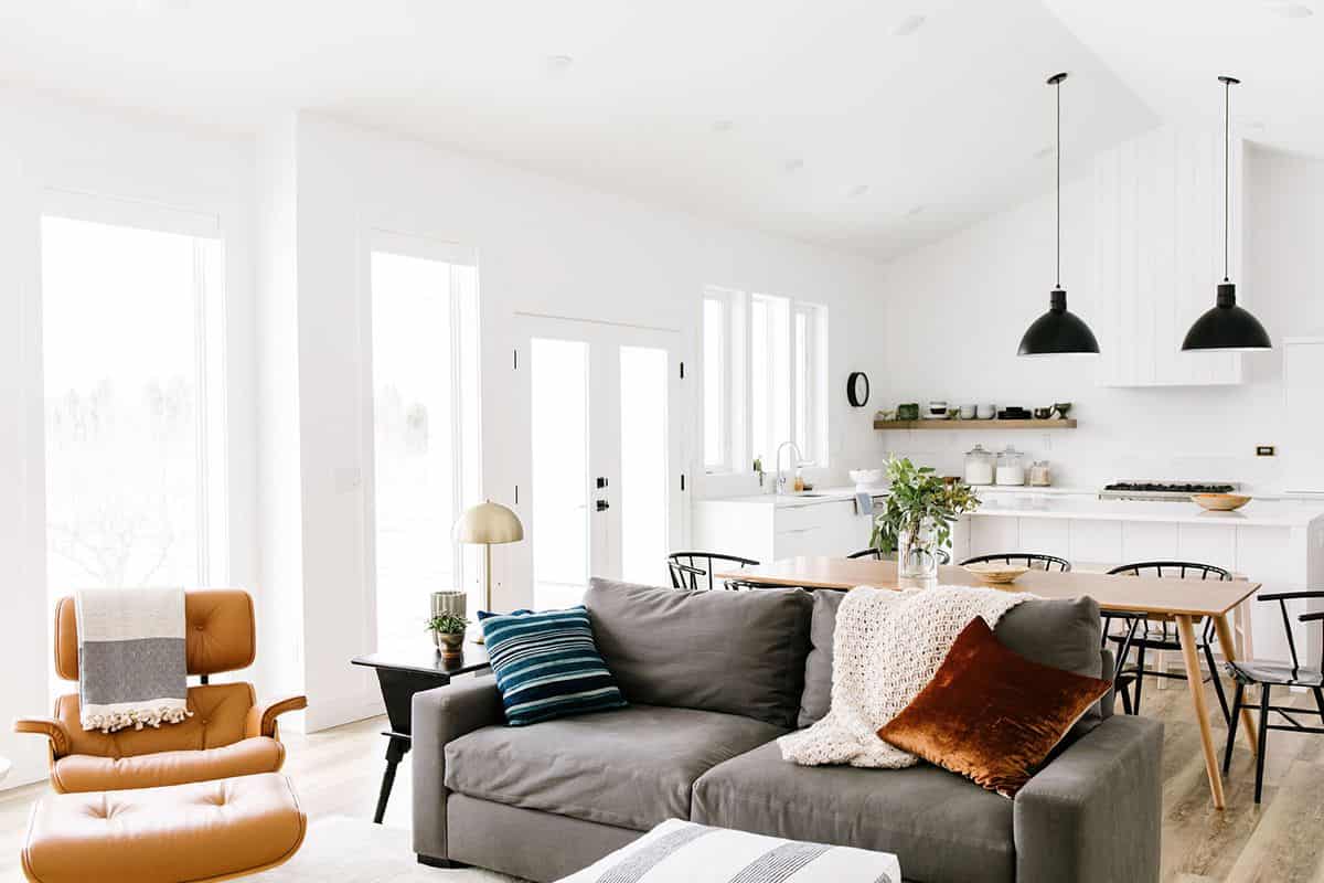
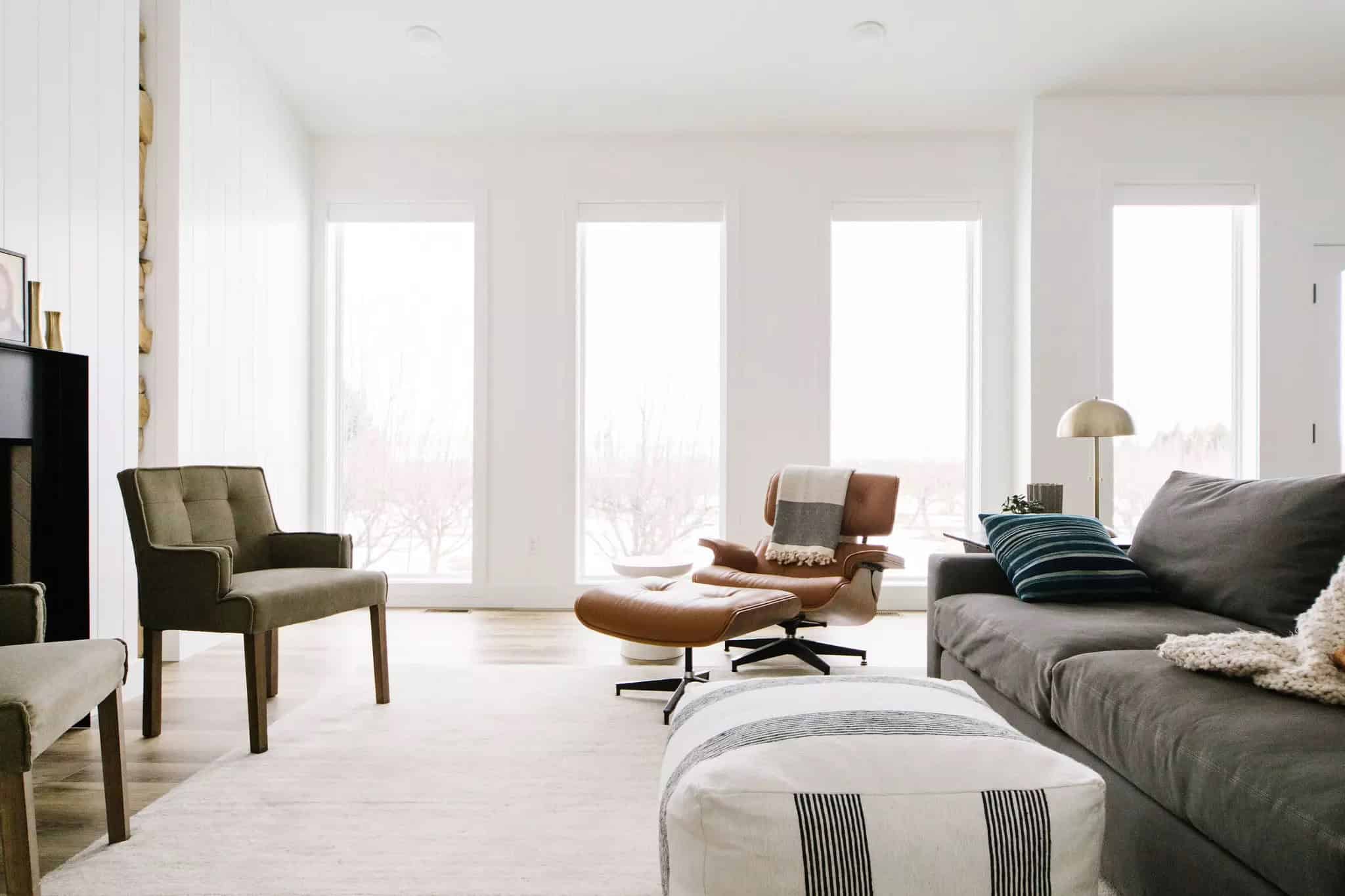
When you take a look at this home you will see the all-white, galvalume corrugated metal roof, the big windows and the black accents. You can see the resemblance from the outside, that this home looks like a modern ranch farmhouse, plus given its location in the middle of an apple orchard in Providence, Utah you simply feel that is the big deal. The designer Katie Booth wanted it to look like it really belonged there, but with a modern touch.
You can feel the light and the pure vibe with the large windows providing a ton of natural light, soaking up the views and bringing the colors of the nature inside the home. This home has four bedrooms and 3.5 bathrooms. Wowed ha? At 3400-square-foot the home is one of the largest that the designer has ever lived in, but she made every step count and went with larger living areas and smaller bedrooms.
To create the home of their dream family home she gathered inspiration all the time and has pinned tons of images that gave her the feeling of what she wanted their home to be like. The main goal was that her and her husband afford a place suitable and comfortable enough for their kids, their hang-outs with friends, and working space.
This property is a a lot to take in, since the process of decorating has been slow, and yes it’s normal. We would pack our bags and leave our homes, so we could live in this one, LOL! But, okey now let’s get back to the process of decorating the dream house. Yes, it took a lot of time and patience to look the way it looks right now, and that’s why the end result is so fascinating.


As you can see the living room gives the look of stylish and comfortably created touch, with some of the best spots for reading in the house. With the orange-brown color it gives warmth to tho the space with all the black and white going on.
When it all came to the design of the house, they knew what they wanted, it was a fairly simple philosophy. When having this space, everything is possible, do you agree with us? The fresh look, the comfortable and quirky touch makes the home so beautiful. There is also a gallery wall filled with art that has been collected for years. When you have random, but special, some vintage art, then some new it means that every piece resembles with your personality. Here that’s the case too.
Heading to the kitchen, there is a separate zone created between it and the dining and the living room. It was done so each room can breathe and yes, they have achieved it so good. The kitchen has such a simplicity with the black chairs and the white oak table. But there is one thing about this kitchen as anomaly, if we may say, and that’s the lack of upper cabinet storage, but the designer realized that what once was a discomfort now is the right decision. First thing first, she stressed about this anomaly, but later on she said that they actually did drawers on the lowers which provides the easy access to pots, dishes, etc.
The focal point of the kitchen are the over-sized black pendants that pop against the white backdrop.
Now, let’s talk a bit about the bedroom. The design is set to be very simple and minimalist, because the designer thought rather of catching some good quality sleep time. And, that’s a fantastic example of prioritizing function over aesthetic, especially when it comes to bedrooms.
This website uses cookies.