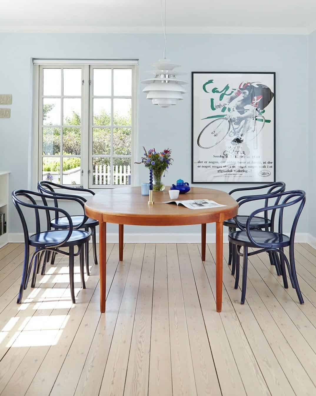
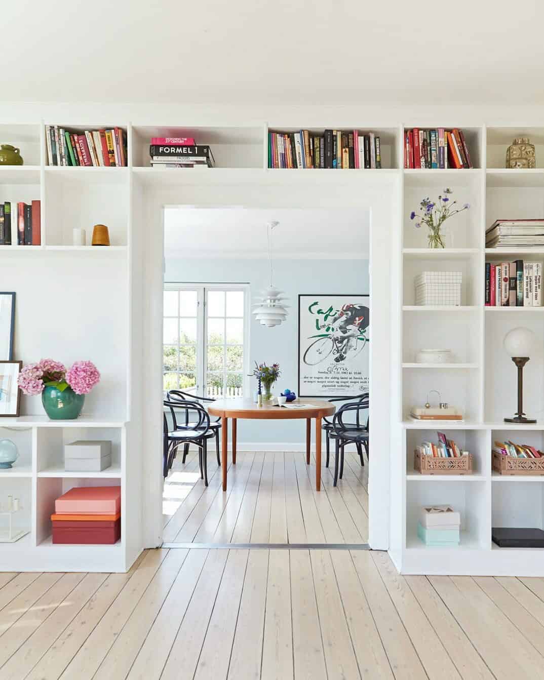
At the end of the post you will see the photo of what the facade and roof of this house built in 1936 in Vejle, Denmark was like before being renovated.


Before the renovation the walls of the house showed red brick, now it is white and the roof is also gray, but of better quality, with better insulation and roof windows.
Inside, about 100 m² divided into two floors, open spaces predominate, integrated and made-to-measure solutions, such as the shelving in the living room, pastel colors on the walls, vintage elements found in flea markets, and Danish design classics (armchairs and lamps above everything).
In all the rooms there is a lot of space, it is not overloaded with furniture or objects, not even the kitchen, which is very clear, without upper cabinets and with that custom-made bench, great as a storage place, always well received in a kitchen. From the inside there are views of the Vejle fjord, one of the reasons why the couple who bought the house fell in love with it, even though it needed renovations, they say that when they stop for a moment to appreciate it, it is as if they were in front of a painting, nice description, don’t you think? Let’s see if you like it.
1.


2.
3.
4.
5.
6.
7.
8.
This website uses cookies.