A good distribution is key when it comes to making the most of the space and succeeding in decorating a small apartment. Remember that the plant rules, so draw a plan to scale and take into account where the doors, windows, light sockets, downspouts are… And sometimes, even if you have to turn the house “upside-down” and change the order of the rooms or throwing partitions, the result is spectacular.
Just because your apartment is small does not mean that it is uninhabitable. The proof of this is these five houses that we have selected to convince you that anything is possible.
1. A LARGER LIVING ROOM OPEN TO THE TERRACE
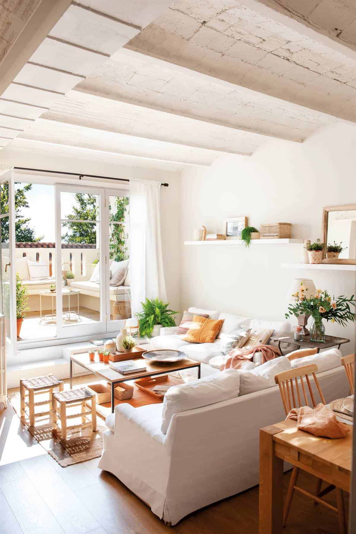
It’s hard to believe, but this was a dimly lit attic that lived with its back to its terrace. The architects eliminated mini rooms to gain a spacious and comfortable day area and extended the window that overlooks the terrace: now the light is imposed on the entire day area.
2. A LADDER THAT IS THE KITCHEN CABINET
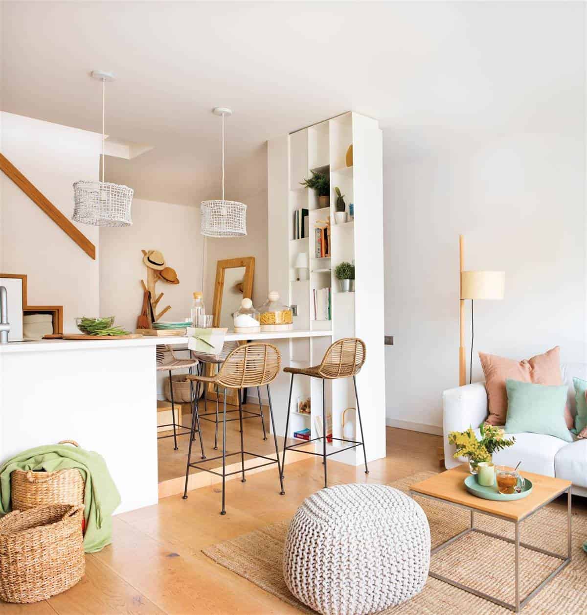
The staircase took up a lot of space in the day area, which is why the architect Gema Ospital integrated it into the kitchen. Now gather cabinets to store, as well as the oven and refrigerator. Also, he extended the kitchen counter as a bar to enable a mini-dining room and thus enjoy a larger living area.
3. A VINTAGE KITCHEN THAT IS THE HEART OF THE HOUSE
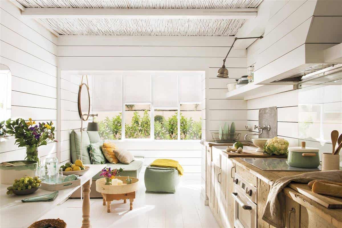
The kitchen, with permission from the patio, is the heart of this ground floor with a cottage vocation. At first, the space it occupies should be destined for the living room, but the owner prioritized having a large kitchen and a very capable dining room. In fact, 10 people have gathered!
4. A DAY AREA PANELED BY WOOD
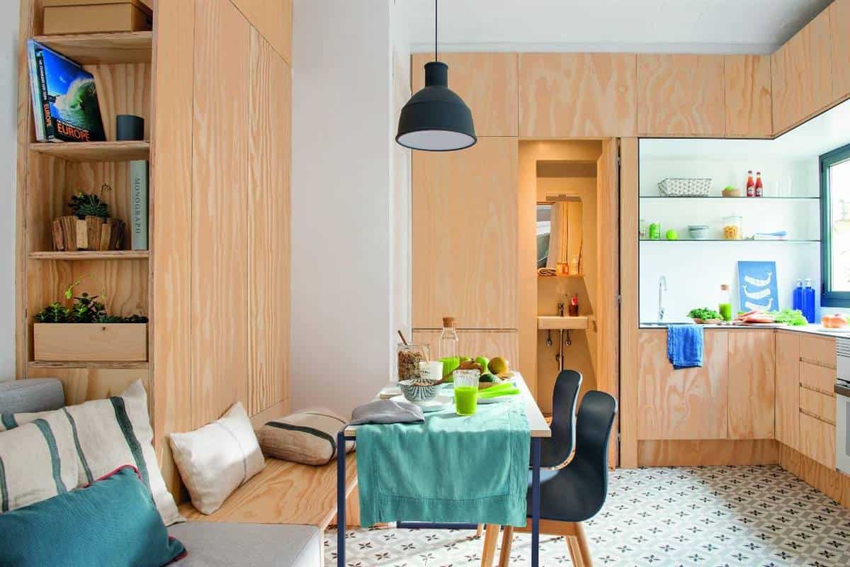
This apartment is what is known as “quart de casa”, a type of habitual residence in the Barceloneta neighborhood of Barcelona. Even being mini, it has been wanted to give it a very careful look, with paneled wood in the kitchen and the furniture of the dining room. The white of the walls helps to visually expand the space.
5. A SMALL BUT VERY CAPABLE SALON
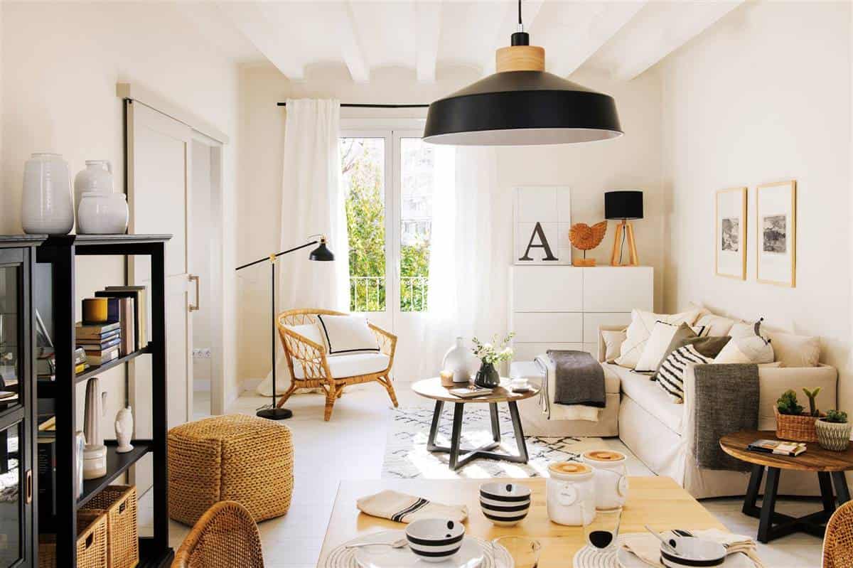
The living room is designed to receive, a large and comfortable sofa, a puff as a footrest that can serve as an extra seat, and a very comfortable armchair. Also, the sofa is transformed into a bed. The sideboard offers plenty of storage space, but being white, like the walls, it doesn’t weigh down visually.
6. A 3-IN-1 BOOKCASE
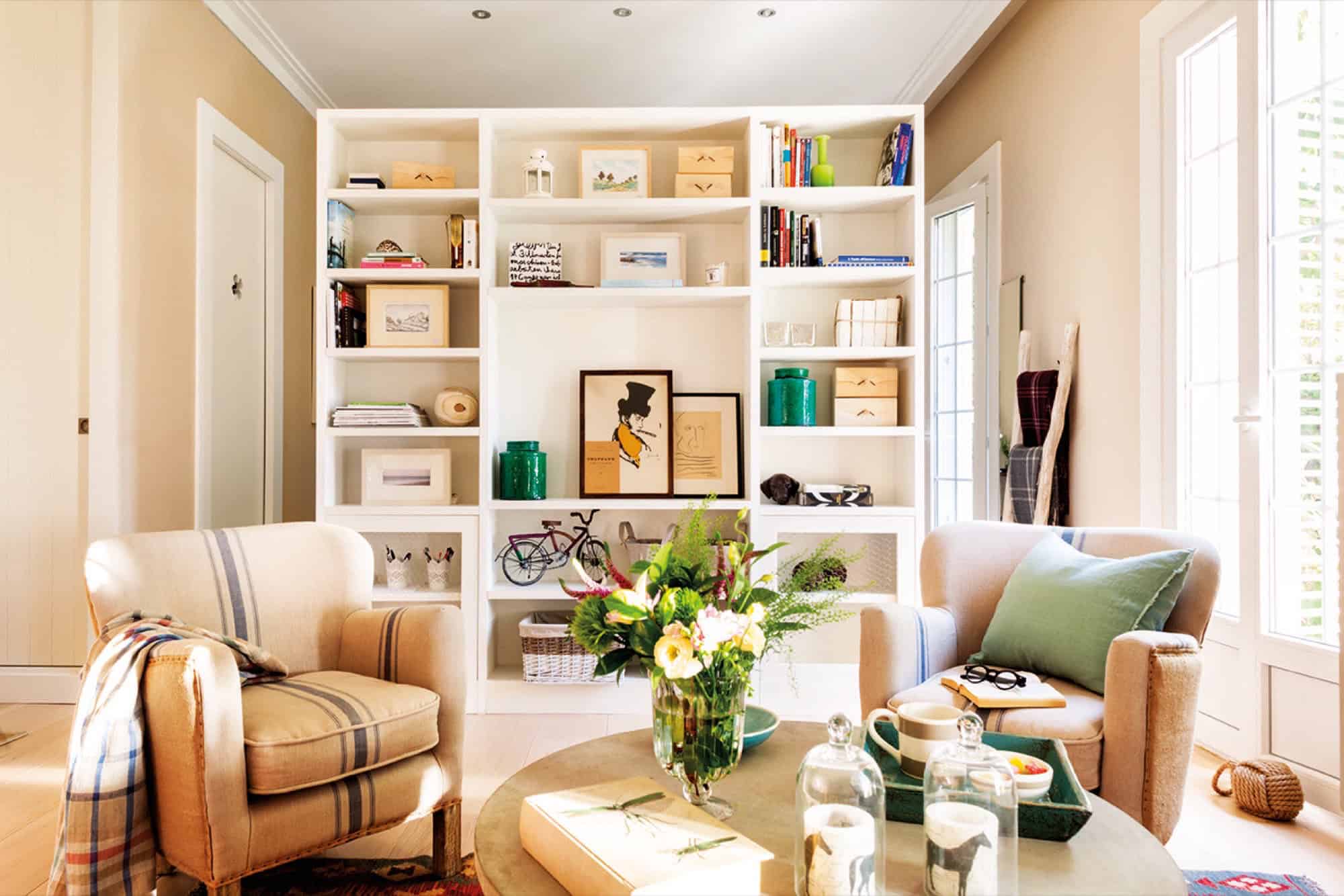
Decorate, store, and work to separate environments. This is how the bookcase on this floor is, on the one hand, it is a bookcase and, on the other, the bedroom closet.
7. EFFECT WOW!
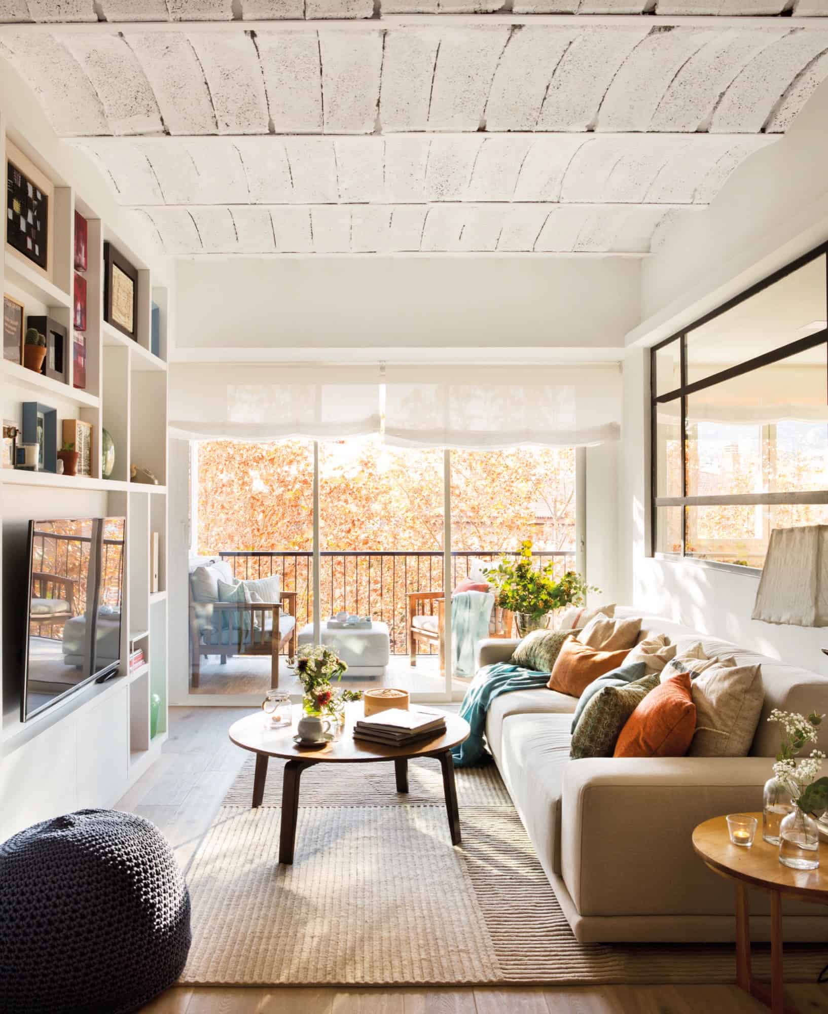
Instead of a white wall that separates the kitchen and living room, they decided to create an iron and glass window to expand the visual optics and gain light.

