- Project: Sidera
- Architect: Tisselli Studio Architetti
- Location: Italy, Forlì
- Year: 2023
- Area: 10000 m2
- Photography: Tisselli Studio Architetti
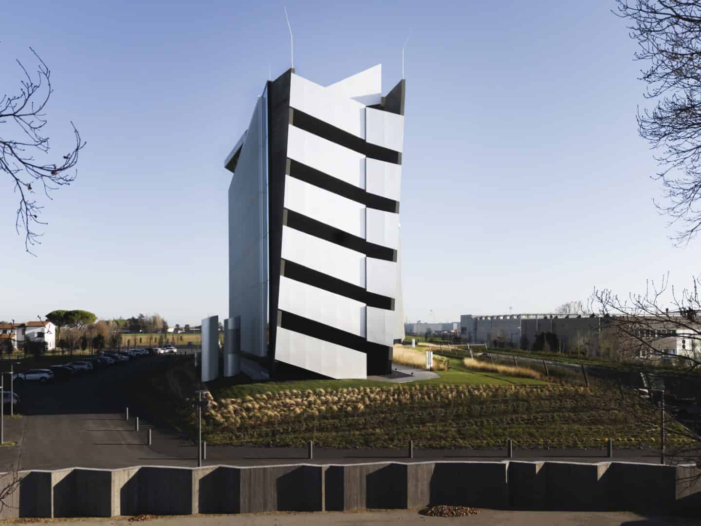
The Sidera Building by Tisselli Studio Architetti is a striking new corporate headquarters in Forlì, Italy, that transforms the language of industrial architecture. Located within an anonymous industrial zone dominated by prefabricated warehouses, Sidera introduces a bold architectural identity rooted in neuro-architecture, sustainability, and employee well-being. With over 107,000 square feet of carefully designed workspaces, assembly halls, and communal areas, the project redefines the concept of a productive, healthy, and inspiring workplace.
Project Overview
Situated on the edge of the ancient Roman centuriation and near a major motorway, the site lacked architectural inspiration. The client’s brief focused on:
-
Flexible office configurations without open-plan anonymity.
-
Six departments, each occupying a full level.
-
A 200-seat assembly hall and cafeteria adaptable into office space.
Tisselli Studio Architetti responded by designing a building that absorbs the rationality and pragmatism of its cooperative client while elevating these values into a poetic architectural statement.
The result is a headquarters that extends horizontally for 100 meters, rising 33 meters high on a soil plinth, composed of aluminium cladding, black pigmented concrete, and 5,000 m² of glazing.
Façade & Material Strategy
The Sidera Building’s façade is defined by six kilometers of vertical aluminium fins that reflect shifting light and create dynamic effects of transparency and opacity. This design detail turns the massive structure into a living, responsive skin that changes character with weather and time of day.
Key materials include:
-
Aluminium panels: Lightweight, reflective, and dynamic.
-
Black pigmented concrete: A grounding element that conveys strength and stability.
-
Glass curtain walls: Introducing transparency, light, and visual connection.
The roof was treated as a fifth elevation, introducing sloping pitched surfaces with skylights — a nod to vernacular motifs and a dialogue with the skyline of the Apennines.
Interior Design & Neuro-Architecture
The interiors were designed not as secondary but as integral to the architectural identity. Guided by principles of neuro-architecture, every choice focused on human comfort and productivity:
-
Natural light floods the workspaces through controlled glazing.
-
Lighting systems follow circadian rhythms to align with human biology.
-
Ventilation systems ensure clean, healthy air without operable windows.
-
Sound insulation fosters focus and psychological well-being.
-
Views of greenery are accessible from every level.
Circulation spaces act as social hubs. Large sculptural staircases, winding like living organisms, carve dynamic vertical connections. Landings double as informal meeting spots, strengthening community and collaboration.
Spatial Experience & Atmosphere
Inside, the building denies rigid orthogonality, opting instead for faceted surfaces, diagonal cuts, and shard-like geometries. The interplay of compression and expansion, light and shadow, creates a narrative of discovery and stimulation.
Employees are not passive occupants but active participants in the building’s performance. The architecture engages them as collaborators in a constantly evolving experience, encouraging creativity, interaction, and well-being.
Landscape & Environmental Integration
Despite being in an industrial zone, the project aims to redefine its context:
-
300 trees and 22,000 plants soften and enrich the surroundings.
-
Landscaping creates a green buffer, neutralizing the monotony of prefabricated neighbors.
-
The building becomes a gift to its environment, elevating a neglected area into one of architectural and ecological value.
The Sidera Building by Tisselli Studio Architetti is a milestone in contemporary workplace design. By merging scientific rigor, neuro-architecture principles, and environmental sensitivity, it transcends the banality of industrial contexts to create a living, breathing headquarters.
It is not just an office building, but a cultural statement — proving that architecture can foster well-being, strengthen communities, and redefine entire urban zones.