Project: Sanyea Sjór Seaside Resort
Architects: Fusion Design Office
Location: Shenzhen City, Guangdong Province, China
Area: 19,375 sf (site), 13,993 sf (interior)
Year: 2021
Photographs by: Outang Yun
Sanyea Sjór Seaside Resort by Fusion Design
Sanyea Sjór was designed and completed by Shenzhen-based Fusion Design Office. This is a 1,800-square-meter seaside resort, with an excellent view of the sea and the most beautiful sunrise and soft beach.
Due to Covid-19 outbreak, people can’t travel too far. For the Shenzhen population in the metropolis, it is urgent to find a place that is not far away, but can release the pressure of heavy work. As a result, Fusion Design has given Sanyea Sjór more functions, value expectations and emotional experience, so that the resort is no longer just a rest carrier, but a distant residence for urban people to temporarily escape.
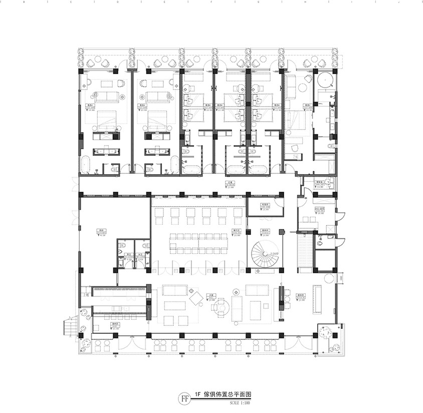
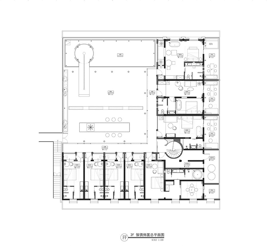
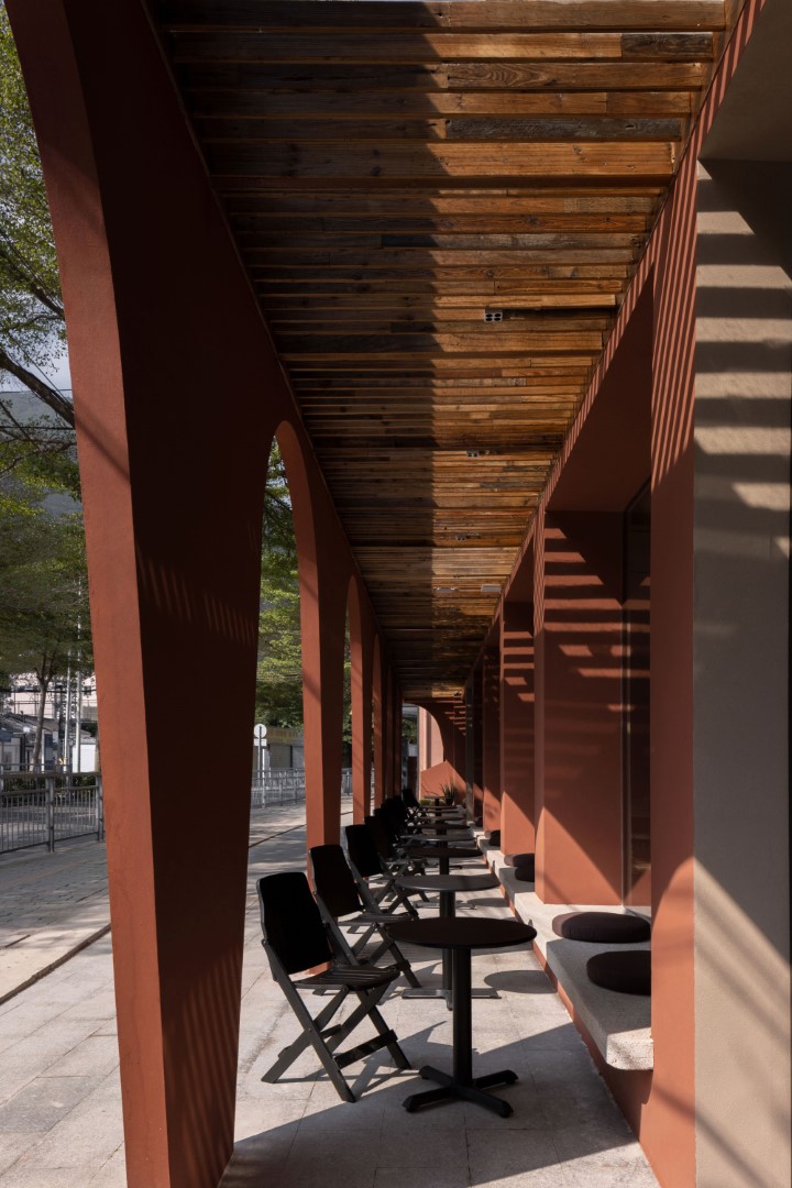
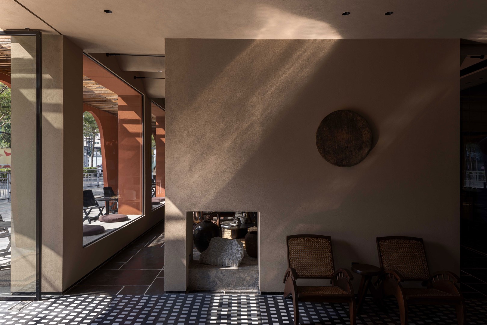
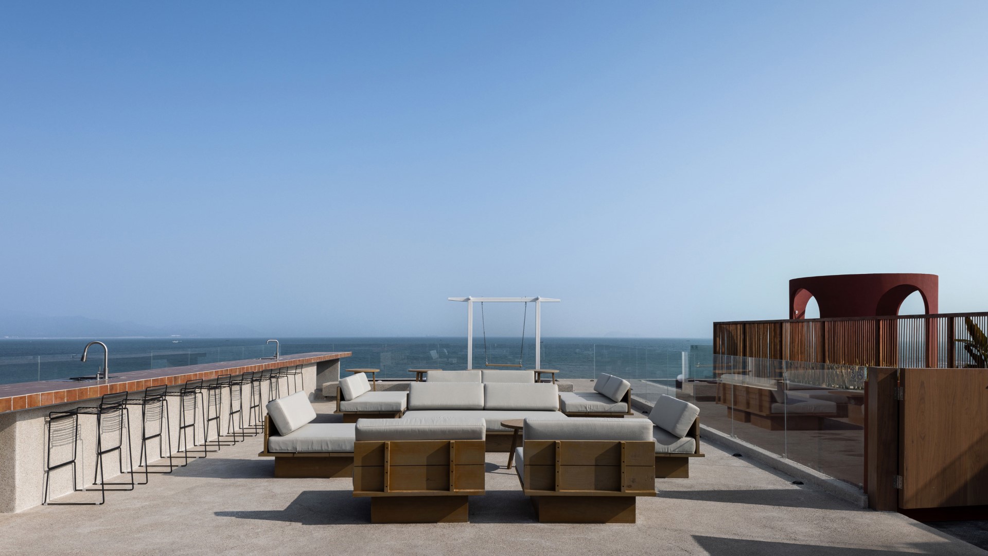
The entire resort consists of two parts: the common space and the residential area. The common space is divided into indoor and outdoor spaces, including restaurants, bars and terraces, which can serve various events such as afternoon tea, weddings, conferences, parties, etc., to witness every important moment.
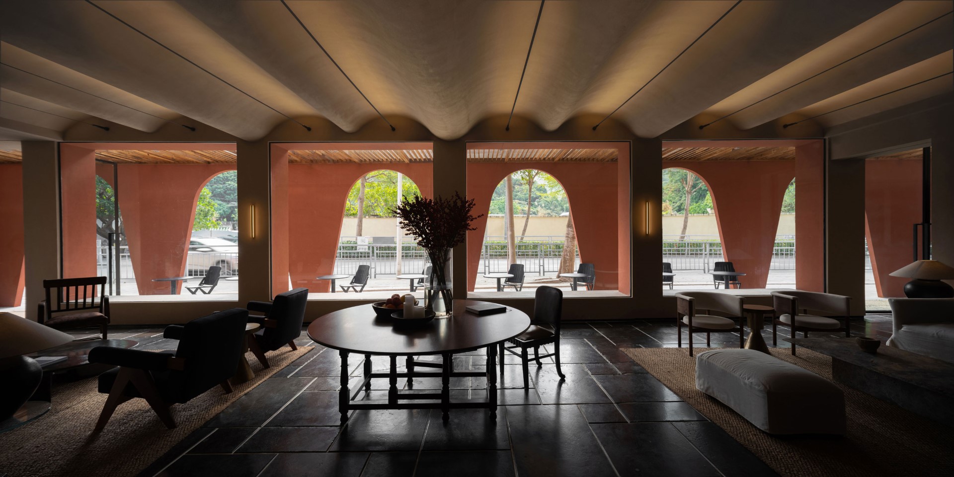
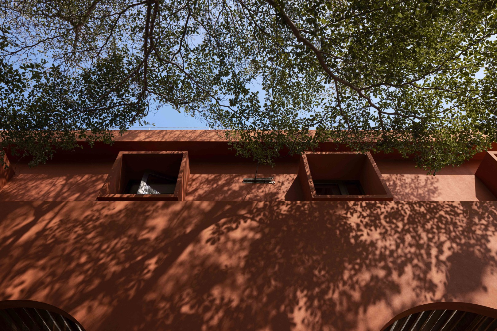
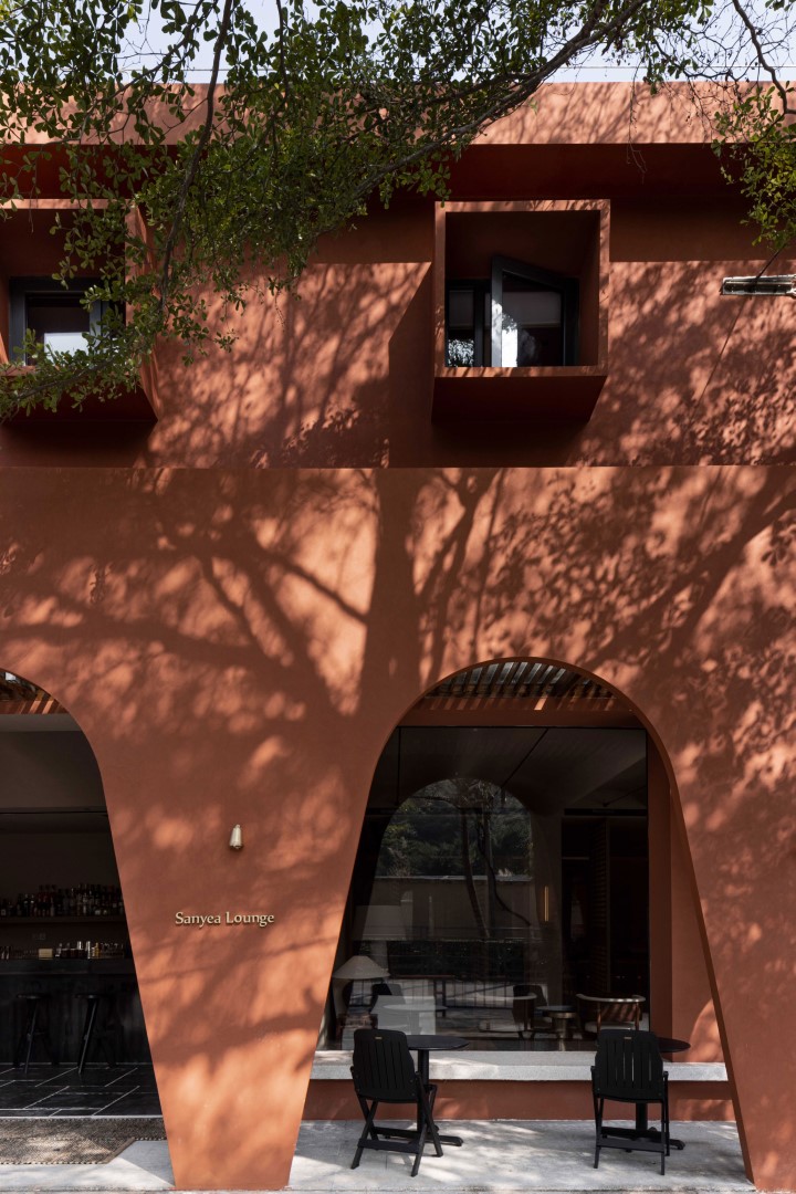
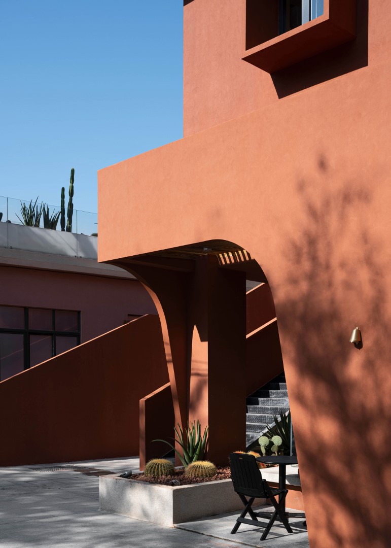
The resort is a two-story building, only a few hundred meters away from the beach. The façade of the resort is a unique red color, which is extracted from the color of the local soil. The design of the windows and walls that extend outwards makes the whole building full of geometric beauty, which is unforgettable.

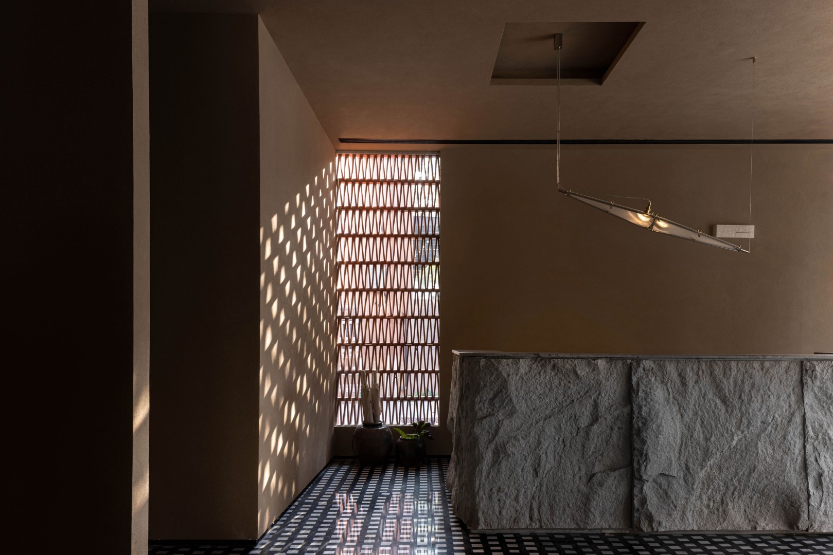
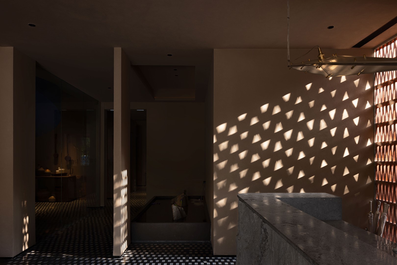
Enter from the door and come to the reception area. The table is a single piece of uncut and unpolished stone, giving it a rough feel. The glass wall beside the table is sandwiched with intertwined and opposite grid bricks, casting a triangular light spot in the sun, as beautiful as the Milky Way.
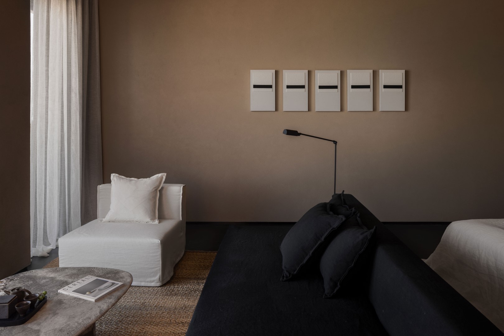
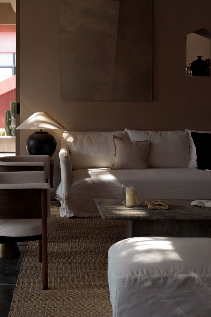
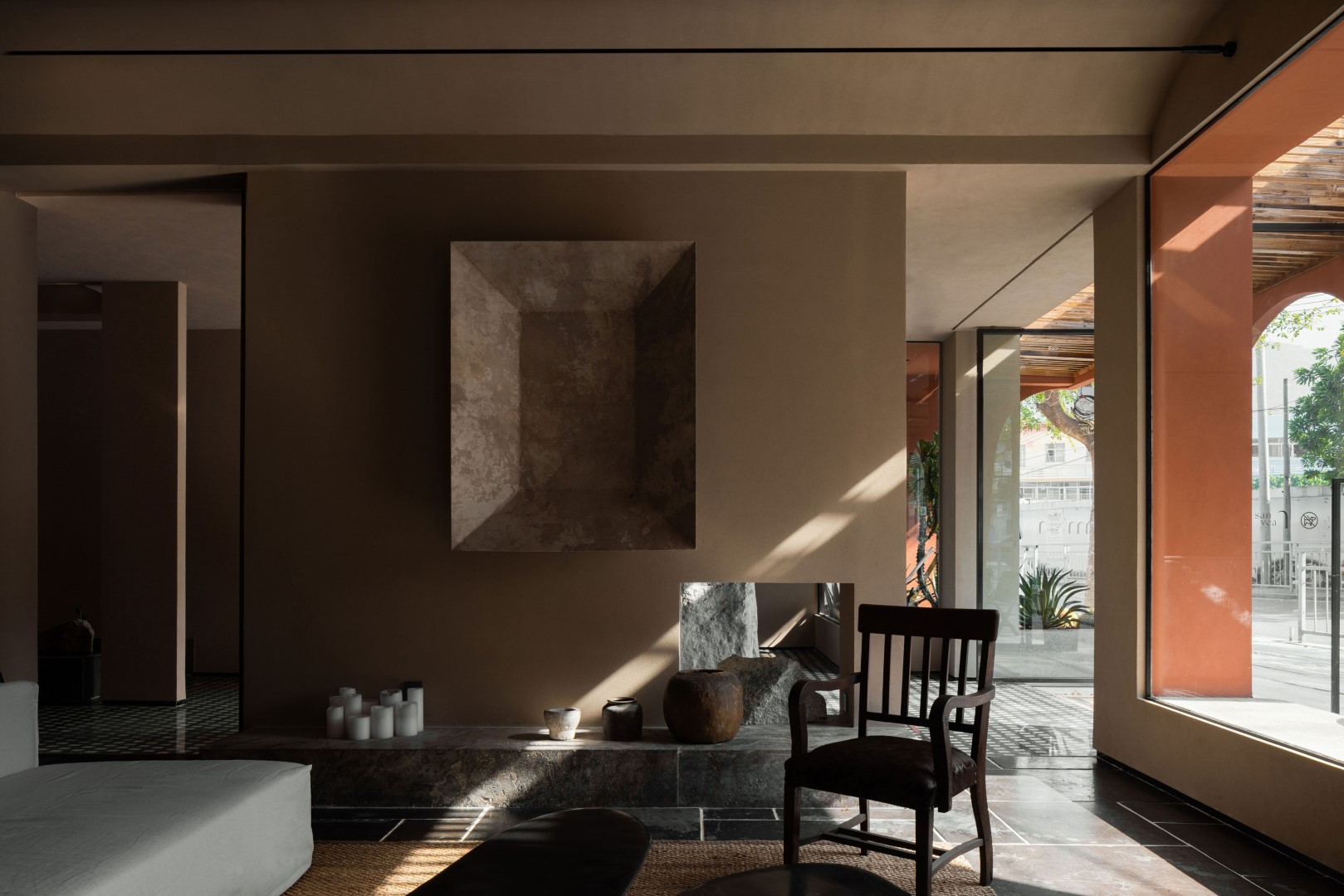
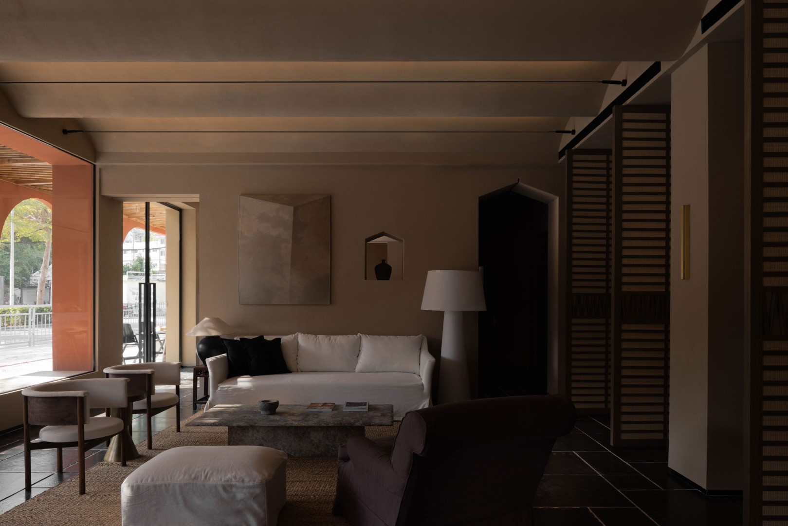
To the left of the reception area is the living room space of the public area. The color system of the entire resort interior is taken from the color of the beach sand. This color makes the whole space more quiet, can soothe people’s emotions, and make people feel the comfortable experience brought by the space design. The wavy lines of the ceiling pay homage to the ocean that nurtured its people, where the curvilinear design brings a dynamic aesthetic.
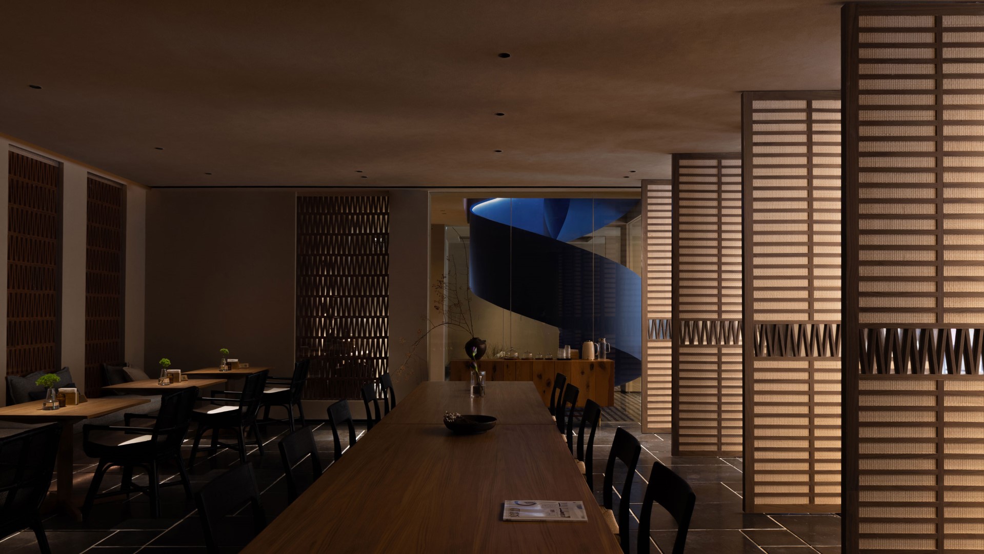
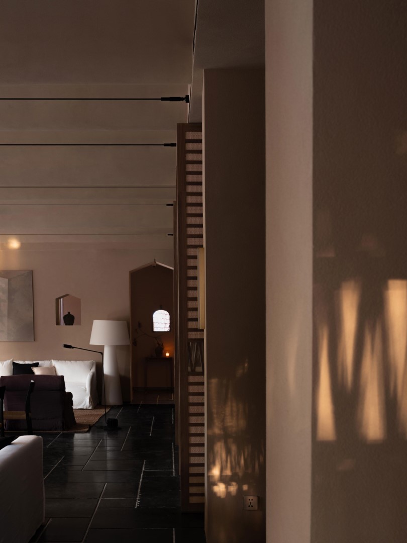
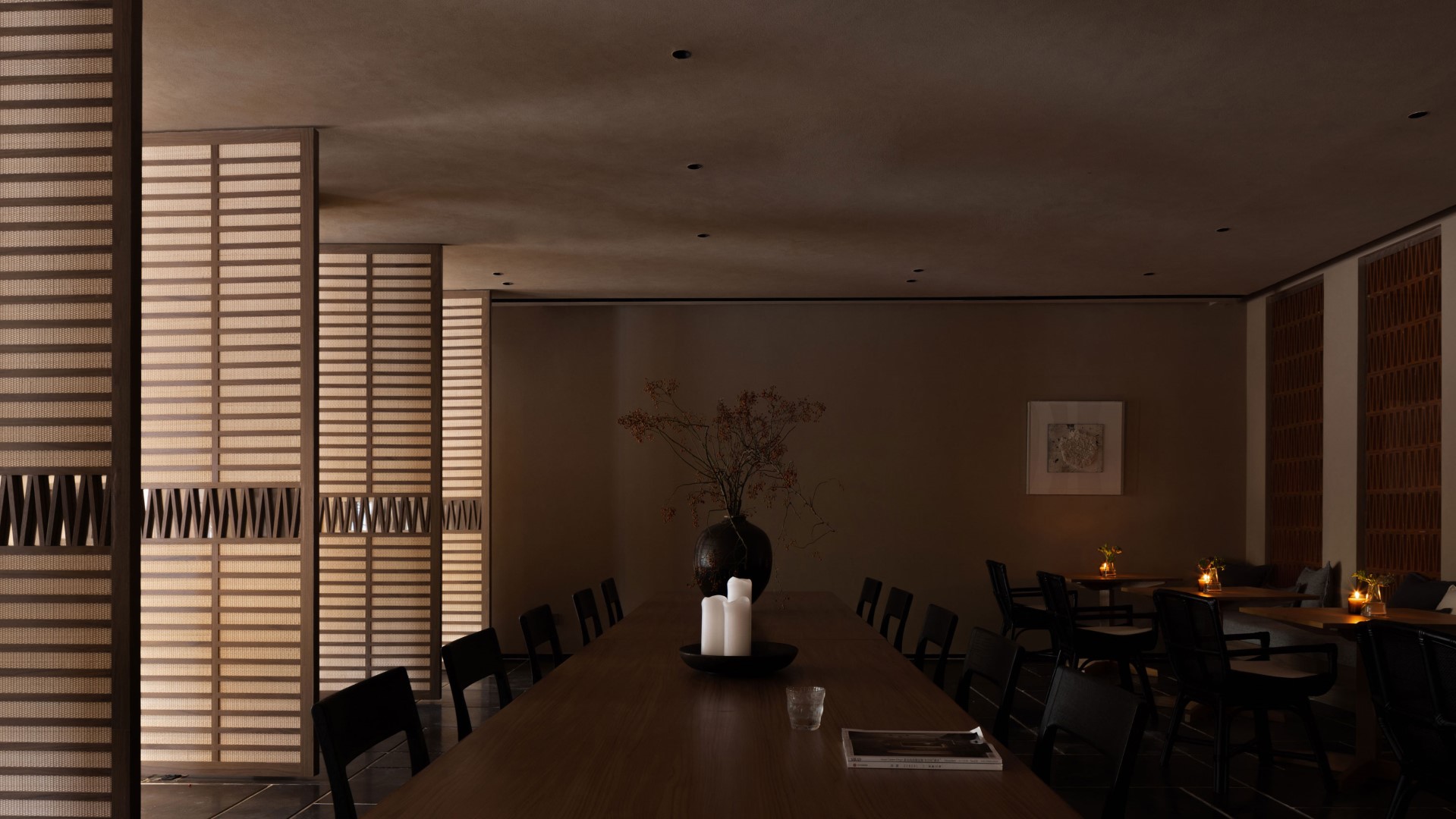
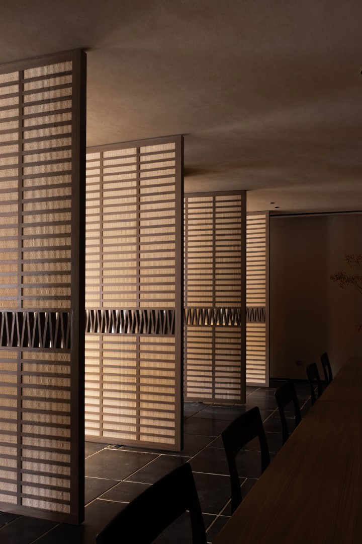
Behind the sofa in the living room is the dining area of the resort, which can also be used as a meeting room or party space. The space is opened through the rotation of the rattan wooden door. According to the needs of the crowd, the interior customized tables and chairs have a variety of permutation and combination options.
The bar stands quietly on one side of the public area, separated by a small door, and is axially symmetrical with the reception area. Arranged linear and spotlights are embedded in the bevels and hollowed surfaces at the ceiling, adding a modern touch here.
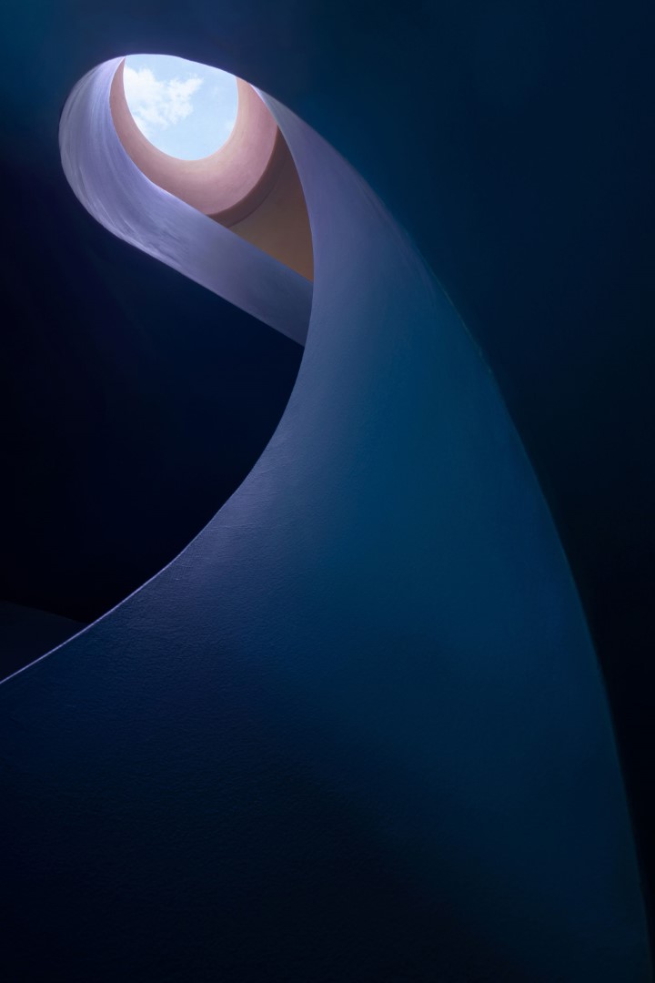
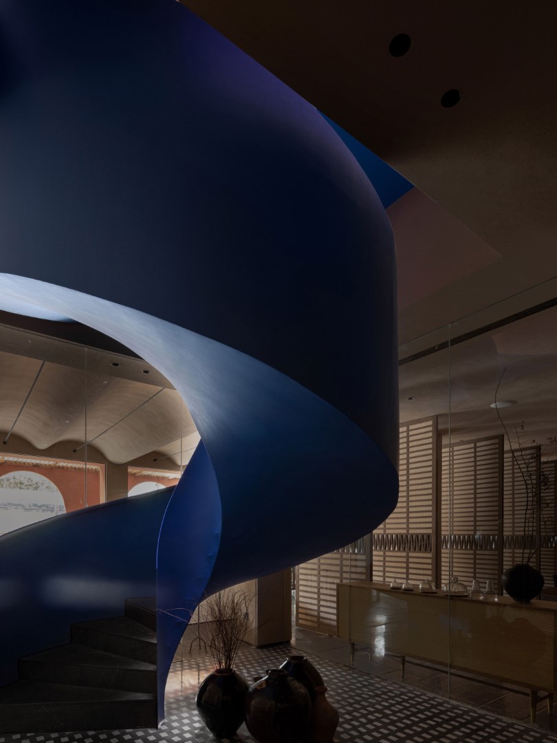
The residential area is separated from the common space by a glass door to ensure the privacy of the guests. The guest rooms are distributed on the upper and lower floors, connected by a Klein blue spiral staircase. A round window is placed on the ceiling of the staircase to bring in the skylight. The stairs are like fish swimming in the deep sea, exuding wonderful vitality and texture under the sunlight coming in through the window.
According to the scenery outside the window, there are two types of resort rooms: ocean view rooms and mountain view rooms.
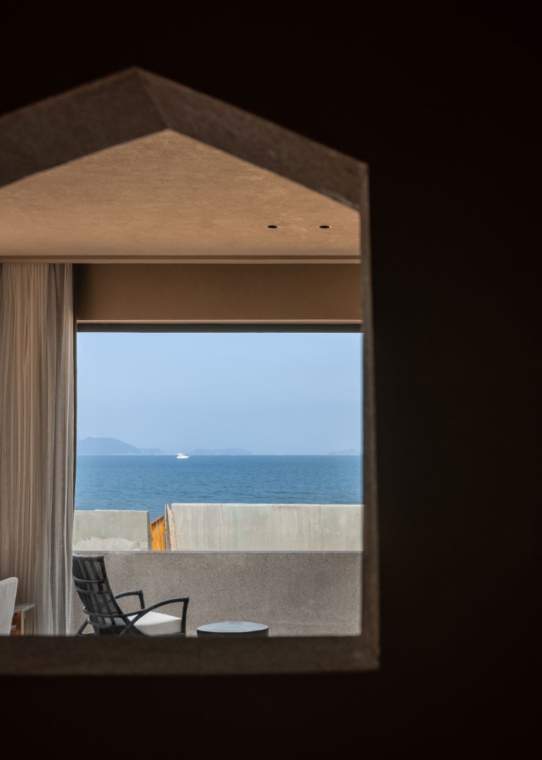
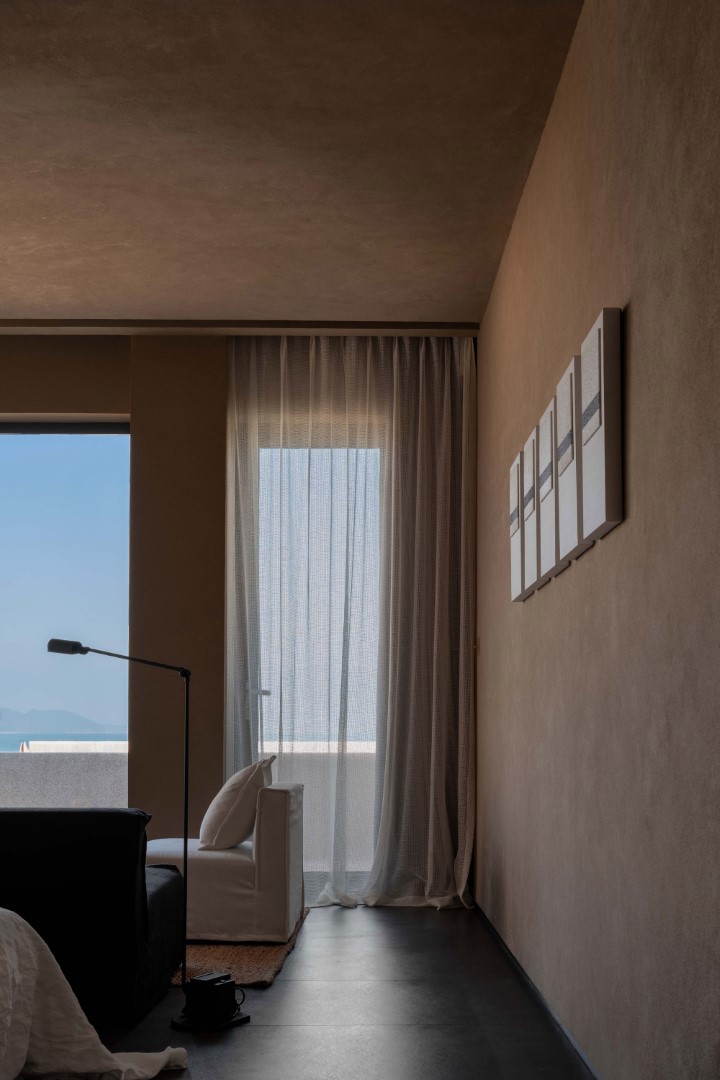
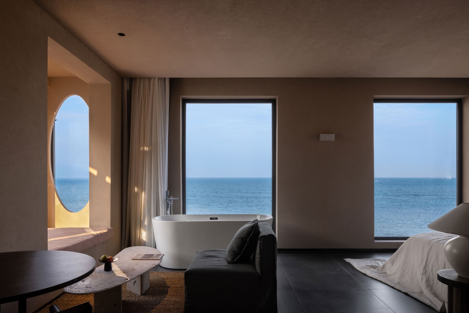
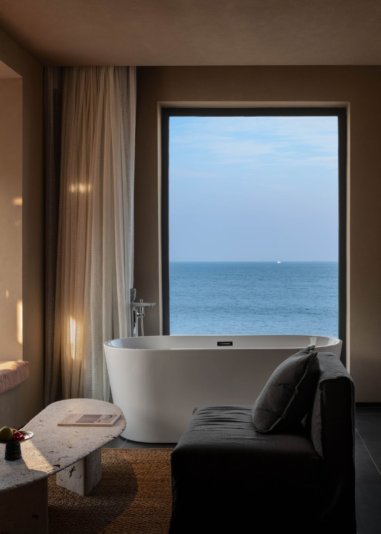
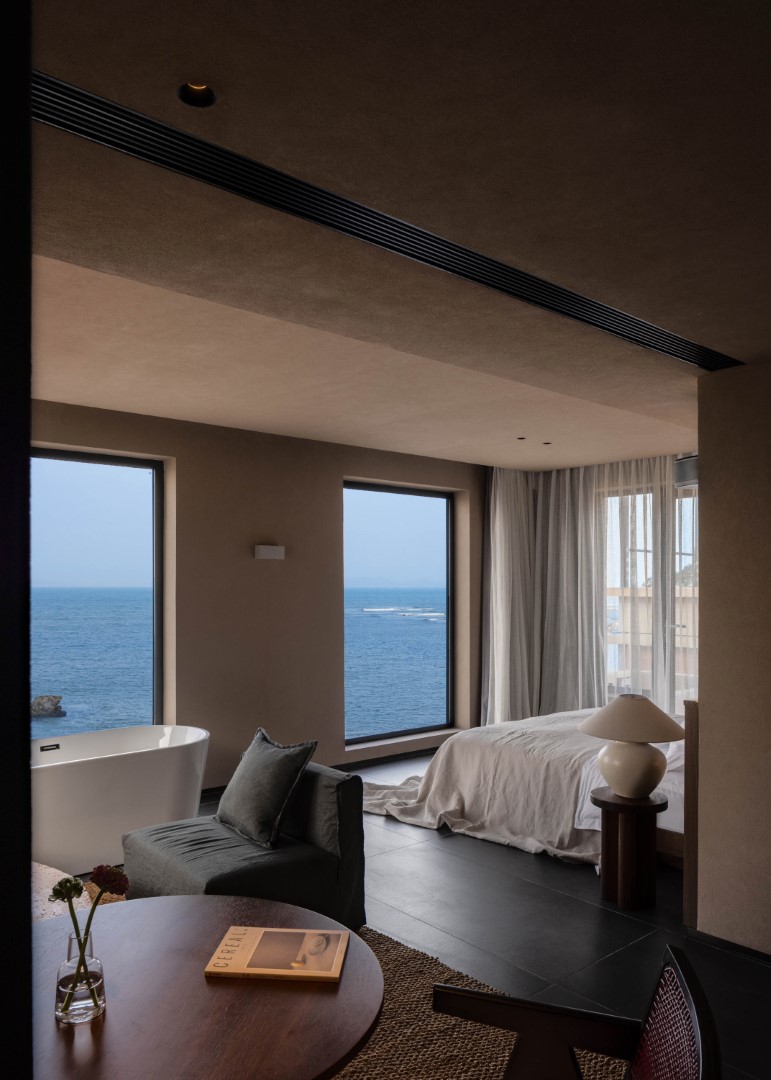
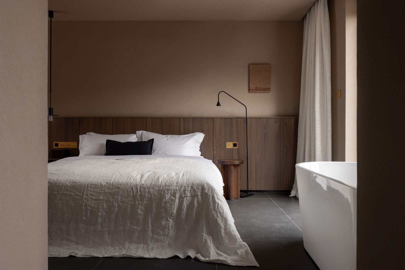
The ocean view room continues the color system of the space, and the soft touch brought by the all-linen fabric is like the caress of the waves. The huge floor-to-ceiling windows eliminate the boundaries of the space, invite the natural scenery in, and integrate with the interior space. At this moment, the room is not only a space carrier for people, but also an exclusive field for the interaction and perception between people and space and nature.
The mountain view room leans against the mountain, giving it a sense of security. In such a space, the large blocks are rather bulky, so the design of leaking window in the traditional garden is used and placed here. It looks like the space is divided, but it is not completely divided. The spatial hierarchy and functional attributes have been enriched and deepened between the virtual and actual transformation of the inner and outer boundaries.
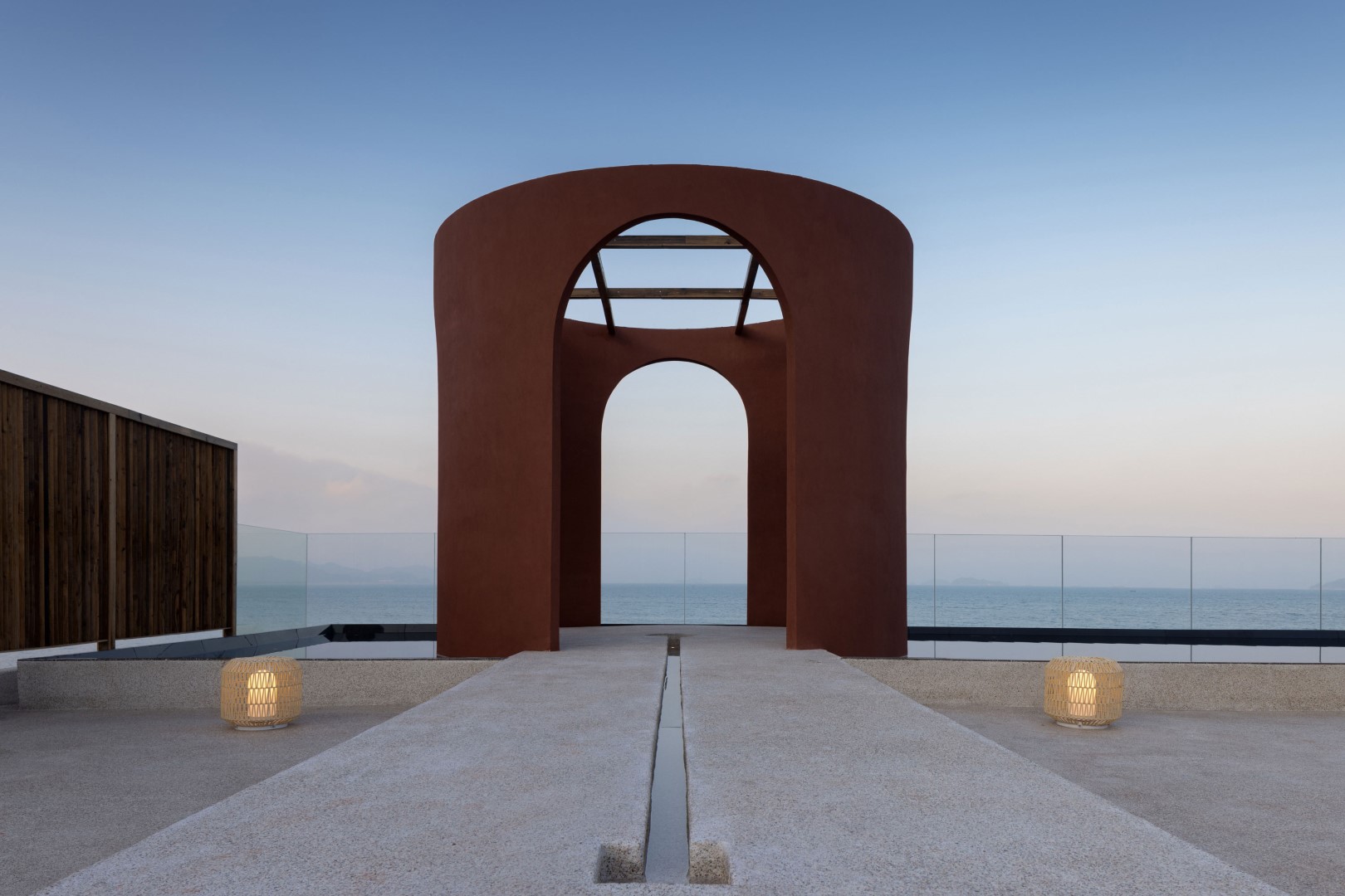
Allowing guests to have a more relaxed and free living experience is the core focus of this design. Therefore, the designer combined the two open-air spaces into one, removed the redundant decorative parts, and gave people more leisure space, leaving only a few woven lanterns dotted here and there, giving a kind of waiting tenderness.
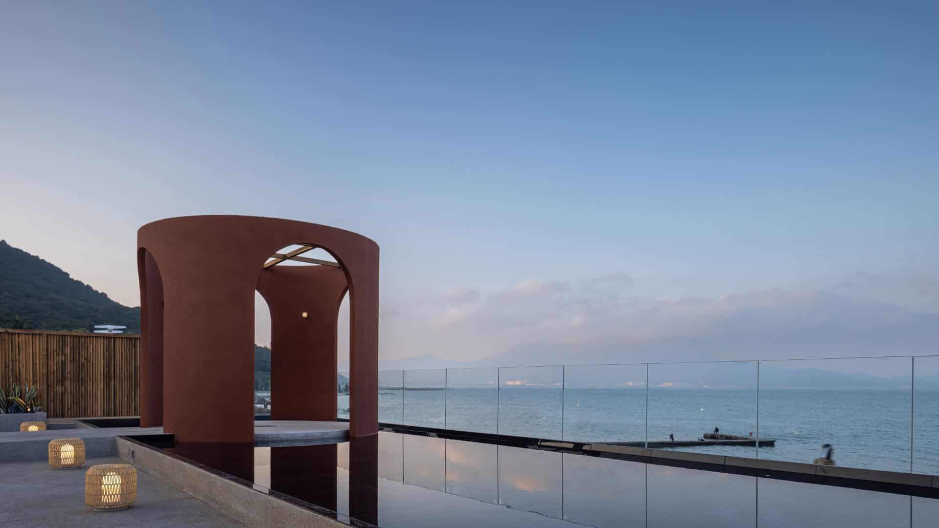
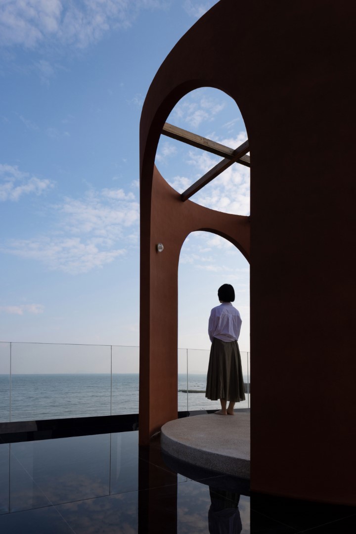
They designed a water installation on the terrace to echo the adjacent sea. The small auditorium stands on the flagstone road of the water feature installation. The water in the center of the slate is gurgling slowly, flowing into the dawn sky.
The design is inspired by an ancient Chinese saying: There is a lot of water, I only take a scoop to drink. It means that there are many wonderful people in the world, but you are the only one in my heart. This is an oath to love and the romance that the auditorium wants to give everyone.
-Project description and images provided by CURRENT-NEWSWIRE
Floor Plan
