Project: Neoclassical Apartment
Architects: Kvadrat Architects Studio
Location: Astana, Kazakhstan
Area: 1,937 sf
Year: 2022
Photographs by: Gleb Kramchaninov
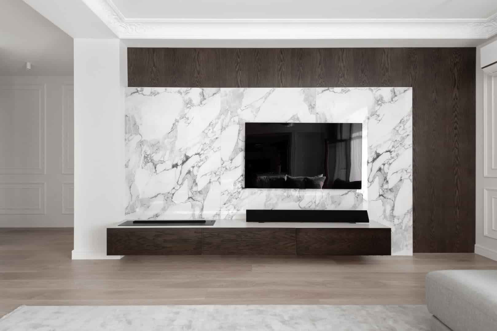
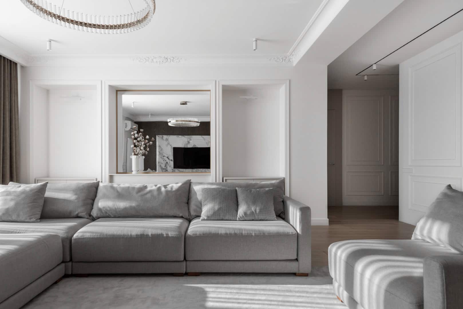
In the capital city of Kazakhstan, a modern apartment with neoclassical touches is located in a residential complex surrounded by the two beautiful parks. The peculiarity of the apartment lies in the architectural approach, in a sense of balance, in love for the combination of natural materials and textures that are reflected in this project.
The owner of the apartment appealed to the interior design studio after she experienced the effect of déjà vu. She saw the interior of her neighbor’s apartment, and it turned out to be a mirror copy of her own: an identical layout, the location, size of the paintings on the walls, and other similar elements.


The fact is that the developer of this business-class residential complex rents out apartments already with a fine finish, furniture, and appliances, therefore, all the solutions are standard. The main task faced by the design studio team was to express the individuality of the owners – a married couple with a child, their desires, worldview, emotions through the interior.
If initially the family was set up for a classic interior, then during the dialogue the vector changed towards a modern interior with neoclassical elements. The elements of ergonomics and geometry of the apartment are completely in the spirit of the time, but the classic elements are easy to read – these are the wishes of the owners.
The layout of the apartment turned out to be successful, therefore the reorganization of the space was done quite gently. Some of the rooms that interfered with the overall concept were removed from the layout and a technical kitchen and internal storage systems were organized instead. The problem of the absence of zones interacting with each other was solved by forming a circular movement in the space of the apartment.


The palette of light shades prevails in the central area of the apartment, in the bedroom and in the owners’ bathroom. In the interior, nature speaks itself in the form of materials, textures and their combinations. The main element of visual zoning is veneered panels in the central space on the walls, and in the office this solution is displayed in the details of the storage structures and on the desktop. Single objects only emphasize the general atmosphere of harmony and balance of the entire space.
Perhaps only the children’s bedroom stands out from the general conceptual range. The clients ten-year-old son prefers niches and hiding places for playing, so a bunk bed with a net and tatami mats was put up for this purpose, and in the wall, is created a niche that is convenient for reading.
-Project description and images provided by Kvadrat Architects Studio
This website uses cookies.