But how is this transmitted in our rooms? Mother Earth comes at a time when we need a solid foundation to celebrate our individuality and creativity. And these tones, which range from brown, red, and green, come to answer this question with tones full of force that do not seek to be the protagonists, but rather to convey serenity.
For this, four different palettes have been created that we can distinguish in expressive colors, trusted colors, timeless colors, and Earth colors. All of them were designed under the social commitment thought for homes in which the home office or the living room can become one of the busiest places in times of Coronovarius.
But, the most important thing is that all of them are colors that generate confidence to create a cozy place. We now go on to know the four shades of Mother Earth that can be combined with a wide range of shades, as well as materials such as wood or marble.
Palette 1: Expressive Colors


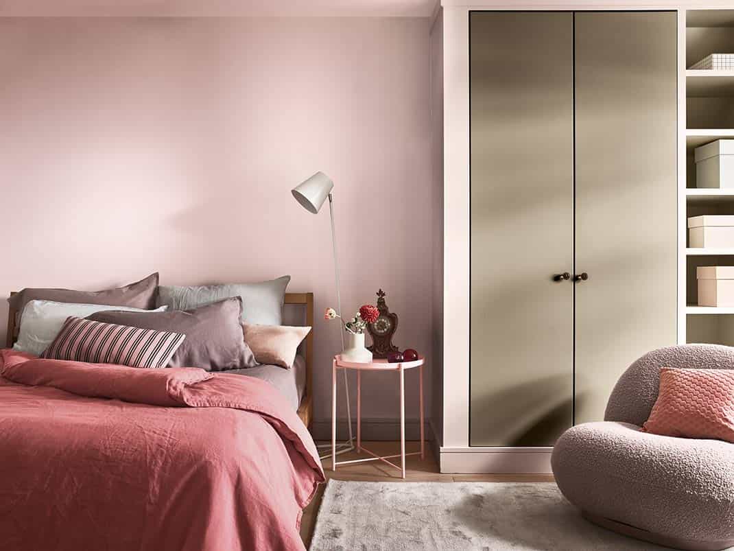
This palette is a subtle combination of reddish hues, inspired by encouraging people to show their best version and increase their creativity. But how do we bring it to our homes? According to interior designer Anna Figueras, these shades, which range from softer to more intense, can help us create an empowering space in which to develop our imagination.
Due to the versatility of these pink and pastel colors, we can combine them with many materials such as marble or wood, as they fit perfectly.
Palette 2: Trusted Colors
This palette has been designed to convey a sense of support and balance that encourages us to team up to create extraordinary things. It is a trend based on social solidarity, on the value of connecting, and on social movements.
They are colors that evoke the earth, the ground. A combination of colors between gray and brown, warm and neutral, creates a balance in those rooms where we apply them. It is ideal to move to the home office, as it gives a cozy comfort effect. In short, tones that can be applied anywhere in the house, that build trust and that give us the courage to communicate and collaborate.
Palette 3: Timeless Colors
A palette that reminds us of the importance of valuing the past to create a bright future, through inspiring tones and, which has been created under the motto of “revaluing the past”, looking back to move forward. When we need a space that tells our own story, the answer is in timeless colors; in those who challenge us to draw the best of the past to build a brighter future, a space in constant evolution.
This color is made up of ocher and yellow that “represent both the past and the future, analog and digital,” explains Anna Figueras. A way to combine elements from around the world with other trends, thus creating a modern space in an old house. The result is a more spacious and welcoming space with these warm and timeless tones that add weight and balance to the room.
Palette 4: Earth Colors
Last but not least, we have this color palette that alludes to our connection with the world around us, the resilience of nature, and the need to protect it. It is the color that connects us with ecological awareness and with the importance of creating responsible spaces where we can promote change towards a better future.
The colors that have been used in this palette are, above all, those related to the earth; green, blue, gray, brown … representing the sea and the land. A set of colors that can be combined with other natural elements such as plants. It also highlights its versatility as it can be combined with wood or more contrasted tones that will give it a touch of strength.
