Project: Diyarbakir Public and Children’s Library
Architects: Studio Vertebra
Location: Diyarbakir, Turkey
Area: 92,354 sf
Photographs by: Courtesy of Studio Vertebra
Studio Vertebra have submitted one of their latest projects – the Diyarbakir Public and Children’s Library in one of southeastern Turkey’s largest cities – Diyarbakir. The design behind this project aims to update the architecture of the city, adding a breath of fresh air but with its roots still inspired by the traditional urban architecture.
The project is based on a relationship between the streets and a courtyard in between, or more accurately, a public library and a children’s library displaced by a central courtyard that serves as a common activity area as well as a bridge between the two buildings.


Designed by Studio Vertebra, Diyarbakir Public and Children’s Library gives a new breath to the architecture of the city with its design inspired by traditional references of urban architecture in the new settlement area of Diyarbakir.
The Diyarbakir Public and Children’s library, which is located in the new settlement area of the city and designed by Studio Vertebra, an Istanbul-based design office in partnership with Chief Architect Gencer Yalçın, Master Architect Dilşad Öktem Aslaner, Master Architect Bahar Yücel and Interior Architect Efe Kağan Hızar; which has been carrying out multidisciplinary works in the fields of architecture, interior architecture and restoration on a national and international scale since its foundation, in Diyarbakir shows its difference in design with the inspiration it takes from the traditional references of urban architecture.
Courtyard Effect in Library Design
In the design of the Diyarbakir Public and Children’s Library, it was inspired by the progressive structure of the city’s Suriçi region, derived from the street-courtyard relationship and the use of housetops. The design was made up of two main programs, the public library and the children’s library, which are located around the courtyard in the middle of the building. The courtyard in design serves as a common activity area for these two buildings, as well as an axis that connects the two main entrances. At the same time, this courtyard was designed as a central garden with a fountain and a tree, based on the city’s traditional references.
By moving the building plot of Diyarbakir Public and Children’s Library to the border of the plot, there were gaps between the garden wall and the building, and these gaps were put to good use as children’s playgrounds in accordance with the purpose of the library. The resulting land from this retreat has been turned into a recreational space with quiet gardens, which isolates the noise of the public place in the public library, and the working area for the library.
In the project, where the progressive structure derived from street-courtyard relation and use of housetops is applied, mass differentiation was created on the floors above the ground, and shaded areas were created in courtyards and gardens while the second floor was used as a terrace area.
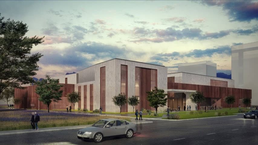
The two main materials used in the building shell emphasize the mass effect; especially corten steel material preferred on the outer wall was designed as a “smart membrane”, which is reminiscent of the “Suriçi” area due to its texture and the feeling it creates, also becomes transparent in some places in order not to interrupt the visual relation while surrounding the structure. Corten steel material, thanks to the canopy areas it creates, allows comfortable outdoor spaces in the building.
According to the approach scenario, the main entrances of the Diyarbakir Public and Children’s Library have been built in such a way as to create a draw from the shell to the center. When viewed from the outside, the shell acts as a transparent base for the progressive structure behind it, and an integrative cover that holds two main spaces, the courtyard and the inner gardens together.
Another material used in the building is the natural stone, which is frequently used in the traditional architecture of Diyarbakir, as one of the main materials of the design, for reasons such as its widespread use and the proximity to the source. Accordingly, while natural stone was predominantly preferred in the main masses, corten steel material was preferred in the shell surrounding the facade.
This website uses cookies.