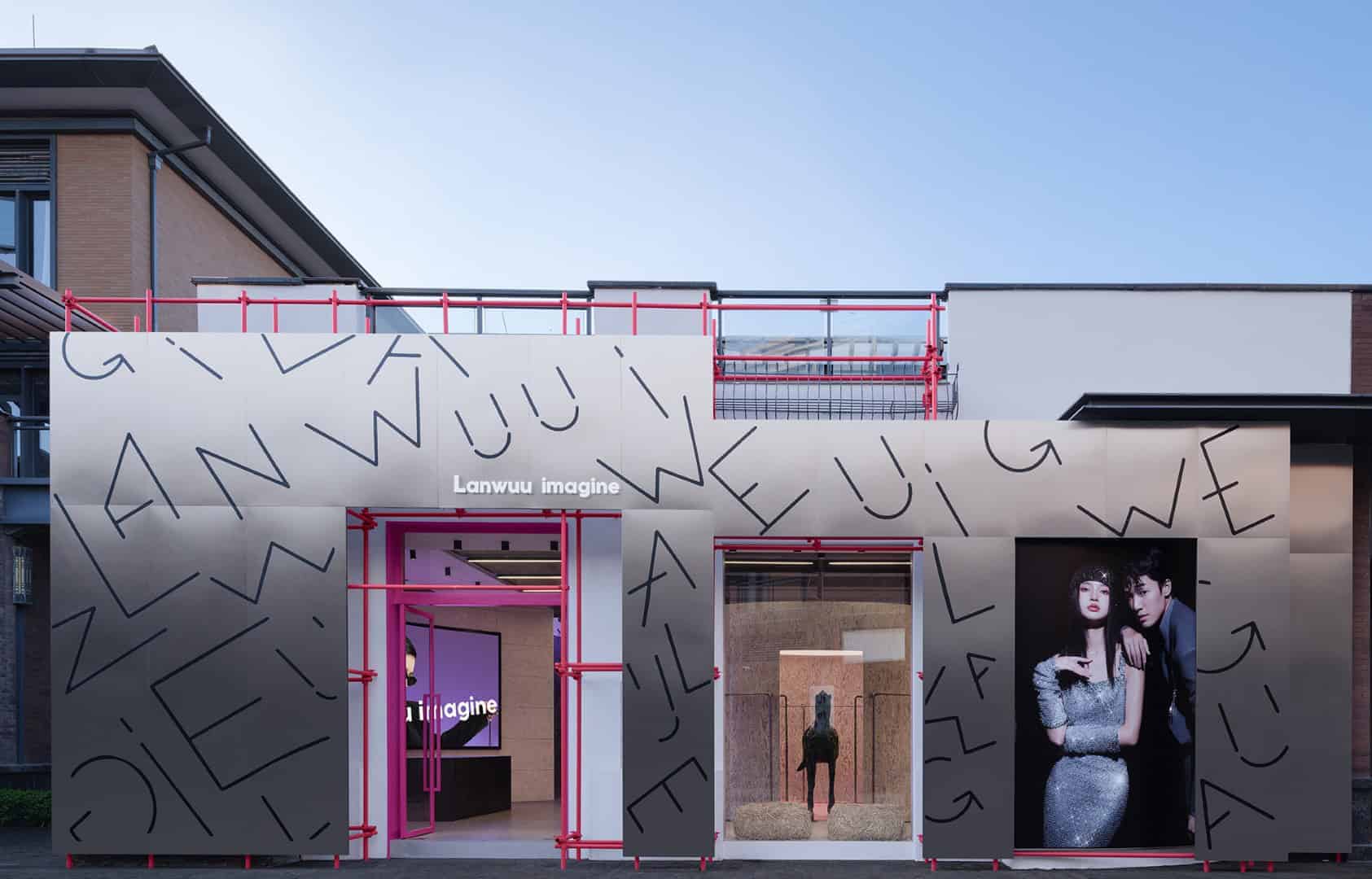
- Project: LANWUU IMAGINE
- Architect: Aurora Design
- Location: China, Kunming, Yunnan Province
- Year: 2023
- Area: 400 m2
- Photography: INSPACE
LANWUU IMAGINE, designed by Aurora Design in Kunming, is a photography studio that reinterprets space through the lens of memory, beauty, and time. Covering 4,305 square feet, the studio provides an immersive environment for wedding photography, portrait sessions, and ceremonial coverage, while embodying the brand’s philosophy of capturing fleeting yet timeless moments.
Design Concept: “Time·Unfinished”
The guiding idea of the project is “unfinished”—a poetic reflection on the tension between the fleeting present and the unknown future. Aurora Design translated this concept into a space that blends construction-site aesthetics with polished sophistication. Exposed scaffolding, stainless steel, and raw concrete coexist with soft fabrics, wood, and warm tones, expressing beauty as something that evolves through imperfection and incompletion.
Visitors entering the space encounter a play of contrasts: cool metallic sheens alongside vibrant pink accents, shadows offset by cascading fabric curtains. This deliberate ambiguity creates curiosity, inviting people to explore an environment where time, memory, and atmosphere overlap.
Spatial Organization and Flow
The studio is arranged around a central core that preserves traces of the site’s original structure. Functional zones unfold sequentially:
-
Reception & Exhibition: Defined by rotating cylindrical forms and semi-enclosed structures, the entrance creates fluid circulation and emotional resonance.
-
Showroom: A circular focal point at the main entry serves as an experiential center, where dynamic forms guide both the eye and the body.
-
Chat Zone / Café Bar: Designed as an informal social hub, this area blends hospitality with commercial space. A coffee aroma enhances the sensory journey, while irregular layouts encourage casual interaction.
-
Dressing & Makeup Rooms: Inspired by Japanese interiors, wooden partitions enclose private areas with simplicity and comfort.
-
Photography Areas: Metal staircases and sliding doors define transitions between leisure and workspaces, echoing the duality of reflection and strength.
Materiality and Color Palette
Aurora Design curated a rich material mix: stainless steel, concrete gray, natural wood, marble, and fabric. This palette creates a balance of futuristic boldness and tactile warmth. White exterior walls, punctuated with round windows resembling camera lenses, frame the interior like photographs in real time.
The color scheme transitions from white and beige to deep metallic grays, mirroring the emotional journey of the brand—moving from clarity and lightness toward depth and contemplation. Graffiti accents and reflective surfaces further inject layers of youthful energy and artistic expression.
Brand Integration: Capture·Beauty
LANWUU IMAGINE’s design philosophy extends beyond function. The entire space becomes a metaphor for capturing beauty in everyday life—whether in a bride’s fleeting smile, the warmth of a chat over coffee, or the reflection of light on polished steel. The circular lens-like windows, flowing fabrics, and fragmented scenes act as visual cues of photography itself: framing, preserving, and reimagining the ordinary.
By blending dynamic architectural gestures with emotional atmospheres, Aurora Design allows visitors to experience beauty as a narrative—one that unfolds as they move through the studio.
LANWUU IMAGINE stands as more than a photography studio—it is a living canvas of unfinished poetry, designed to embrace the fluidity of time, memory, and creativity. Aurora Design’s approach bridges bold material contrasts with soft human emotions, offering a spatial journey that mirrors the very essence of photography: capturing fleeting moments and preserving them as timeless experiences.