Project: ido & Friends Café
Architects: Aurora Design
Location: Kunming, Yunnan, China
Area: 753 sf
Year: 2023
Photographs by: INSPACE
ido & Friends Café by Aurora Design
The late 19th to mid-20th century saw the rise of the modernist wave in Europe. From urban streets to rural hamlets, from coastal islands to private homes and public cafes, well-known artistic hubs and meeting places ignited the creativity of countless artists. ‘Open’ and ‘friendly’ were the key features of European coffeehouses during that time.
In 1919, Walter Gropius initiated the “Bauhaus Manifesto,” declaring the abolishment of distinctions between craftsmen and artists, erasing the boundaries of disciplines, and envisioning and creating the future of architecture with an open and integrated approach.
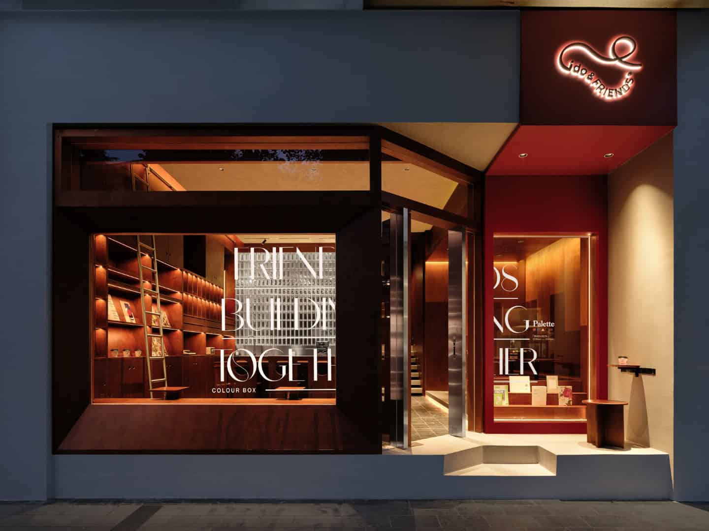
In 2023, ido&Friends Café emerged on the streets of Kunming, Yunnan. Just like its brand name, “ido&Friends,” the brand’s owner envisions this space to be more than just a café with diverse coffee offerings from different origins and flavors. It’s also intended to be a meeting place where people from various fields can gather, chat, and engage in conversations. This open and inclusive brand philosophy is reminiscent of the ideals of modernism, much like the Bauhaus movement.

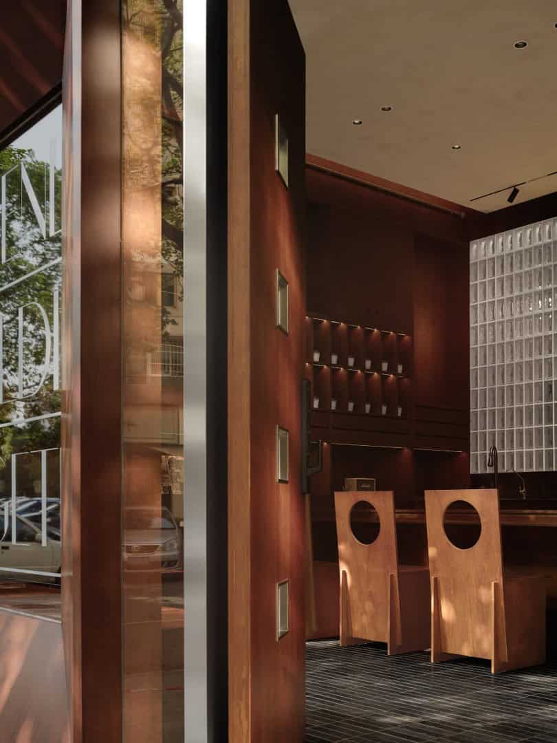
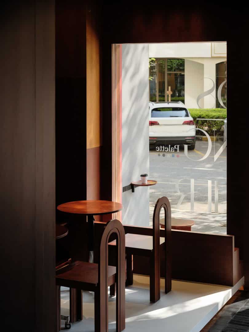
The open and inclusive attitude is evident from the exterior design of the building. The glass façade connects the street to the interior space, and the recessed side doors create a corner space. This corner space can serve as an outdoor coffee seating area and a resting spot for passersby.
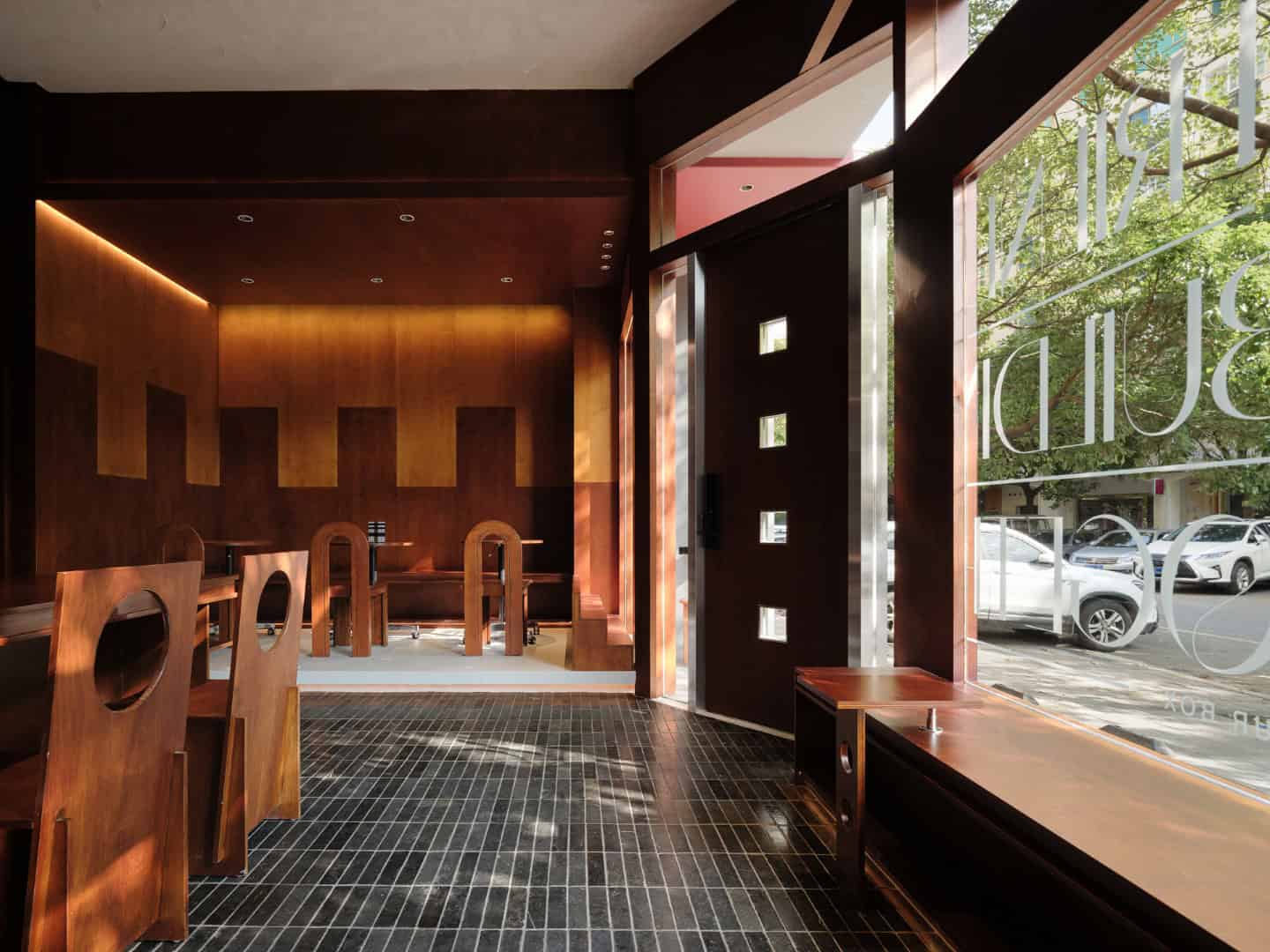
Low wooden bench are arranged along the glass wall, providing seating for multiple individuals. This arrangement along the glass wall leaves ample space for a walkway. The customized coffee tables serves as contrasting elements to the bench, with hollow circular patterns on the tables echoing the chairs across from them. At the same time, they adds a touch of vertical variation to the bench.
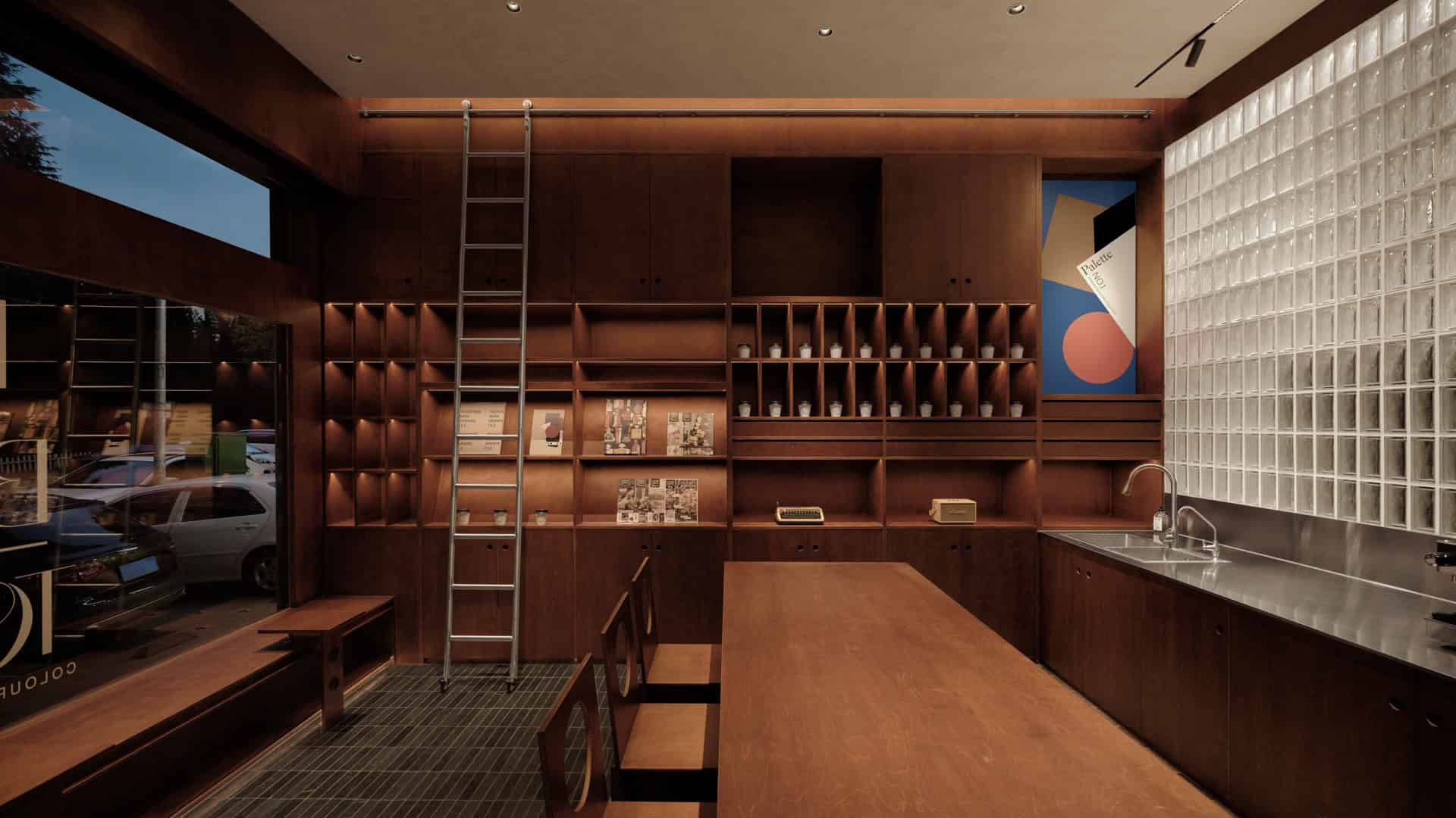
On one side of the space, there is a display cabinet made from the same type of wood. It’s a three-tiered wooden display case that can hold various items such as coffee cups, magazines, and audio equipment. The metal sliding mechanism makes it easy and convenient for both customers and baristas to retrieve items.
The books and magazines placed on the cabinet create a tranquil corner for visitors, offering a mental retreat within the coffee-scented space. Here, one can discover a good book and escape into another beautiful world.
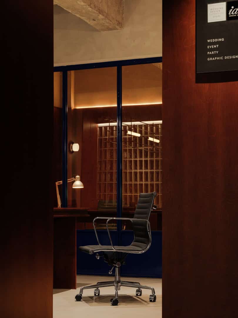
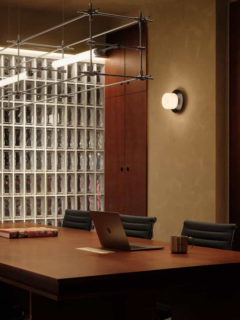
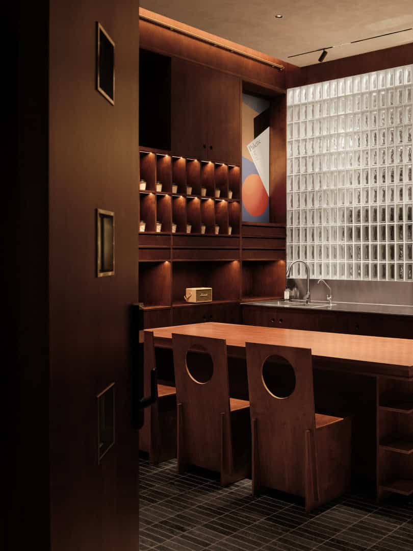
The glass brick wall gently divides the space. On the outer side, there’s an area for guests to savor specialty coffee, while on the inner side, there’s a workspace for digital nomads. The designer’s intention is for people to not only enjoy delicious coffee at ido&Friends but also embark on a creative journey together, inspiring countless individuals through friendly interactions.
In addition to the horizontal glass brick wall for functional zoning, the designer also elevated the entire office space vertically as a method of dividing the areas.
The combination of stone steps and the glass brick wall delineates a relatively private office space while remaining open to visiting guests. The minimalist linear desk lamp provides uniform lighting that is both calm and warm. The horizontal and vertical pipelines, along with bookshelves and glass bricks, create a visual harmony in the space.
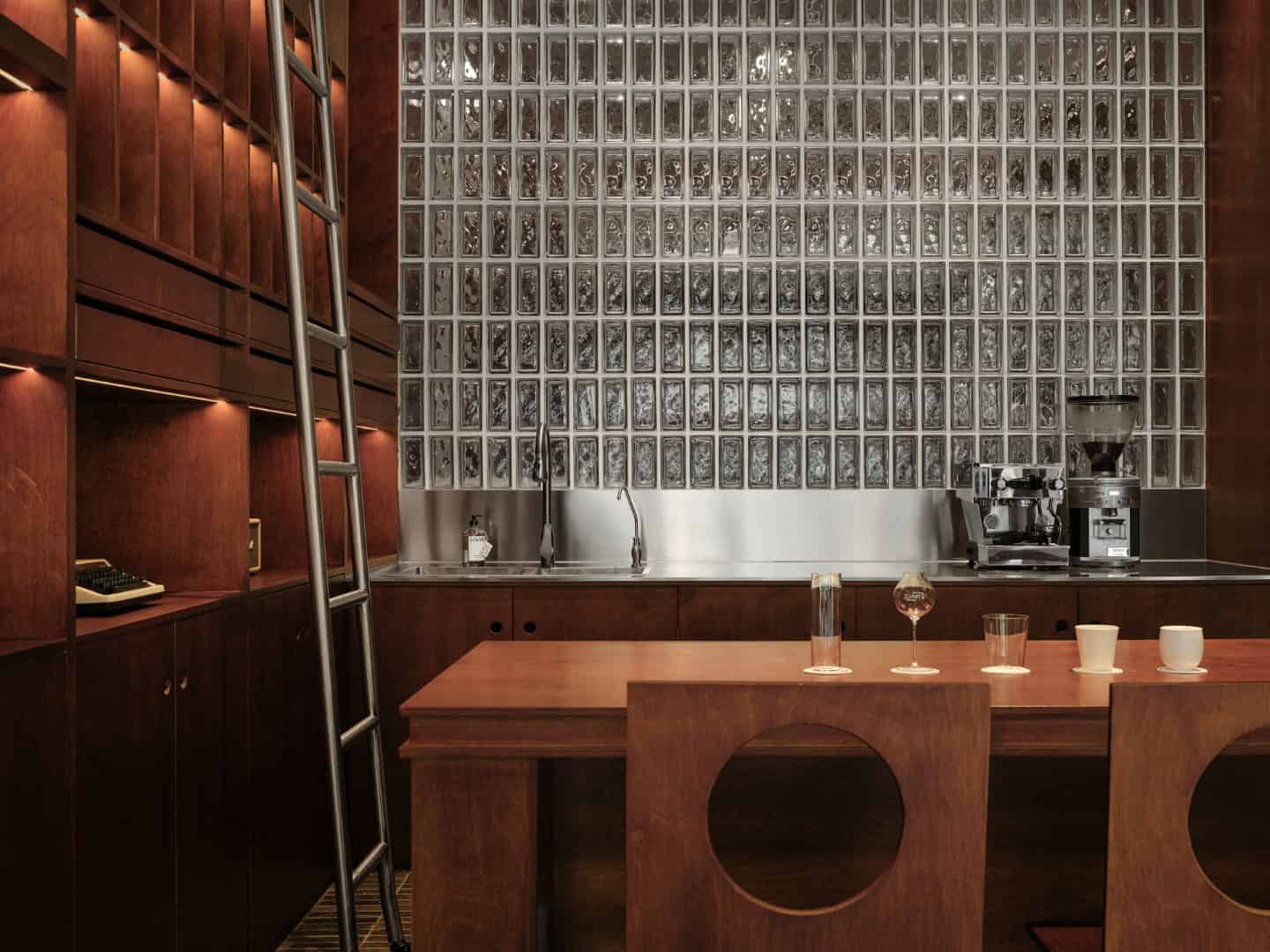
Adjacent to the glass brick wall, there is a closed cabinet surface that serves as storage for everyday items. Another part features an open bookshelf, with a simple frame that can accommodate various materials. It can hold daily office documents and also serve as a printing and copying station.
In addition to incorporating multifunctional spaces, the designer also aimed to embody the Bauhaus spirit in design techniques and styles, fostering collaboration across different fields.
The color scheme of the space is intentionally limited, primarily featuring neutral colors such as coffee, black, and white. This choice of colors reflects the principles of simplicity and geometry while emphasizing the purity of color.
The varying shades of coffee-colored wooden boards interlock with each other, akin to the emphasis on flat surfaces in Bauhaus design. The self-designed chairs draw inspiration from the letter “A” in the Bauhaus font, featuring distinct geometric shapes that highlight geometric composition and form.
Selecting a leisurely afternoon, within the sun-kissed ambiance of the café, indulging in sipping coffee and daydreaming, or working quietly, offers a passage for your thoughts to traverse back to the mid-20th century. You can transport yourself to cities like Paris, Venice, and Barcelona, where artists congregated, engaged in lively debates, and delved into each other’s works, all while contemplating the world both near and far.
-Project description and images provided by ZZ Media PR

