
Orange is the color of good humor and high spirits. This is a color full of meanings and a color that deserves a little space in any decor. That’s why we brought in today’s post tips and ideas for you to take the most varied shades of orange to your home and make this color your inspiration.


You need to know what the style of your environment will be before choosing which shades of orange to use.
The different shades of color suggest different aesthetics. Those who want a modern and youthful decoration, for example, can bet without fear on the open and more reddish tones of orange.
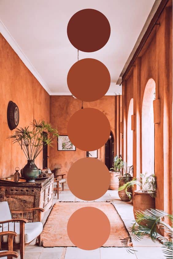
Those who prefer a decoration with a rustic touch can venture into earthy orange tones. A modern and elegant decoration, in turn, looks beautiful with shades of orange with a grayish background, darker and closed.
Depending on where you are going to use the color orange, you also need to pay attention to the shades. Rest and relaxation environments, such as bedrooms, should prioritize earthy and more closed orange tones, or even pastel tones. Social environments, on the other hand, can experience more vibrant shades of orange without the slightest problem, as well as outdoor areas.
Orange is an energetic color full of vitality, which is why many people end up choosing to use the color only at strategic points in the decor. This means coloring just a few details in color rather than using it to cover large surfaces.
But this is not a rule. You can apply orange to larger areas. Everything will depend on your decoration proposal. If you choose to stay in the details, a good way to do this is to bet on orange chairs, lamps, pillows, decorations in general, and even a washcloth or dish towel.
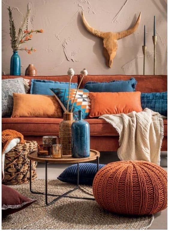
Unless you want a monochromatic decor, orange will probably share space with other colors. And here is the cat jump. Combining colors according to the desired aesthetic proposal is the big secret to incredible decor. If you want cheerful and lively environments, combine orange with complementary colors, such as blue or purple.
For a more sober, but still original and creative environment, the tip is to bet on similar colors which, in this case, are yellow and red. But if you prefer more sober, neutral, and clean environments, combine orange with white, gray, or woody tones.
Black, despite being a neutral color, is only an option if your goal is to create a bold and extravagant space.
This website uses cookies.