Project: House WADD
Architects: BASIL architecture
Location: Belgium
Area: 1,614 sf
Year: 2022
Photographs by: Johnny Umans
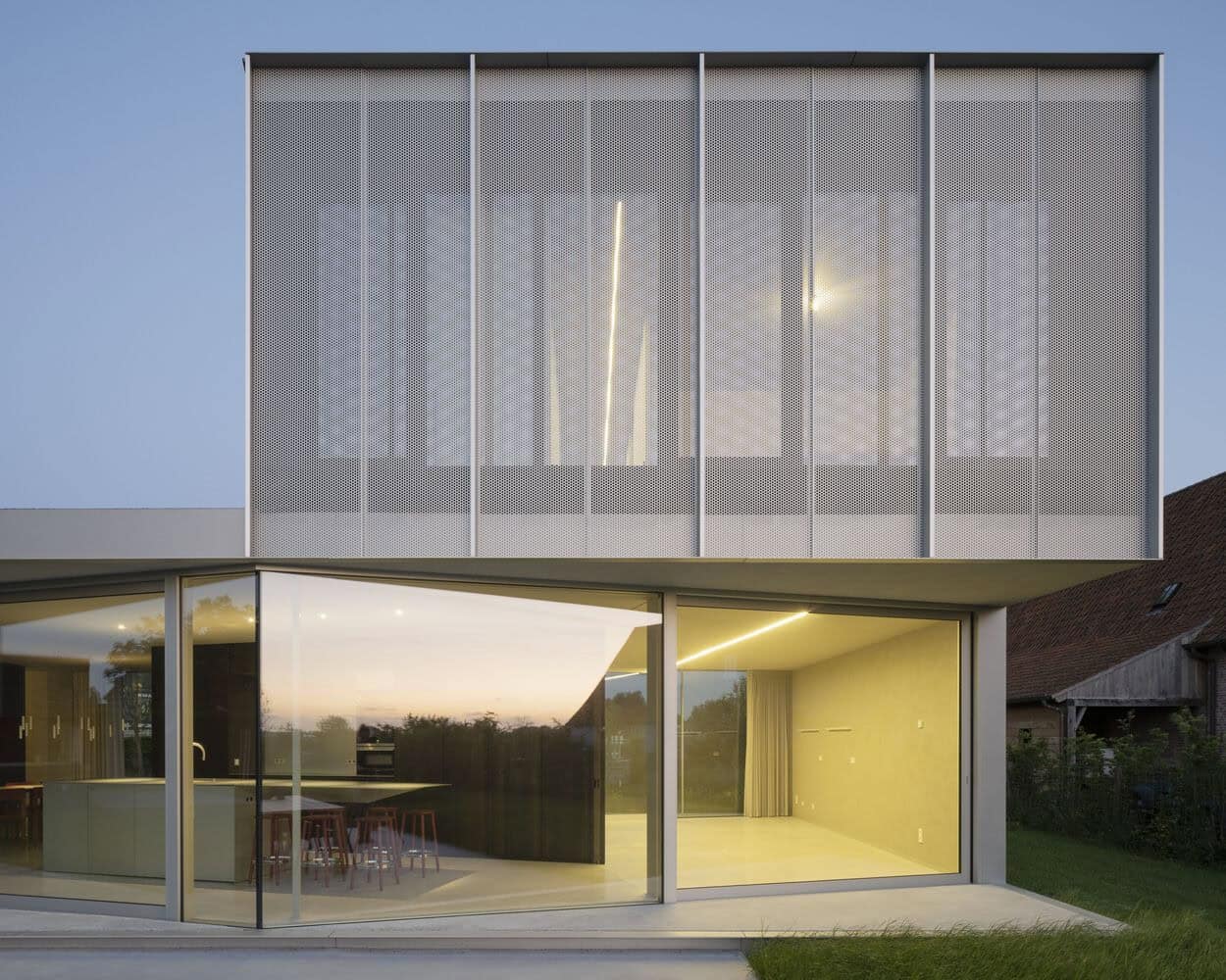
House WADD, an extension project by BASIL architecture in Belgium, creates a pavilion-like addition to the existing house. The dark rooms of the original house are repurposed, while the new extension features light-filled living spaces that integrate with the surrounding garden. The design aims to evoke a holiday atmosphere and meets the family’s need for extra space, including a multipurpose room, additional bedrooms, and a bathroom. The extension’s architectural language incorporates canopies, pleated facades, and cantilevered volumes, providing shading, indoor-outdoor flow, and privacy. Anodized aluminum is used for the façade, offering a contemporary touch that harmonizes with the existing house.


The extension for this house located in the countryside of Aalter (Flanders) was conceived as a pavilion, connected as an appendix to the existing house. The very dark and closed rooms of the existing house are reduced to secondary functions such as storage rooms, TV corner, and home office. The living spaces in the new section are developed in contrast to the existing house as very light-rich spaces, nestled in the green character of the surrounding garden and vast landscape. The fragile appearance of the extension should underscore the pavilion feel, splitting the walkways into an indoor and outdoor course created by airy canopies acting as sunshades and covered terrace areas. Resulting in the Holiday feeling envisioned by the client.
By way of investment, the client, a family of 5, had purchased the adjacent lot, with the idea of creating an expansion volume on it that would accommodate the family’s growing need for extra space, but which could just as easily later be separated again from the existing home, as an independent entity. The client also had an explicit desire to create a home with a high Holiday appeal. The lack of daylight and views of the landscape environment in the existing house was the driving force to create a volume as a kind of appendix to the main volume, and with maximum interaction with the garden. The new volume had to meet the need for a more spacious and airy living space, a multipurpose room for hobbies, 2 additional bedrooms, and a bathroom. Preferably also a place for the youngest son’s noisy drums.
As this was a separate building plot, the planning regulations were quite flexible, just the prescribed building depths and heights had to be respected. The biggest challenge was to get an agreement to realize an attached volume. The main structure consists of a few concrete slabs on which the zigzag plan is projected. The interaction between incisions and cantilevers ensures that the building’s stability is technically balanced. A secondary visible aluminum structure supplemented by perforated panels was employed for the façade finish. Natural-colored anodized aluminum is not only used for the facade finish and secondary structure but is also continued in the exterior joinery and interior, including the kitchen island. The sober aluminum gray color palette is continued in the concrete flooring, as well as on the textured wall and ceiling finishes. Warm accents are created by the core-smoked eucalyptus-finished furniture volumes of the sitting area and kitchen.
The greatest challenge was to create a new volumetry that creates a fascinating field of tension with the existing classical house appearance. Especially since the existing house, which had already been renovated in the past, is a collection of various architectural styles and formal languages. Another challenge was to find a new neutral, yet contemporary radiating materialization for the expansion pavilion. From there, the concept was formed to conceive the extension as a transparent pavilion, put in maximum dialogue with the surrounding garden. As an appendix to the existing house. The zigzag shape in the ground plan forms a kind of parody of the multitude of shapes and styles of the main volume. The used materialization in anodized aluminum was chosen as a kind of neutral contemporary answer which dialogues with the many materials of the classical house volume.
The architectural formal language of canopies, pleated facades, and cantilevered volumes attempts to provide a natural response to aspects of shading, indoor-outdoor space, and privacy, without the need for additional external additions. A functional building envelope and volumetrics.
This website uses cookies.