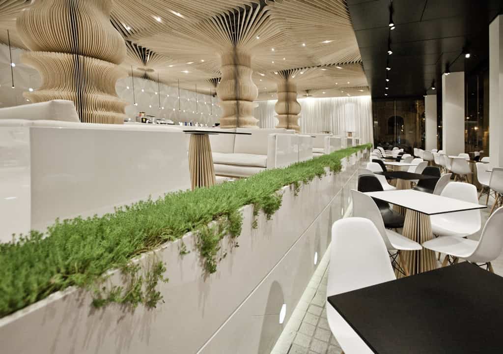
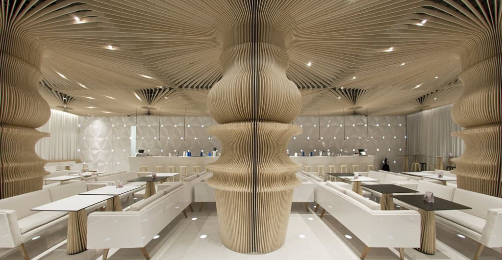
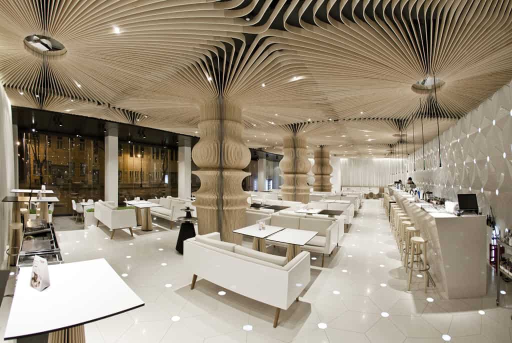
Creating a harmonious interior that naturally extends the architecture is no small feat. We took on this challenge by dividing the space into two distinct zones, each serving a unique purpose. The front zone melds with the exterior, creating a public space that mirrors the building’s silhouette. In contrast, the rear zone is cleverly designed with floor and roof adjustments to reduce space depth while preserving a panoramic view.
The real test? Solving functional issues like ventilation, sound, and acoustics without compromising on aesthetics. Inspired by Escher’s work, we aimed for a blend of structure and simplicity, achieving our design goals with minimal materials and expressive elements.
Our solution is both identical and unique. It generalizes and masters the space, meeting all technological and functional needs. The result is a trendy interior that reflects the artistic vibe of the Gallery of Modern Art located in the same building.


This website uses cookies.