Project: Floating in Space
Architects: W Design Architecture Studio
Location: Pretoria, South Africa
Photographs by: Courtesy of W Design Architecture Studio
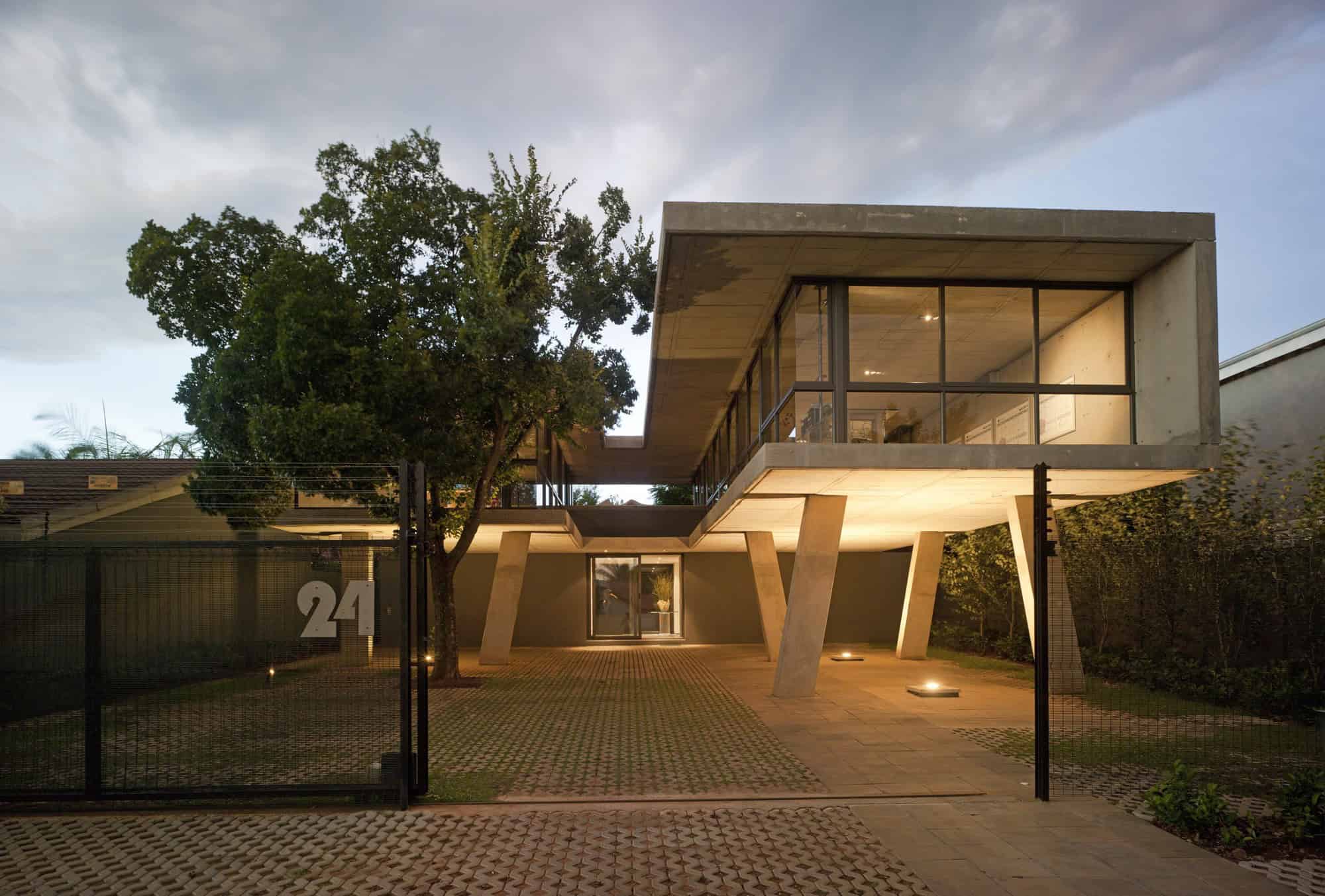
The Floating in Space residence is a spectacular contemporary project designed by W Design Architecture Studio. It is placed on an elevated volume in the eastern part of Pretoria in South Africa. The unique, elevated design of the home enables it to be used as a residence, an office or a combination of both. Its minimalist design makes use of plenty of glazed surfaces to deliver natural light to the interiors as well as open it to views of the outdoors.


‘How do we give our client more for less?’ is the future-proofing quest architects Johan Wentzel and Grete van As of W Design Architecture Studio embarked upon when considering the conceptual design of this strikingly contemporary, yet unpretentious building. Nestled amongst a mixture of residential and small business properties on a busy sub-urban road in the East of Pretoria, the structure was designed and developed to fit right into its ever-changing suburban context as an adaptable space that can be used as a house, an office or a combination of the two. The concept of adaptability and optimization of resources are interwoven into every level of the design and radiates a spirit of multi-functionality from the very core of each design consideration – from the position and shape of the building on the site up to the detail design and construction material selection.
At first glance this approach is evident through the illusion of infinite space that is created by extending the landscaping of the relatively small site right up to the edge of the street boundary, effectively inviting the street space and urban context to become a visual part of the garden landscape. This illusion is reinforced by the raised off-shutter concrete and glass structure of the building that floats lightly above the landscaped garden below on a couple of playfully juxtaposed columns and wrapped sensitively around an existing indigenous stinkwood tree. The clever choice of grass concrete pavers adds an additional greening opportunity by transforming the parking area into a pristinely manicured lawn.
The result is an inviting aura that lures the visitor towards the courtyard entrance, flanked on both sides by the two floating concrete and glass blocks. The concrete core at ground floor level houses the basic services of the building, including the two hidden sets of staircases that lead up to the first floor level.
The moment one reaches the first floor level it becomes clear why the main functions of the building have been raised off the ground. With the exception of the two side boundary walls, the solid concrete structure gives way to expansive glass curtain walls that open up to a surprisingly wide vista of unobstructed views. The sharp contradiction of solid concrete mass floating lightly between the leafy tree tops heightens one’s experiential awareness to this effect. “Our ultimate aim was to create a ‘floating’ space on the upper level of the building that would extend the perception of space beyond the boundaries of the property by providing unobstructed open views of Pretoria’s Eastern suburbs,” says Johan.
The simplicity of the exposed off-shutter concrete construction system made it possible to cast the entire primary structure – walls, floor and roof – as a complete simplified shape from a singular material. Defying the common perception of concrete being a ‘cold’ and ‘solid’ construction material, the architect’s careful attention to detail celebrates the warm, responsive and decorative side of concrete. The exposed underside of the concrete roof slab creates a beautifully patterned ceiling throughout the building. The tongue-in-cheek use of colored glass beads to fill the holes left by the concrete formwork in the walls allow for decorative colored light to filter through the walls.
Careful consideration was also given to the climatic behavior of the building. The off-shutter concrete roof cantilevers over the glazed wall sections to provide deep protective overhangs against the penetration of unwanted direct sunlight. In addition, all the windows slide open to encourage passive cooling of the building through cross ventilation and are equipped with sheer motorized roller blinds to allow for optimal environmental control by the user.
Ultimately, the exterior of the building is designed as an envelope to contain the multi-functional interior spaces. The architectural design consideration allowed for multiple variations of layouts – thus ensuring future adaptability. The very essence of the space resonates that of a three-dimensional blank canvas for living in. The seemingly ‘rawness’ of the finishes invites the occupants to participate in the process of creation by customizing the flexible spaces according to their specific needs.
The ‘more for less’ design approach results in an intriguing architectural response towards creating sustainable buildings and neighborhoods in a world driven by constant change and consumerism. Taking into consideration the ever-changing fabric of neighborhoods as a result of densification and sub-division, it makes perfect sense that buildings should be designed as highly adaptive shells that can accommodate the changing needs of its occupants and the context that it resides in. On a site-specific level, the optimization of land use, the minimalist approach towards construction material consumption and the multifunctional nature of the building presents a thought-provoking alternative towards creating sustainable neighborhoods for the 21st century.
This website uses cookies.