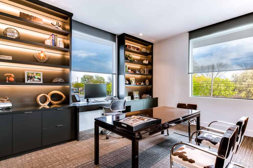
More companies are seeing the importance of having good-looking offices. It’s not enough to have buildings where people work every day. You need a clean, orderly workspace that is visually accepting to anyone who walks through the front door. Learn how to design a company office and choose the right elements to include in your designs.


A room’s layout includes different arrangements of furniture, artwork and other elements. In a circular arrangement, the furniture is arranged in a circle that goes around a table. Some offices have rows of furniture that are pushed against the wall, and others have chairs and tables that are scattered and facing different directions.
Focus on the practical aspects of layouts first. People don’t want to sit in chairs that are too close to the front door or bathroom. However, you don’t want chairs that are too far from the front door. In a lobby, arrange the furniture to face any place that has traffic, such as a door or desk. Incorporate vantage points into the arrangement so that branded custom designed dibond sign printing is visible from where most people will be standing or sitting.


Space is the most important quality of any structure and layout, and business offices are no exception. The front of the building has the most traffic, so the front lobby layout needs the most amount of space and attention. Even a break room that has only a few people will need enough space. If not, people will run into each other when they enter or exit the room and knock over appliances.
First, consider the amount of space that people need to move around. Estimate the number that could fit into the room at one time and create aisles for them to walk in between furniture without bumping into other people or objects. Consider adding extra space and less furniture to create a larger room design.
Every business needs proper lighting, but this element is not applied properly in every office or building. Consider the type of room and the activities that occur there. Then, decide the most appropriate type of lighting to use, whether it’s ambient, task or spotlighting.
In a typical office where people read constantly, task lighting is recommended. In many lobbies, ambient lighting is used mainly for decorative purposes. Visitors prefer the shadowy, low-level lighting that is not too bright and distracting to their eyes.
An office is an area to look at and not just a place to work. Include a few visual elements, such as color, shape, pattern, texture, and form. Cover up blank wall spaces by adding a background of artwork. Decorate an empty floor with rugs.
Contrast is another important quality of design. Combine different soft and hard textures like velvet furniture and a granite countertop. Choose two or more colors to alternate throughout the room design.
The dullest offices are monotonous in design. Add more movement throughout the room by adding color contrasts. Combine a dull color like manila with a more vibrant one like lavender to avoid making the entire room one color.
A successful business does not just have a good reputation and high profits. It’s just as important to have good room designs and layouts that start with the front lobby and continue throughout the building. To impress any client or visitor, start with the basic elements of a clean, orderly room.
This website uses cookies.