
While few dispute the idea that color affects mood, some are taking things too far
Color psychology has been in vogue for more than a few decades, but considering that humans more often than not conform to color stereotypes, there’s a case to be made that the “science” of color psychology has begun to morph into a new-age pseudoscience.
Search the web for some combination of psychology+color+some room of a home. What you’ll find is that experts have varied opinions, very varied opinions. One website with an article on the topic has the headline “15 Perfect Office Paint Colors.” There are fifteen, eh? And they are all “perfect?”
Keep looking and you’ll easily find, “10 Colors that Boost” (insert desired positive emotion). With so many claims mixed with so many colors, it does seem that the essence of understanding that colors can affect humans in many different ways is shifting from observational science (or common sense) to subjective Jackson Pollak-esque projections of meaning.
Green is connected to loyalty, according to one color wheel. But another version states green attracts prosperity. Are these two connected? -Sure, sometimes. But we’ve gotten away from the point, especially when we are talking about color in home design/décor.
Loyalty, prosperity, clarity, success, respect… all of these are great, but are not really the values most of us consider when remodeling a kitchen. Color may or may not have the ability to bring you prosperity, but for the majority of people, color simply needs to pass the Marie Kondo test: does it spark joy? How does it make you feel – good or not so good?
Take this dresser made by New York-based interior designer Kurrent. Don’t bother psychoanalyzing the colors and style, instead, simply ask yourself if it looks “cool.” If it does, it’s a winner.
In short, color psychology shouldn’t resemble horoscopes; vague cookie-cutter jumbles of words that many times border on the absurd. Color’s connection to the psyche shouldn’t become psychobabble, because it isn’t. Anyone in the home décor industry knows this, as do most “civilians.” Most folks wouldn’t paint their bedroom walls bright pink – not out of hatred for femininity, softness, or creativity, but because it “doesn’t look good.”
Another chic New York brand, Gessi, has a showroom that uses virtually every color one can imagine. Several showroom walls are huge screens that explosively blossom with colorful visuals resembling a combo of smoke, fabric, and water. Another wall at Gessi is festooned with flowers, vines, and butterflies – a 3D art deco blend of shades and colors that almost dares you to leap into it. But move on over and look at their faucets for sinks and showers, and you’ll find brushed metal with that brass-gold color (and many other colors), bamboo, and wood that says, and has said for quite some time, “luxury.”
Certain colors have been associated with parts of the human experience for millennia. Take black, for example. A beautiful, deep black was very hard for ancient peoples to produce. Usually, they needed to repeatedly dye it dark blue, and then add various chemicals to make the darkest blue pigments seep in deeper. Due to the laborious process, black was an expensive color to produce.
The ancient Romans used black as a color for mourning and at funerals, and not just because it’s an “unhappy” color. Wearing black was costly, and therefore a sign of respect. The fact that many cultures still use black at funerals, despite black now being easy to create, shows the power of old associations.
Black equaling expensive continues today: high-end dresses and suits, luxury cars, many types of tech gear, etc. And the concept extends to pop culture: Darth Vader’s uniform is black, as being powerful is expensive. (Some cultures in Asia, however, use white as the color of bereavement. But spotless white outfits are also expensive and hard to keep spotless.)
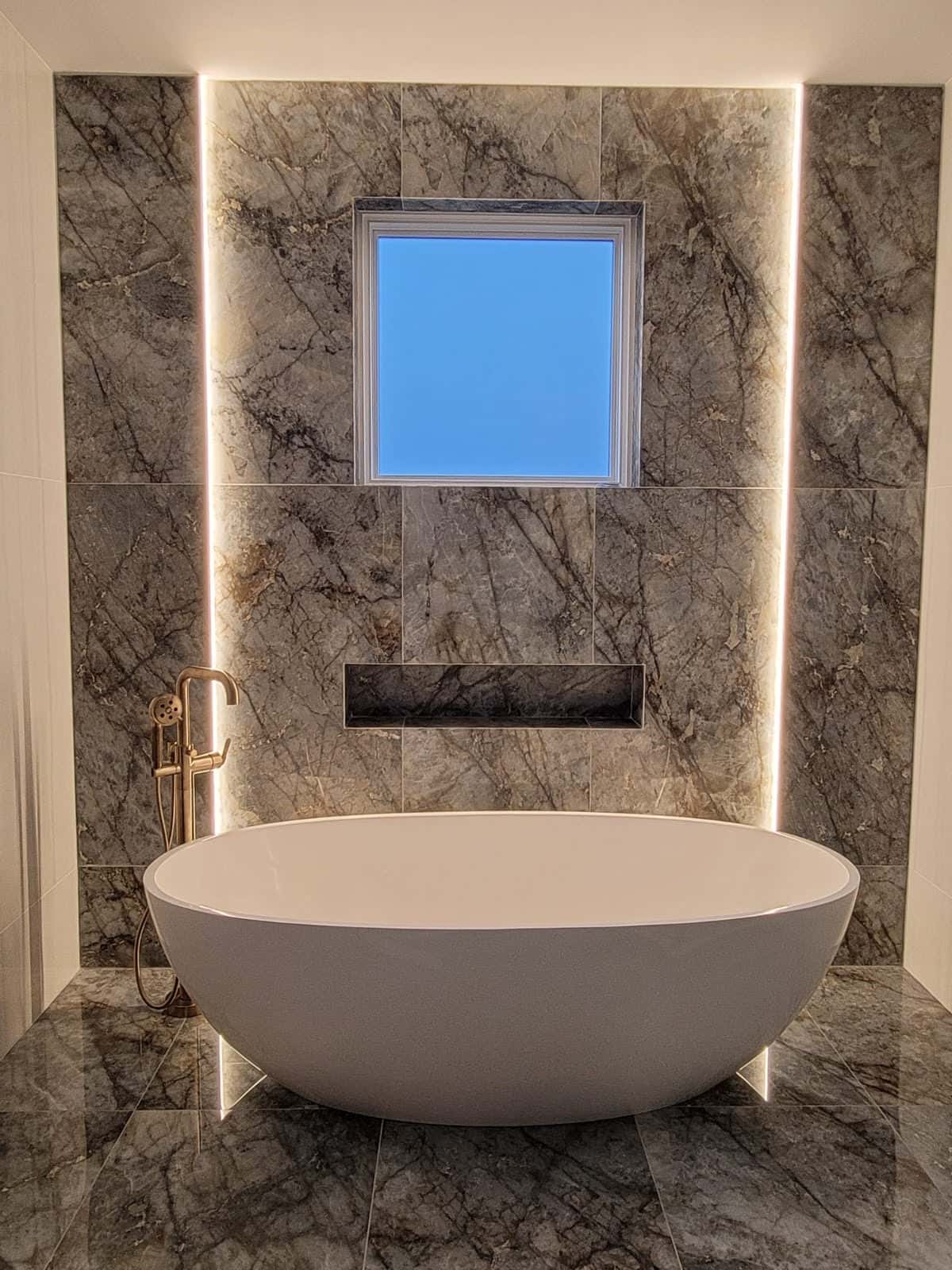
People project what they wish onto virtually anything, and color is no exception. Classics, however, are classics. Wood (and or paint that mimicked the dark hues of wood) has been used alongside gold trims in the palaces of pharaohs, the temples of ancient Rome, and the boardrooms of 1920s multinational modern companies. Why? Because the two complement each other and look good. Simple gray slate walls coupled with fixtures of bronze can make a bathroom look elegant – and elegance is almost always connected with simplicity. These combos are intuitive, and often based on very old traditions.
Interior decorators should use color sparingly and with purpose. Colors should accentuate and highlight. Color has “flare,” and a person with a sense of “flair” can add a rug or a vase or some other colorful element to a bathroom, and a room can come alive in a unique way. But most of the time, the best color for a one-of-a-kind, high-end ceramic bathtub would be white. You don’t need a degree in psychology to understand why: if a white tub is clean and filled with clean, clear water, it’s inviting.
That’s not to say it wouldn’t be possible to use some sort of black marble for a tub, or even some other random color. For the most part, however, humans have come to expect certain colors to be used in certain places, and while not averse to innovation, these basics are unlikely to change anytime soon.
This website uses cookies.