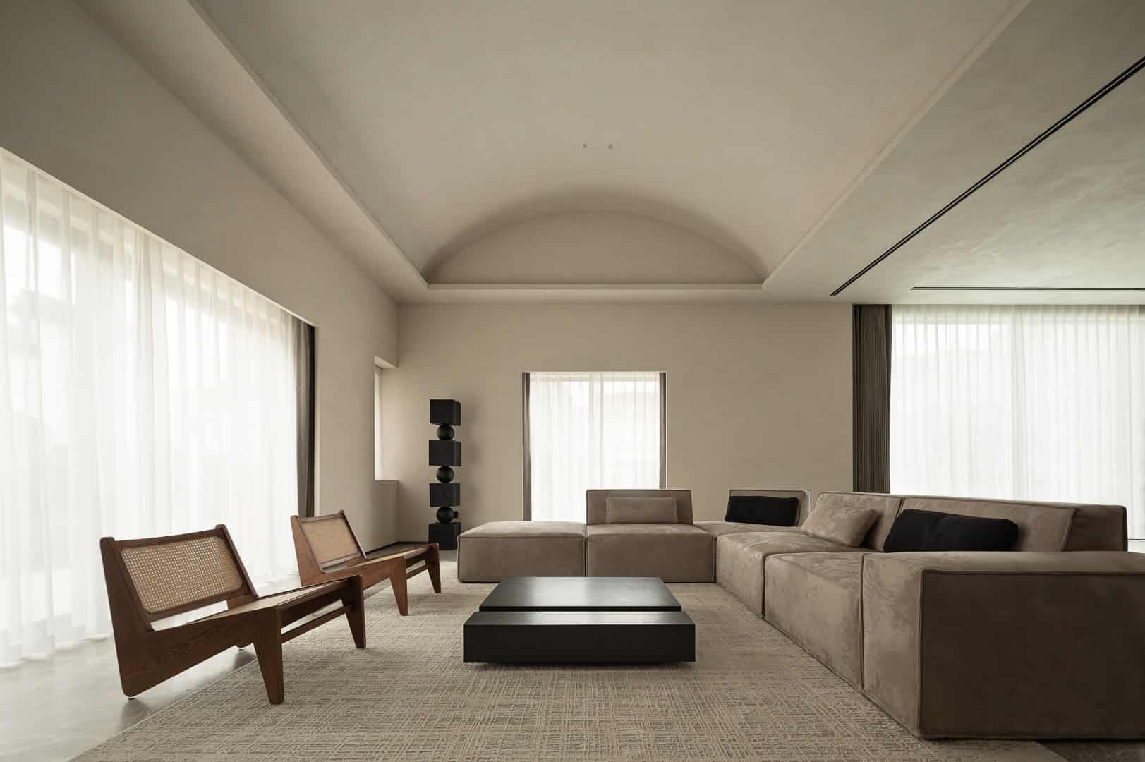
- Project: Art Space Gallery
- Architect: Lycent Design Studio
- Location: China, Suzhou, Jiangsu
- Year: 2023
- Area: 1300 m2
- Photography: Established – Gao Yi
The Art Space Gallery by Lycent Design Studio in Suzhou, Jiangsu, explores the architectural concept of “margin” — the poetic boundary between human activity and the environment. Designed by Lycent Lai, the 13,993-square-foot gallery transforms a once-chaotic space into a flowing, harmonious composition of light, curves, textures, and natural materials. By redefining spatial boundaries and embracing fluid geometries, the gallery establishes a dialogue between illusion and reality, order and freedom, dynamism and tranquility.
Project Overview
The design intent was to reinterpret the idea of margin as a mediating threshold—a zone of transition where architecture, light, and materiality overlap. Upon encountering the original site, the architect recognized both the potential of its abundant daylight and the disorderly nature of its existing interior.
The project restructured the space into a cohesive whole by introducing curved semi-enclosed walls, which divide yet connect functions. This spatial fluidity ensures interaction among visitors while maintaining distinct atmospheres for different programs.
Design Concept: Flowing Boundaries
-
Curves as spatial dividers: Columns and walls are wrapped into flowing geometries that define rooms while keeping them interconnected.
-
Margin as dialogue: Each threshold balances openness and privacy, structure and emotion.
-
Integration with light: Daylight becomes a connective thread, entering through concealed gaps, skylights, and glass walls.
-
Dreamlike quality: Spaces evoke a sense of wandering between reality and imagination.
The result is a narrative interior, where each movement through the gallery reveals new relationships between texture, proportion, and shadow.
Light, Shadow & Materiality
Natural light is central to the project:
-
Floor-to-ceiling glazing admits abundant light, softened by fabric textures and natural finishes.
-
Skylights animate the sculptural staircase, which spirals upward like a tree or cloud.
-
Louvered and concealed openings filter daylight, creating rhythms that shift throughout the day.
The material palette balances warmth and restraint:
-
Cotton, linen, and vegetable-tanned leather provide softness.
-
Dark wood contrasts with light bedding and pale surfaces.
-
Stone, wood veneers, and artistic paints create a tactile harmony of cold and warm tones.
This contrast enhances the gallery’s poetic and contemplative atmosphere.
Spatial Organization
Ground Floor
-
Curved walls organize the entrance hall, living room, and dining spaces.
-
Semi-enclosed layouts foster independence yet retain visual continuity.
Spiral Staircase
-
Acts as a central sculptural feature, guiding visitors upward in a poetic movement.
-
Plays with light and shadow, resembling musical rhythms.
Second Floor
-
Houses a spacious master bedroom and office separated by a hinged door.
-
Contrasting tones embody movement vs. stillness, restraint vs. freedom.
Basement
-
A 700 m² open plan integrates leisure, reading, swimming, and garage functions.
-
Columns and curves dissolve artificial partitions, emphasizing fluidity.
-
A sunken lounge with a fireplace becomes a cozy communal gathering spot.
Water as Design Element
The swimming pool is elevated into a reflective mirror surface, juxtaposing straight geometric lines with curving boundaries. This duality of order and freedom reflects the gallery’s guiding principle: balance between rigor and imagination.
Atmosphere & Experience
The Art Space Gallery embodies a poetic, dreamlike journey:
-
Spaces oscillate between openness and intimacy.
-
Visitors encounter a choreography of light, shadow, and material tactility.
-
Interiors dissolve rigid boundaries, encouraging emotional engagement.
By applying the philosophy of “margin,” Lycent Lai has created a timeless cultural space that evokes curiosity, contemplation, and serenity.
The Art Space Gallery by Lycent Design Studio is more than an exhibition space — it is an architectural narrative of margins and thresholds. Through curves, flowing light, and tactile materials, the gallery redefines how people interact with space and nature. Its fluid geometry, poetic atmosphere, and integration of natural phenomena establish it as a landmark of contemporary cultural design in Suzhou.