Project: AIRMIX Lifestyle Concept Store
Architects: SpActrum
Location: Qujiang Creative Circle, Yanta District, Xi’an, China
Area: 2,583 sf
Year: 2022
Photographs by: INSPACE
AIRMIX is a lifestyle boutique located in Xi’an, designed by SpActrum. AIRMIX Lifestyle Boutique (Xi’an Store) is the first showroom store of the newly established lifestyle boutique buyer brand. The challenge of the project consists in a relatively small shop area, where a strong image of the new brand is to be showcased while building a significant identity for AIRMIX. It starts by redefining the position that lifestyle holds for human life. Rather than something adhesive to everyday life, SpActrum understands lifestyle as an essential need deep inside humanity. It’s fragile yet unhesitatingly steady. It’s like a bubble of soap, transient and pleasuring. Bubbles become both a metaphor for such need and the form-making concept of the design.


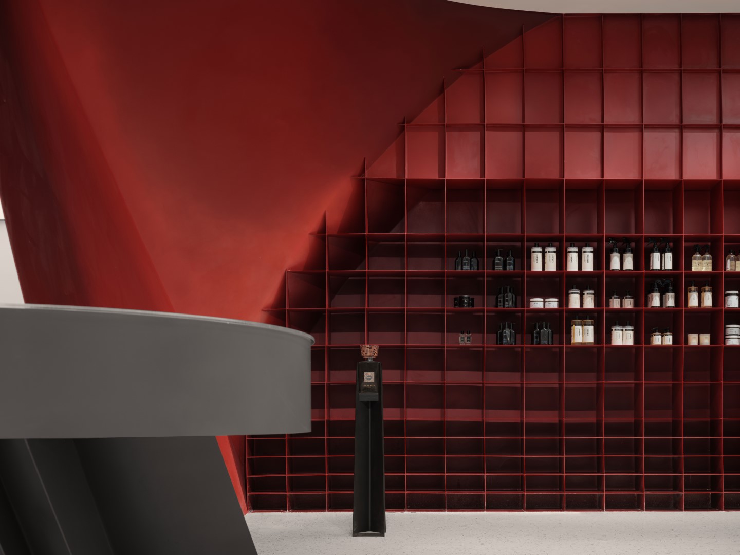
SpActrum introduces the metaphor “bubbles”, which is not only a design concept echoing the lifestyle boutique topic, but also a form manipulation methodology used as part of the design. The final formal presentation is a collection of the deliberately selected fragments of the latent generative geometry, or “bubble clusters”, which are developed into a series of seemingly very diverse sculptural display objects: altar, cabinets, shelves, floating slice, etc., formally optimised yet functionally-customized for best showcasing specific products. Although not apparent at a first glance, the order of the latent generative geometry creates a formal consistency and unifies the objects in space.


When soap bubbles cluster together, they form a series of interconnected domes, with planar walls separating each bubble from the next. The form and structure of a bubble as a physical phenomenon serves as a formal inspiration for the design. Through geometrical iterations of bubbles shifting in scale, being intersected by planes or other bubbles create a series of sculptural fragments that populate, connect and divide space.
The colour scheme studies were carried out via digital rendering, miniature models and full-scale prototypes until a gradient of red was made to resemble a stellar sunset on an alien planet. The resulting colour is a crimson with a non-homogeneous texture which makes it almost look like a living thing, at the same time having a close resemblance to the “Langyao Red”, a gradient famously used in traditional Chinese porcelain.
The geometrical studies carried out during the design phase give all the elements of a general formal language which was further progressed and detailed with the manufacturers. The steel plates have been cut and shaped in a steel workshop which specializes in art pieces. Fixing and welding details have been discussed with the appropriate know-how to ensure precise and efficient manufacture and installation. The construction of the impressive giant red sculptural fixtures is commissioned to a local prestigious fine art manufacturing studio based in Xi’an, famous for its high-quality production of large-scale art installations for some of China’s first-class artists. Benefited from its rich experience in producing abnormal-shaped objects and the advanced machinery and techniques, the final result is a bold fusion of industrial manufacture precision and the subtleties of artisan labour with a highly refined aesthetic.
Most of the materials used, such as steel and glass, are fully recyclable. 100% LED lighting is used to reduce energy consumption. Most of the suppliers for construction are located within a 50km-radius, which helps to reduce the carbon footprint on transportation. This boutique’s purpose is to bring a glimpse of lightness to the “heaviness” of urban life both by its bright form and the sustainable lifestyle it represents.
SpActrum has been extensively involved in urban regeneration projects, and especially for such large-scale projects, every specific micro store is an living cell, part of a large body of the city. In its interior projects, SpActrum consciously responds to the vastness of the urban-scape, breaking the barriers of routine hierarchy of “store-street-city”, and making the interior a part of the street and city. Treating the urban environment or architecture as a living thing, and constructing a whole from a cell makes SpActrum’s work full of humanity and inspiring a sense of connection. Without exception, all of these projects speak for the city and the wider public space.
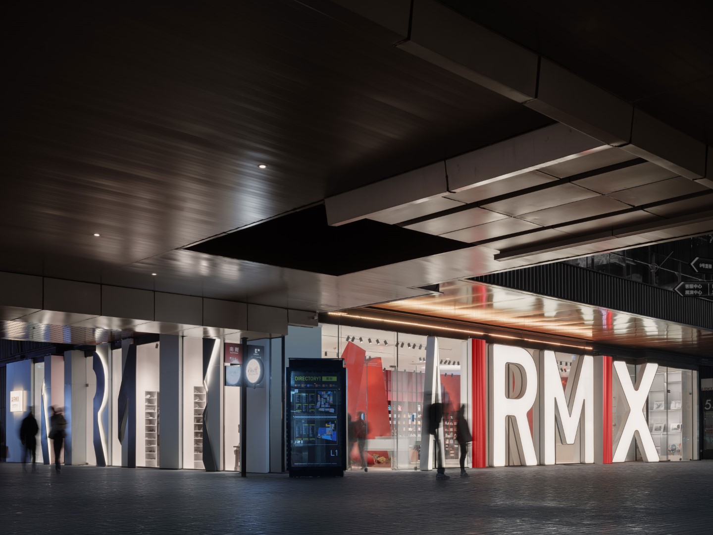
To strengthen the brand image of AIRMIX, SpActrum takes advantage of the fact that both facades face busy pedestrian streets, erecting the giant illuminated brand logos as advertisement billboards and showcase windows. The facades become a kind of communication interfaces, as well as filters between the external and the internal.
Being a new boutique brand, the front facade features the full height brand logo as illuminated boxes and LED screens. A-I-R-M-I-X, with A and X, gently tilted towards the centre to indicate two entrances at two ends. The other side of the L-shaped space faces a busy corridor connecting to plazas. The logo is repeated on the short side with the letters wrapping around the vertical storage units. From the direction you walk towards the shop, depth hides the gaps in-between, and the whole of the logo letters are revealed.
Through this design SpActrum helps the newborn brand AIRMIX to establish a distinct and memorable brand image — strong, trendy, arty, and out of the ordinary. It successfully raised the awareness of the AIRMIX brand among the target customer group and significantly promoted the sales; furthermore, it has played a key role in a laying a solid foundation and setting the keynote for the brand’s chain store development in the future.
-Project description and images provided by CURRENT-NEWSWIRE
This website uses cookies.