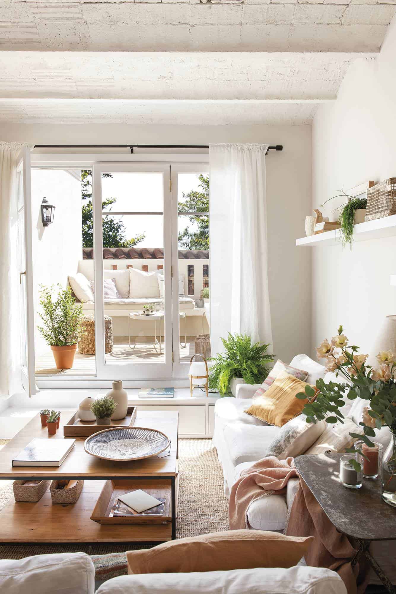
This small penthouse in Barcelona has the magic formula to appear larger and gain light: lots of white and great ideas in every corner. Do you want to see it?
This apartment is tiny, but it has two things in its favor: the terrace, where its owners make a lot of life throughout the year; and the practical non-existence of transit areas.


The terrace only measures 8 m2, but the architects conditioned it to be ultra-comfortable: they put an outdoor floor with wooden slats that give more warmth and designed a custom bench to take advantage of the space. It is an L-shaped bench, with a color that does not fail to give light and spaciousness: white.


To make the most of its barely 60 m 2, the architects knocked down partitions and thus gained a large, diaphanous day area without a single door. Now, from the hall, you can see the terrace. In addition, they enlarged the window in the living room in height and width: Before it was barely 1 meter long and we took it almost from wall to wall… and wow! The floor was flooded with light. That, and painting the terrace light, because it was dark before.
The designers pulled ingenuity, not only in the reorganization of the spaces but also in the design of the furniture, most of it made to measure. An example is the steps that lead to the terrace which, at the same time, are the low furniture in the living room.
Where do you see it, up to 8 people can comfortably fit in this dining room? And without tightness. This was very important for the owners because they are a young couple and they love to receive friends at home.
The transparent kitchen is one of the great attractions of this apartment, with permission from the terrace. It is small but it lacks nothing! It is super used: it has its bar, which they use a lot, a lot of light, and a wall of cabinets that integrates the appliances. The large guillotine-type window gives a lot of play and, in addition to giving personality to the kitchen, it is super comfortable as a serving hatch.
The choice of colors was very careful. Being a tiny flat, the designer chose to unify the spaces with soft sand for the walls, which gives a warm and enveloping hue, and white for furniture and textiles.
In the main bathroom, the designer took out the dressing table and integrated it into the room. They placed the mirror in such a way that it reflects the window, which further multiplies the light.
This website uses cookies.