- Project: A.H. Beard Mattress China Flagship Store Exhibition Hall
- Architect: FARNEAR Design
- Location: China, Shanghai
- Year: 2023
- Area: 155 m2
- Photography: Cong Lin
In Shanghai, FARNEAR Design has redefined retail architecture with the A.H. Beard Mattress China Flagship Store Exhibition Hall. The Australian luxury mattress brand, known for its century-long commitment to craftsmanship, nature, health, and comfort, unveils a new store image system that transforms the showroom into a curatorial commercial space. The design integrates art, culture, and brand storytelling, offering visitors an immersive, multi-sensory journey that extends beyond product display.
A New Retail Paradigm
Led by chief designer Jia Huainan, FARNEAR Design challenges conventional showroom typologies by applying curatorial strategies to retail. Instead of presenting static displays, the exhibition hall is conceived as an evolving environment where nature, art, culture, and commerce coexist. This approach underscores the brand’s dedication to high-quality craftsmanship while positioning the space as a cultural destination.
Spatial Experience: Immersion and Ceremony
-
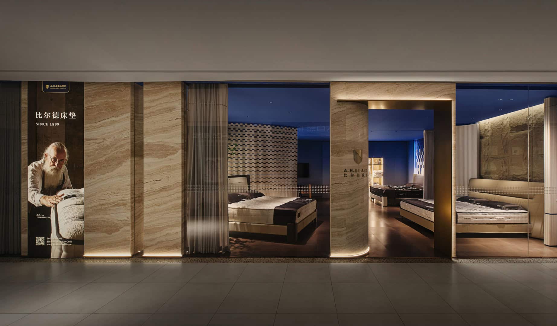
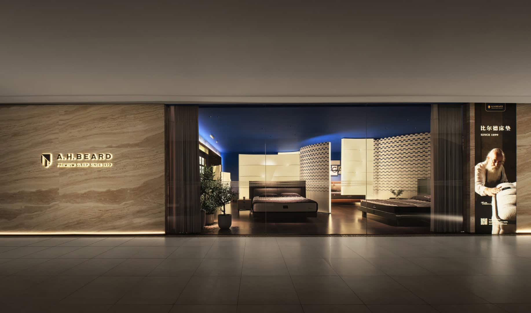
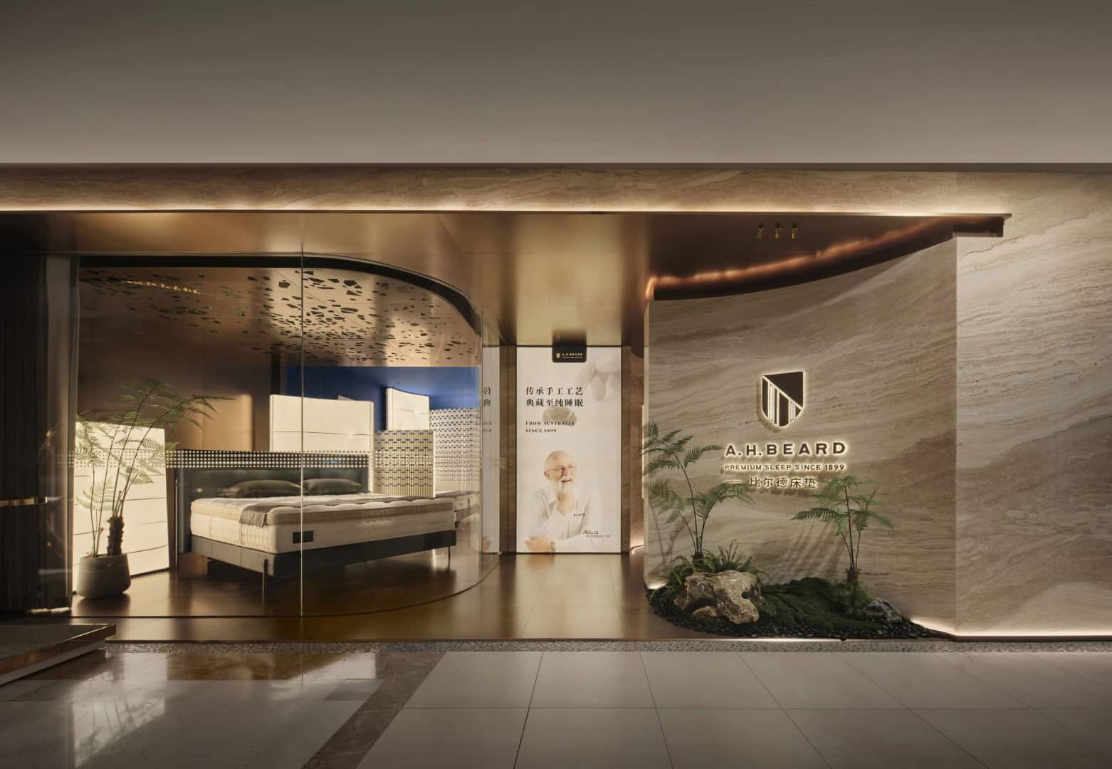
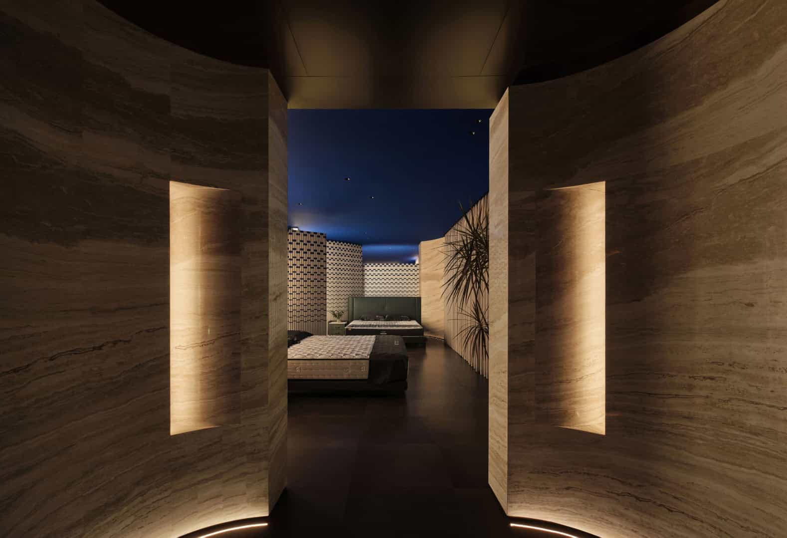
Entrance Sequence: A dramatic arrival framed by curved floor-to-ceiling glass dissolves boundaries between indoors and outdoors. A luxurious stone wall and natural scenery create an immediate sense of comfort, setting the tone for the experience.
-
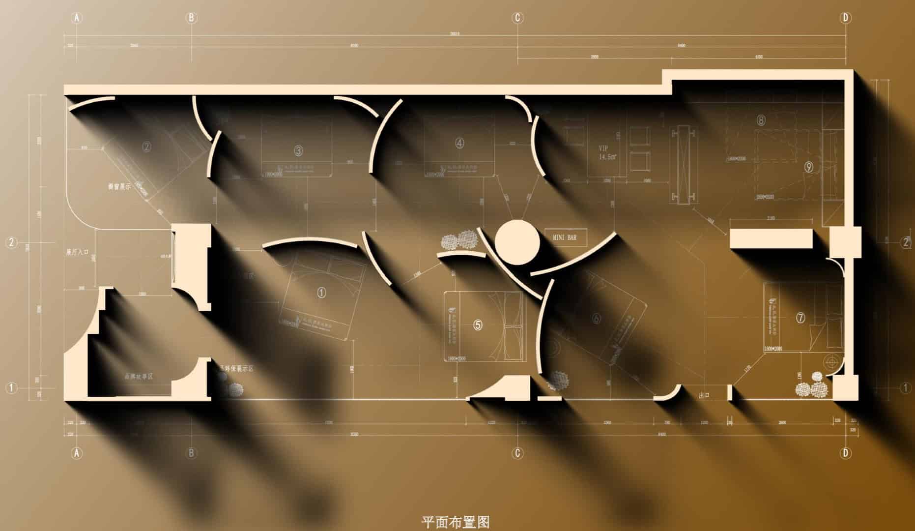
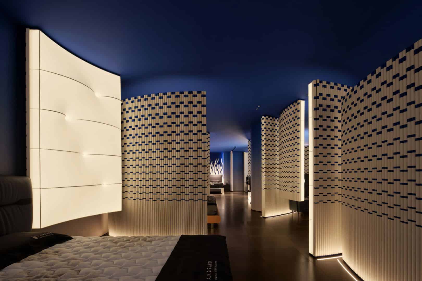
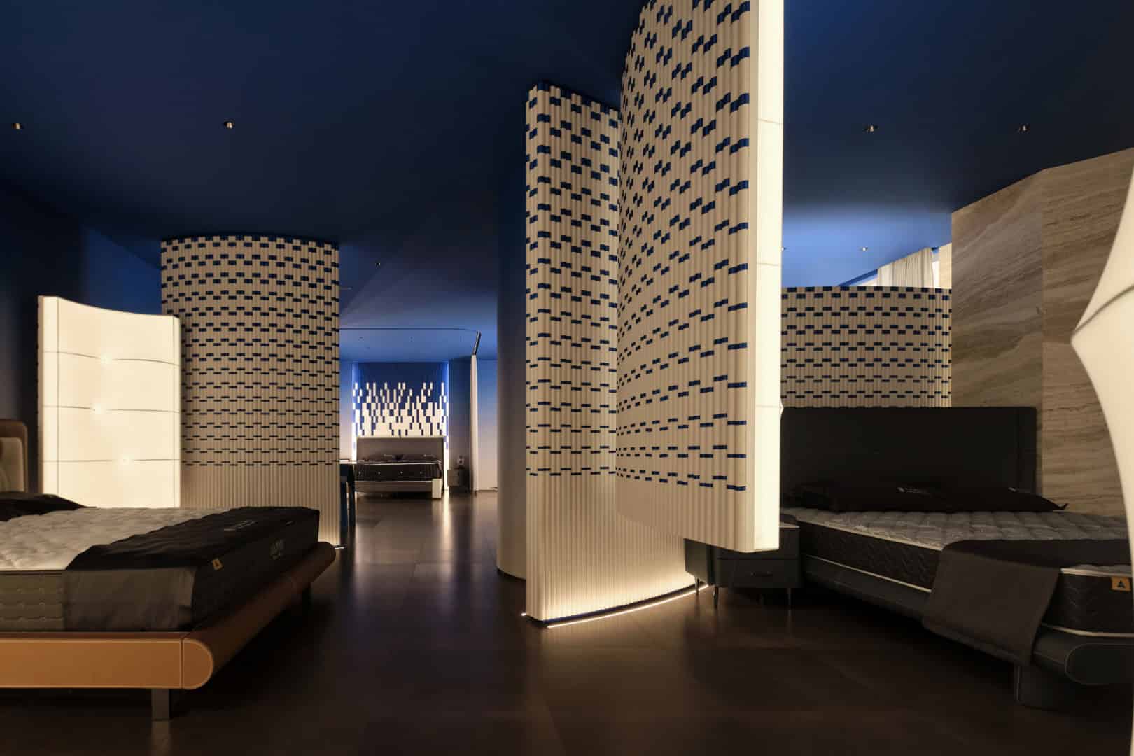
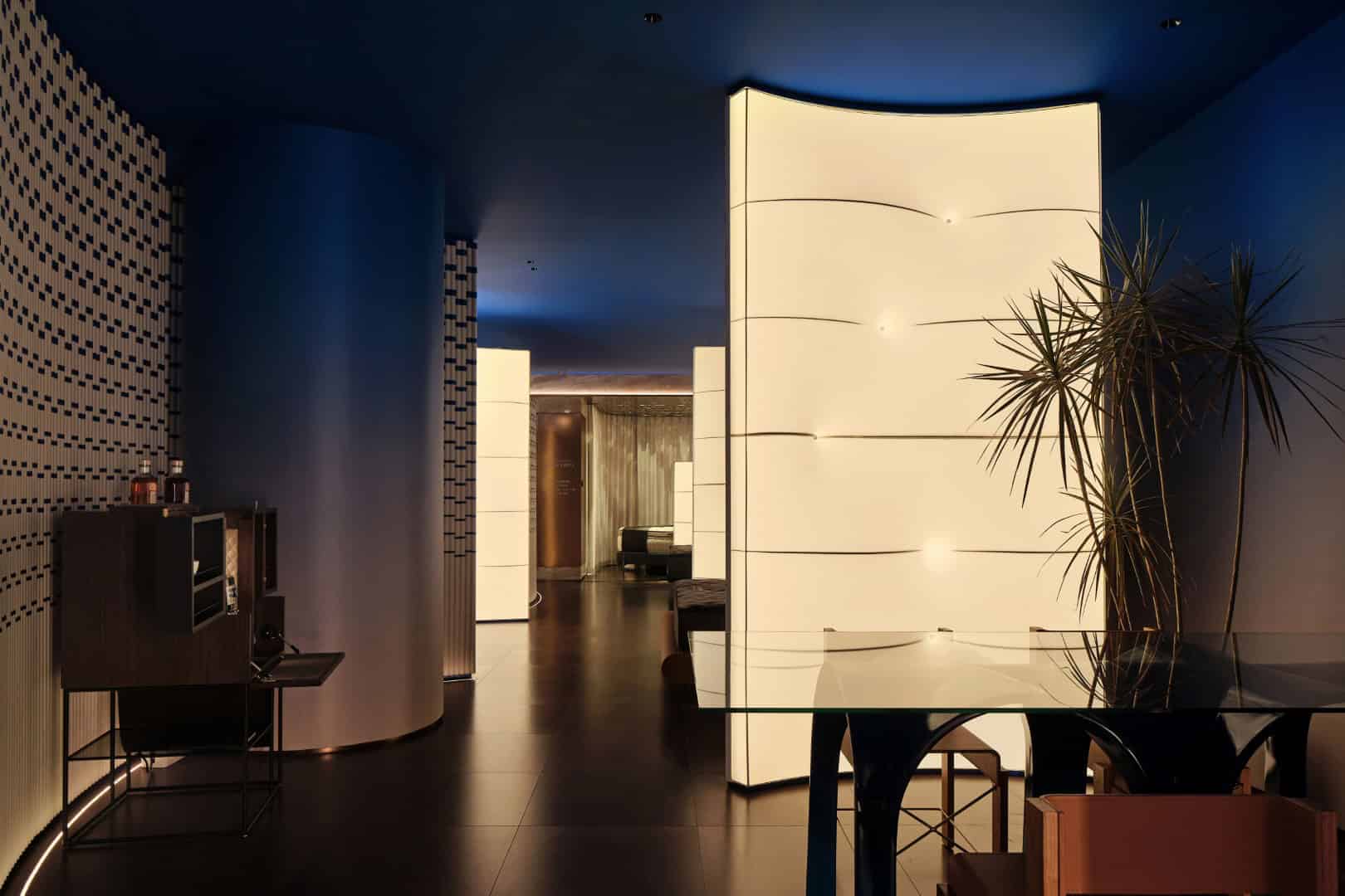
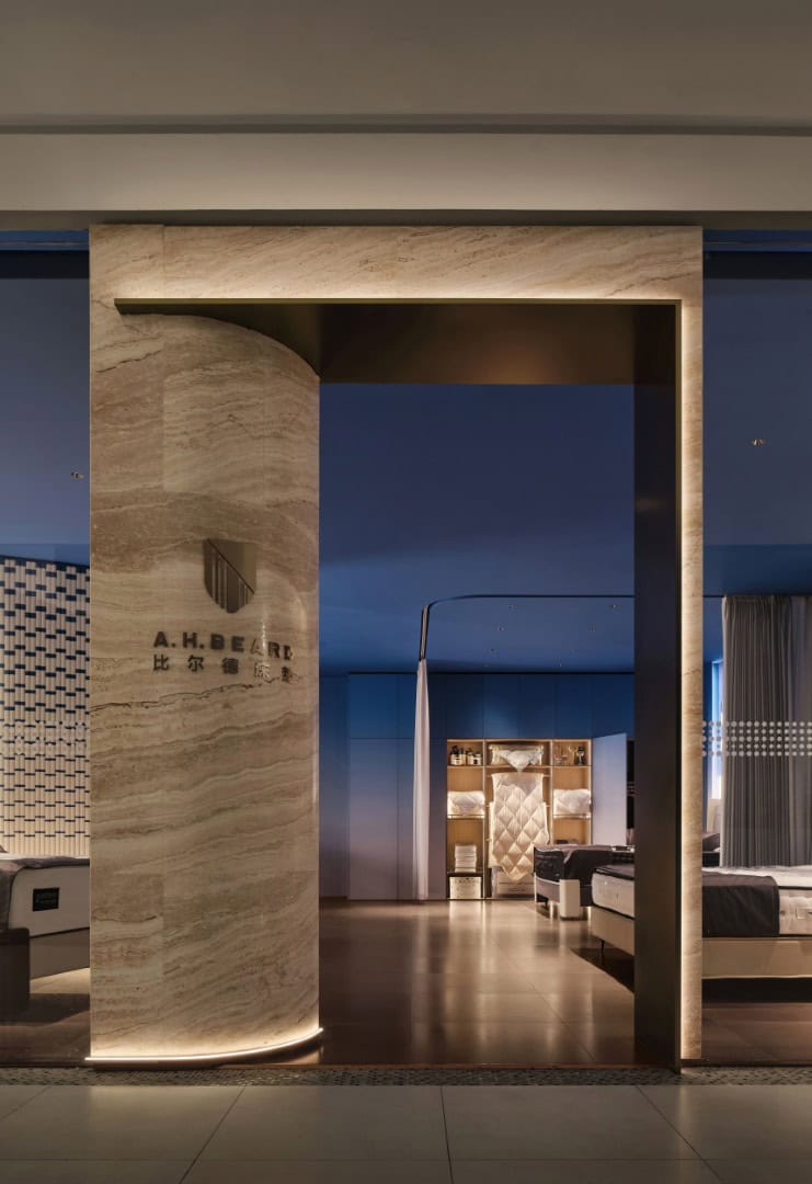
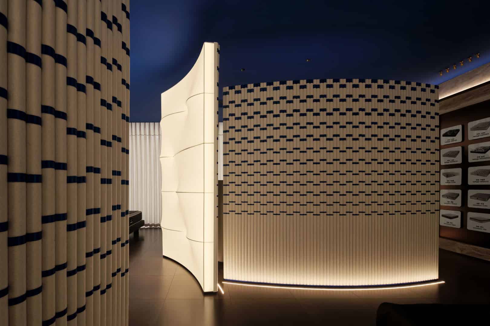
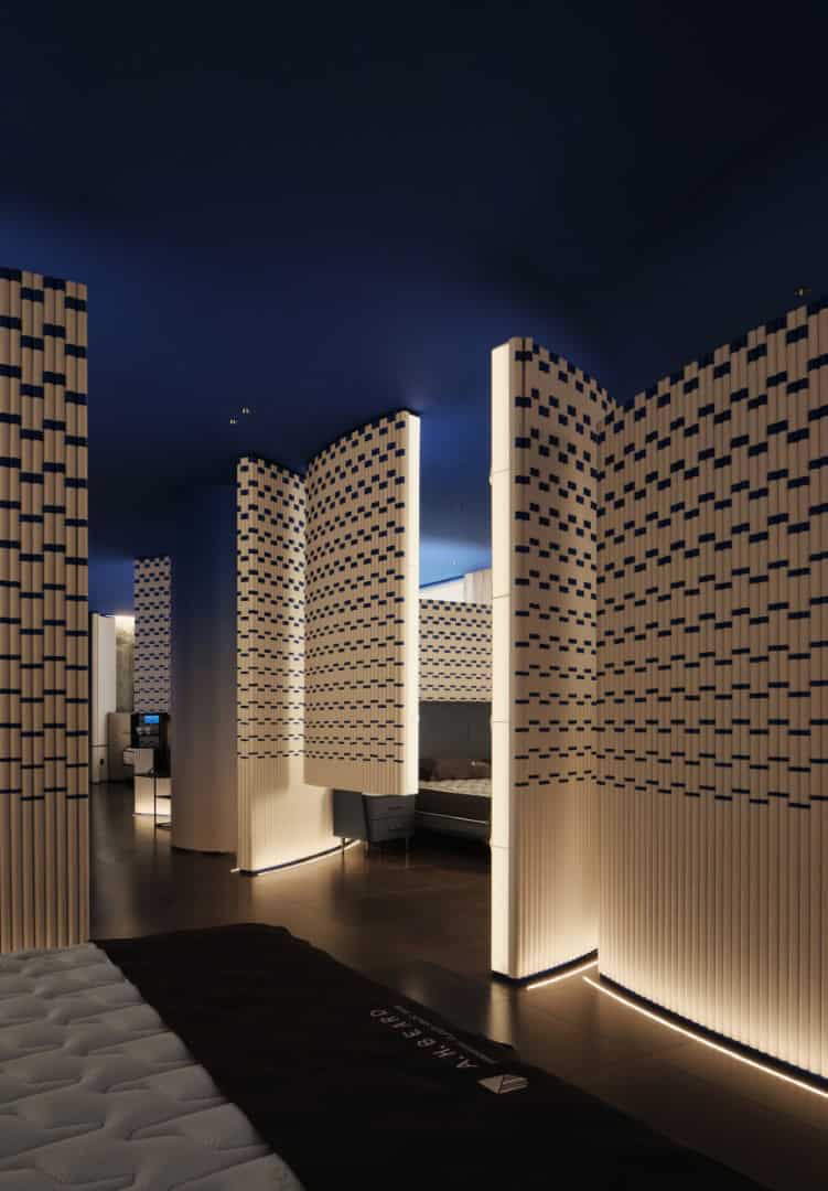
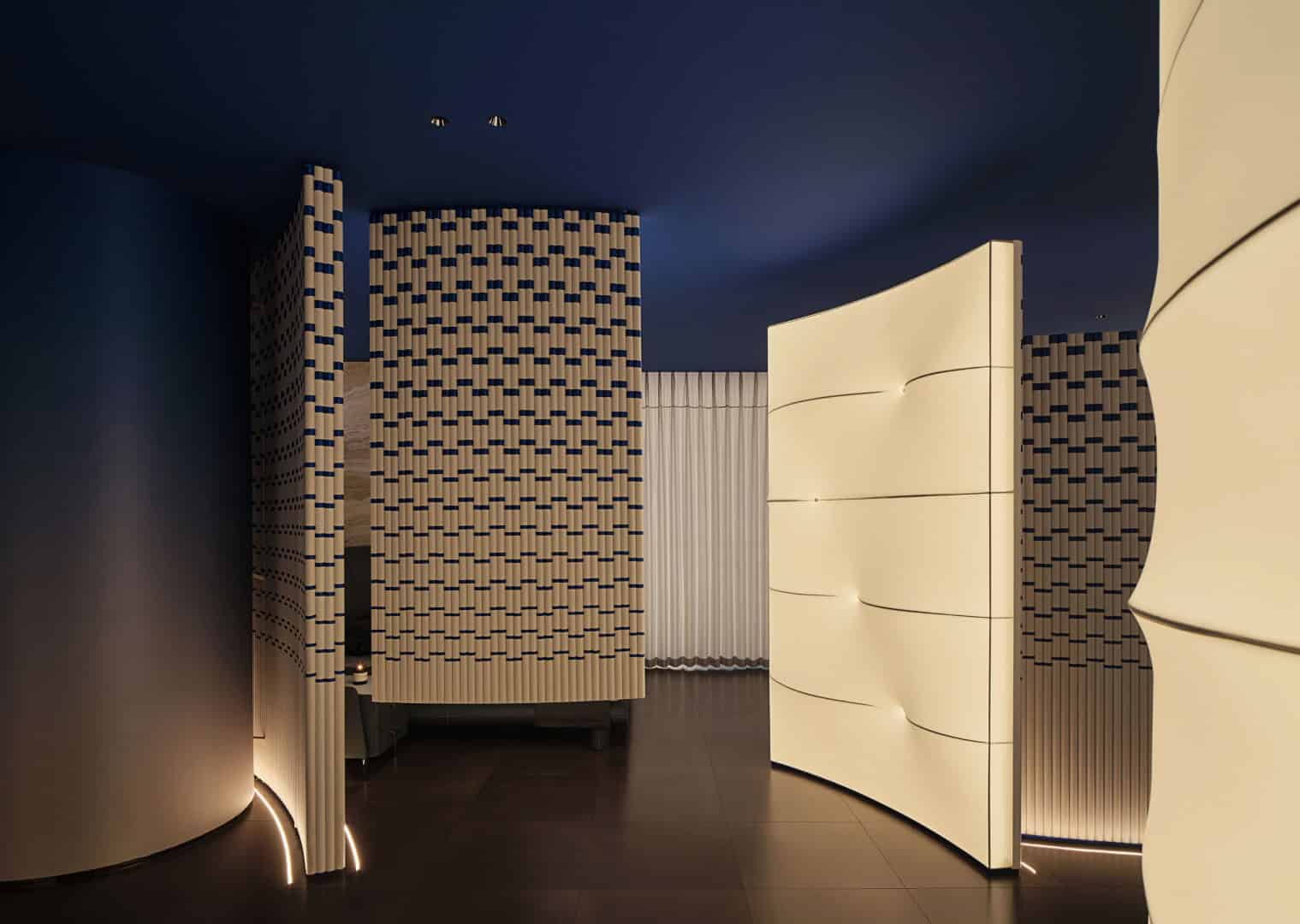
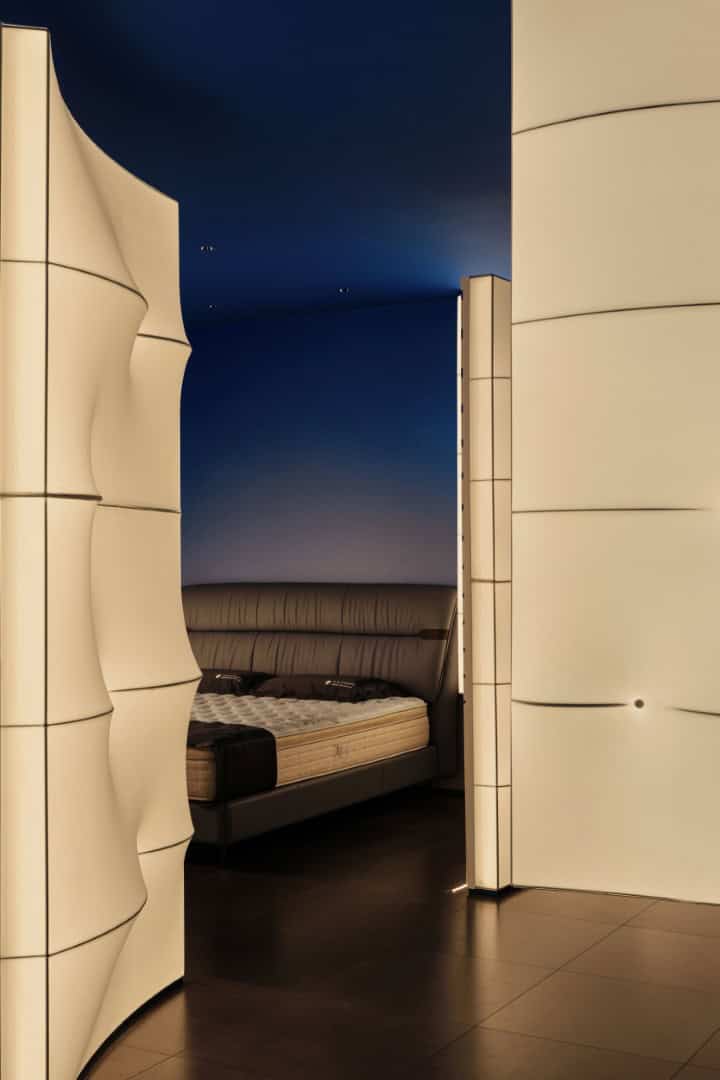
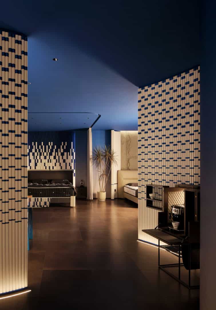
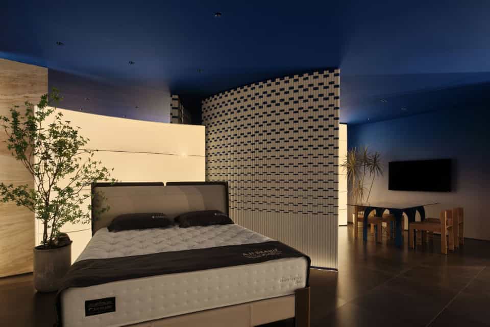
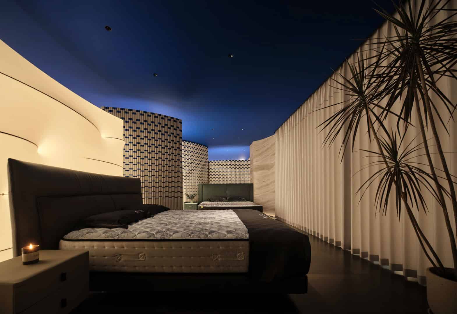
Curved Geometry: Semi-circular walls and flowing partitions guide visitors through the space. Curves express fluidity and continuity, softening the narrow, elongated floor plan into a dynamic sequence.
-
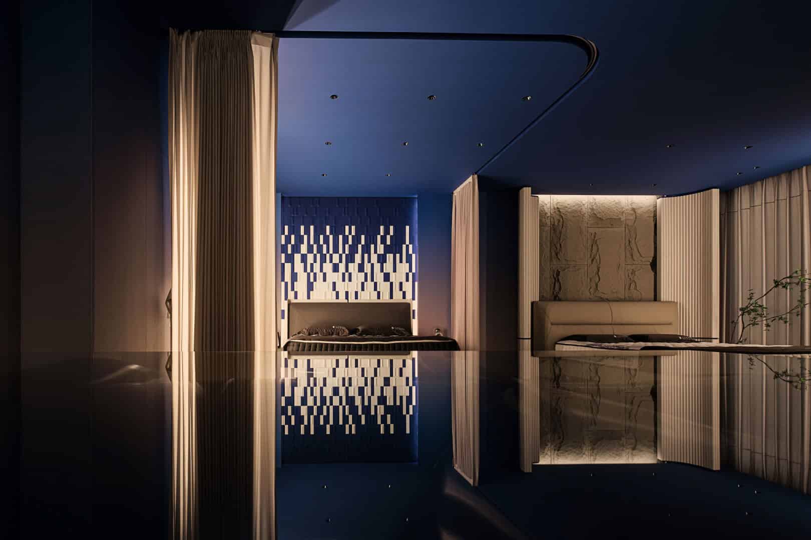
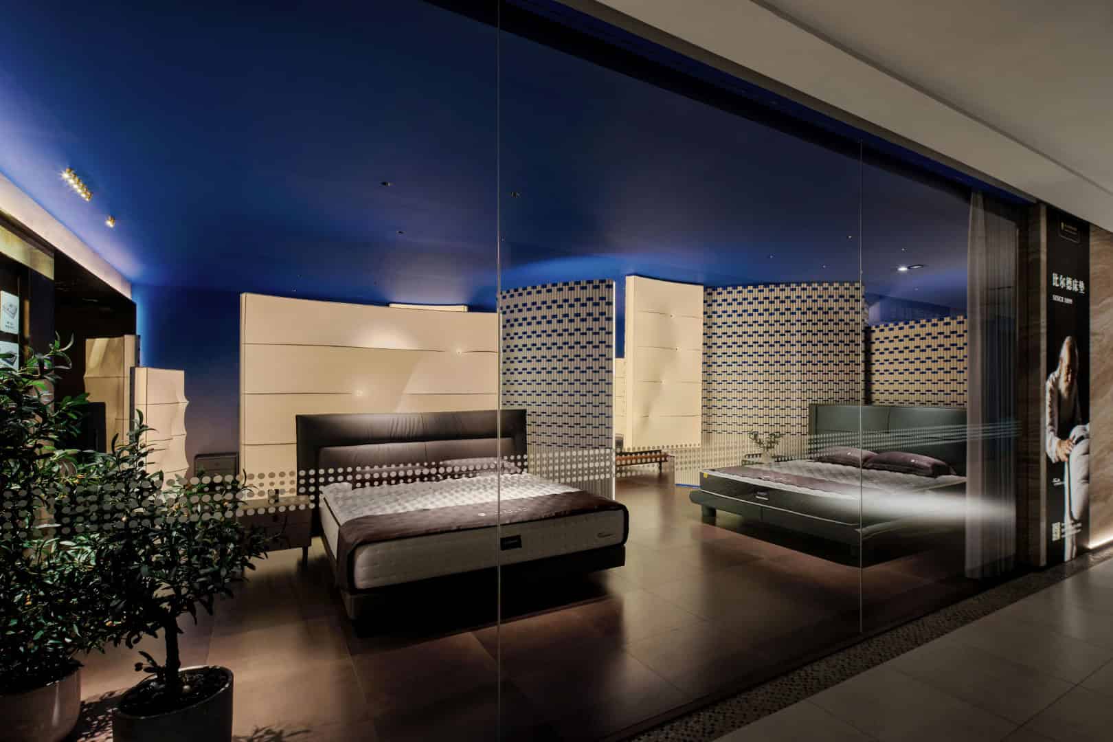
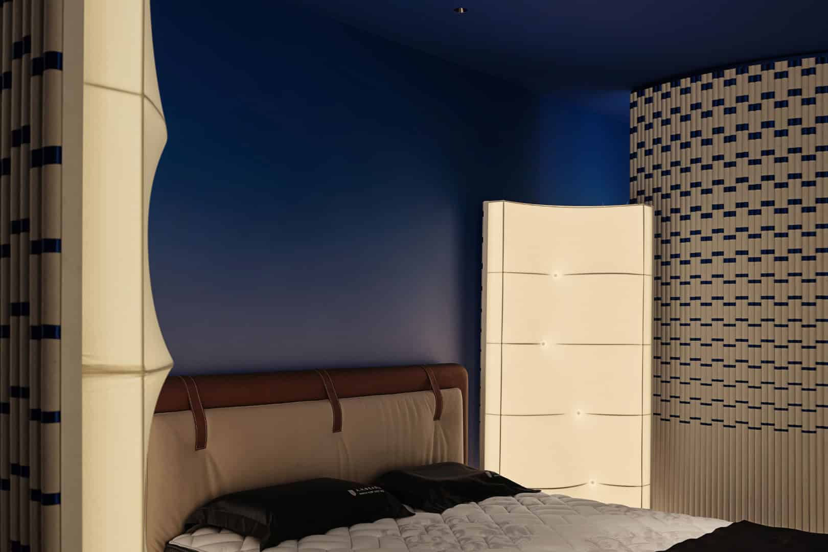
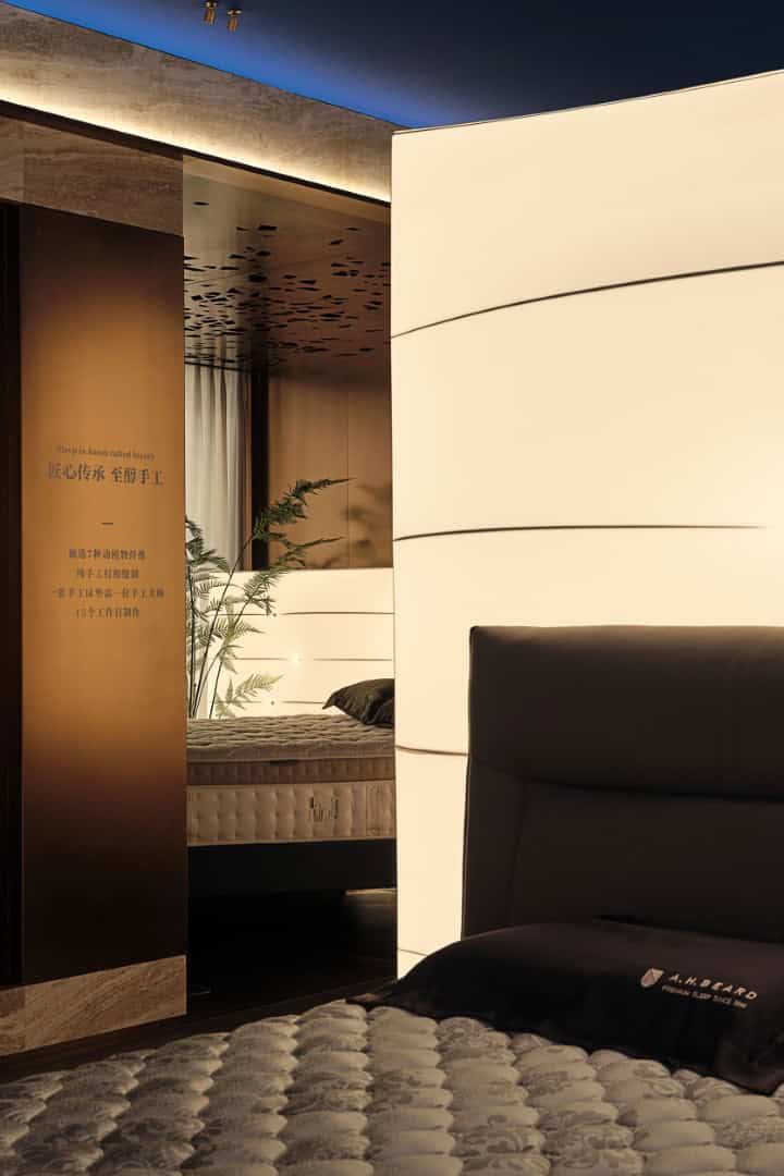
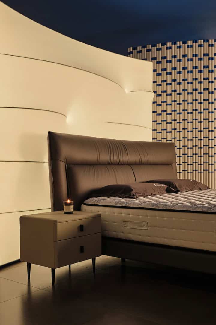
Materials & Tactility: Wool felt, gradient blue silk, luxury stone, and illuminated wall panels evoke the qualities of handmade mattresses—softness, resilience, and refined detail.
-
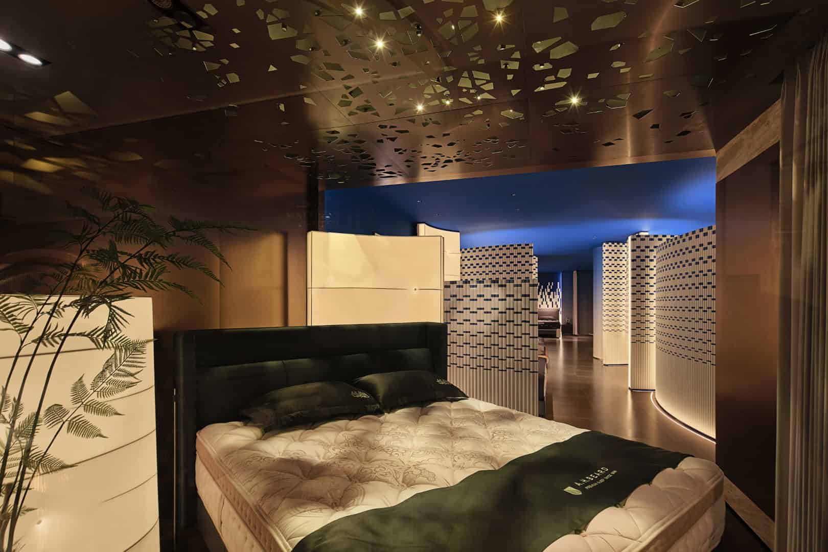
Atmospheric Lighting: Spotlights resemble twinkling stars against a deep blue ceiling, crafting a serene, dreamlike environment that references the brand’s connection to rest and night skies.
Narrative of Sleep and Lifestyle
The design reflects A.H. Beard’s philosophy: sleep as a harmonious dialogue between body, nature, and spirit.
-
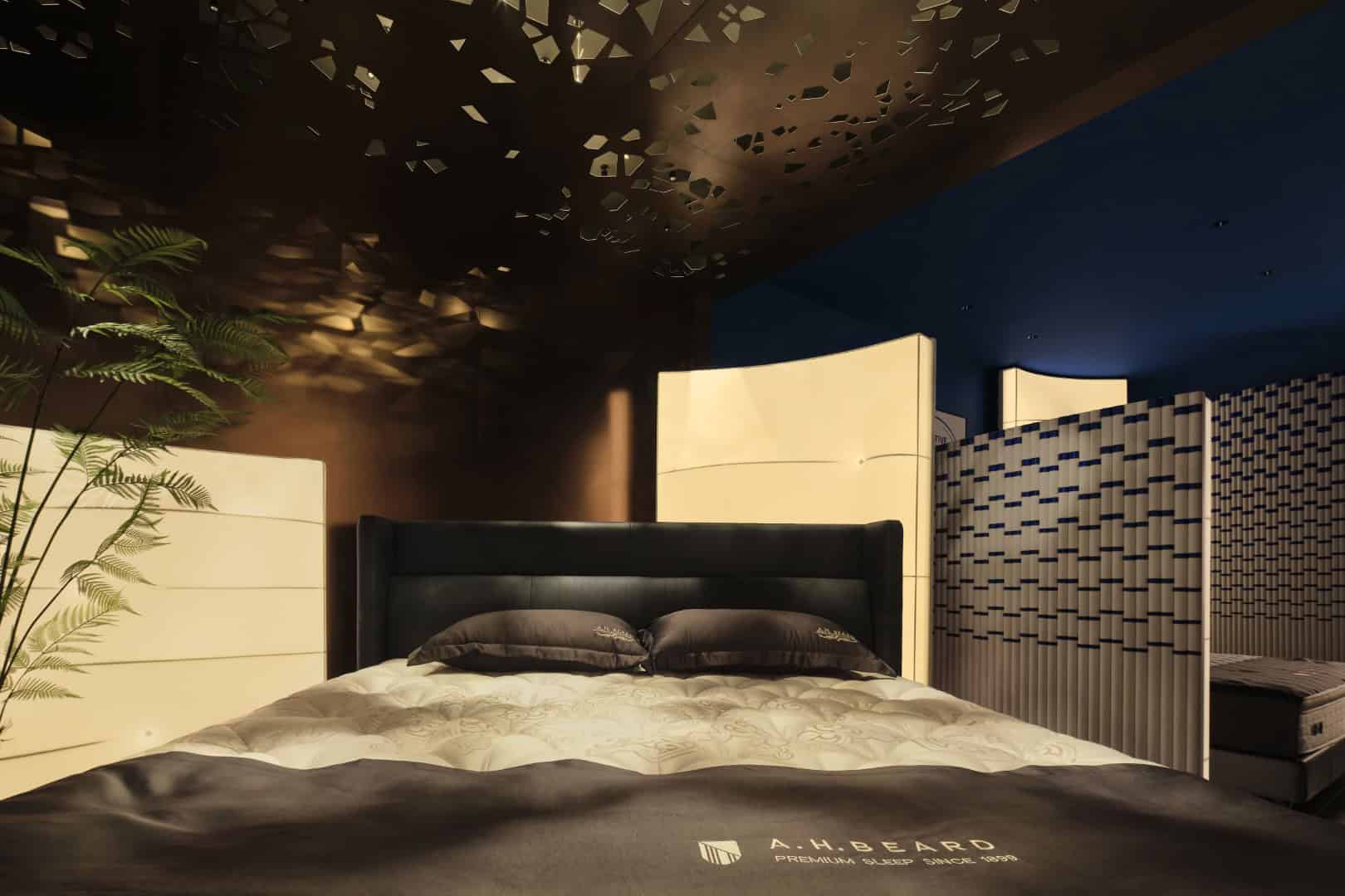
Thematic Installations: Details like embroidered stainless-steel ceiling patterns and miniature bamboo displays symbolize growth and vitality, aligning with the brand’s heritage.
-
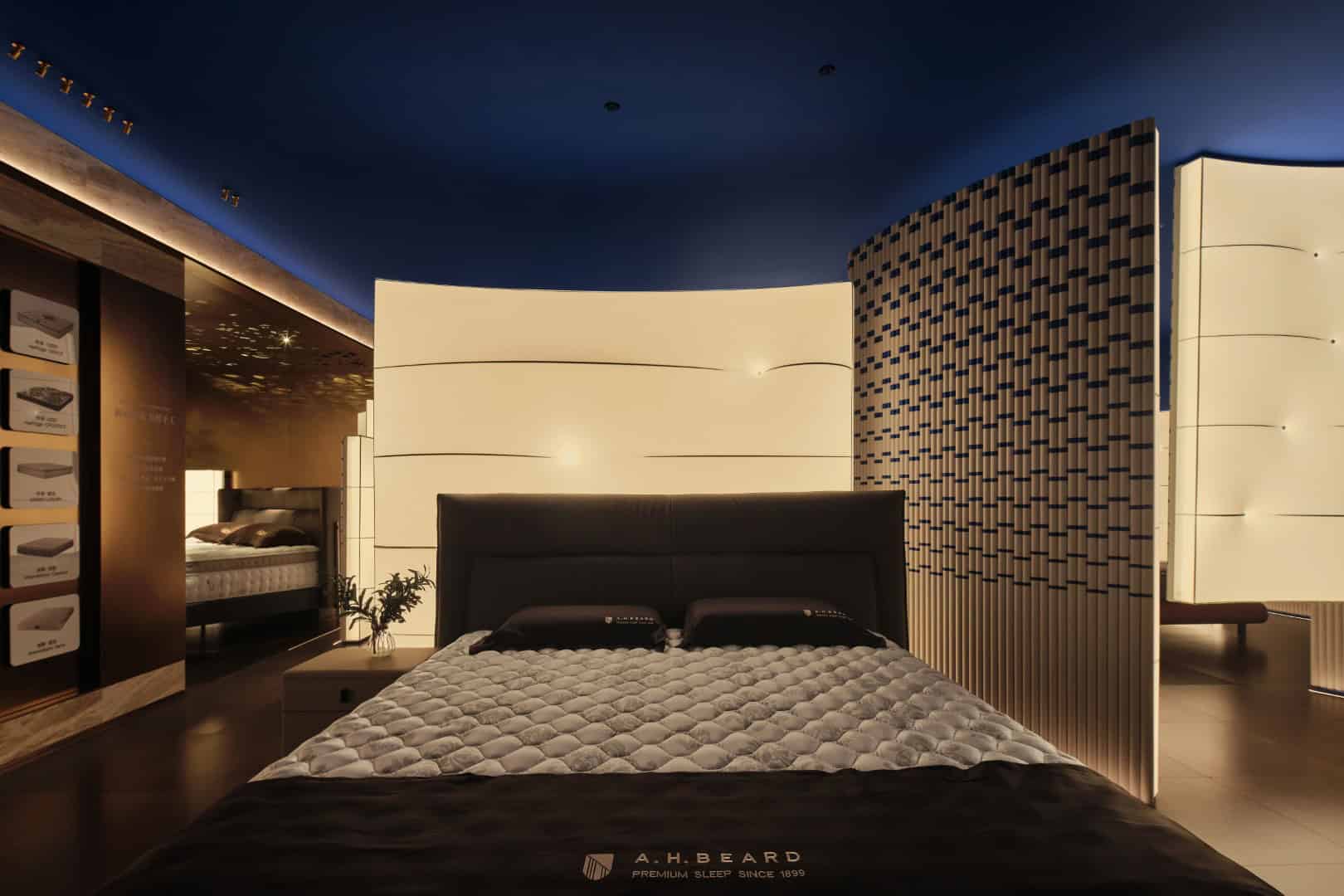
Product Integration: Beds and accessories are not just displayed—they are embedded into immersive storylines that highlight craftsmanship, natural materials, and lifestyle value.
-
Interactive Fields: Semi-enclosed alcoves provide flexible zones where the “protagonist” can change—allowing new product launches to seamlessly integrate into the space.
Beyond Retail: Culture and Connection
Jia Huainan describes the project as “new retail built on rationality and brand spirit”. Instead of being flashy, the design remains aligned with A.H. Beard’s DNA. Elements such as a coffee corner with a retro cabinet emphasize hospitality and cultural interaction, offering visitors more than a shopping trip—an opportunity to connect, converse, and pause.
The design also acknowledges the social nature of retail: private negotiation areas and casual seating zones balance commercial objectives with intimate experiences, while the color palette of dark blue and warm beige conveys both elegance and comfort.
The A.H. Beard Mattress China Flagship Store Exhibition Hall by FARNEAR Design is more than a showroom—it is a curated brand experience. Through immersive storytelling, fluid geometry, sensory lighting, and material richness, the space elevates mattress retail into an artful cultural encounter. In doing so, it reinforces A.H. Beard’s position as a global leader in luxury sleep products while pioneering the future of experiential commercial design in China.

Floor Plan
