The best way not to be wrong is to know what not to do. With this list of the 9 most common mistakes when decorating or renovating the house, you will never trip over the same stone.


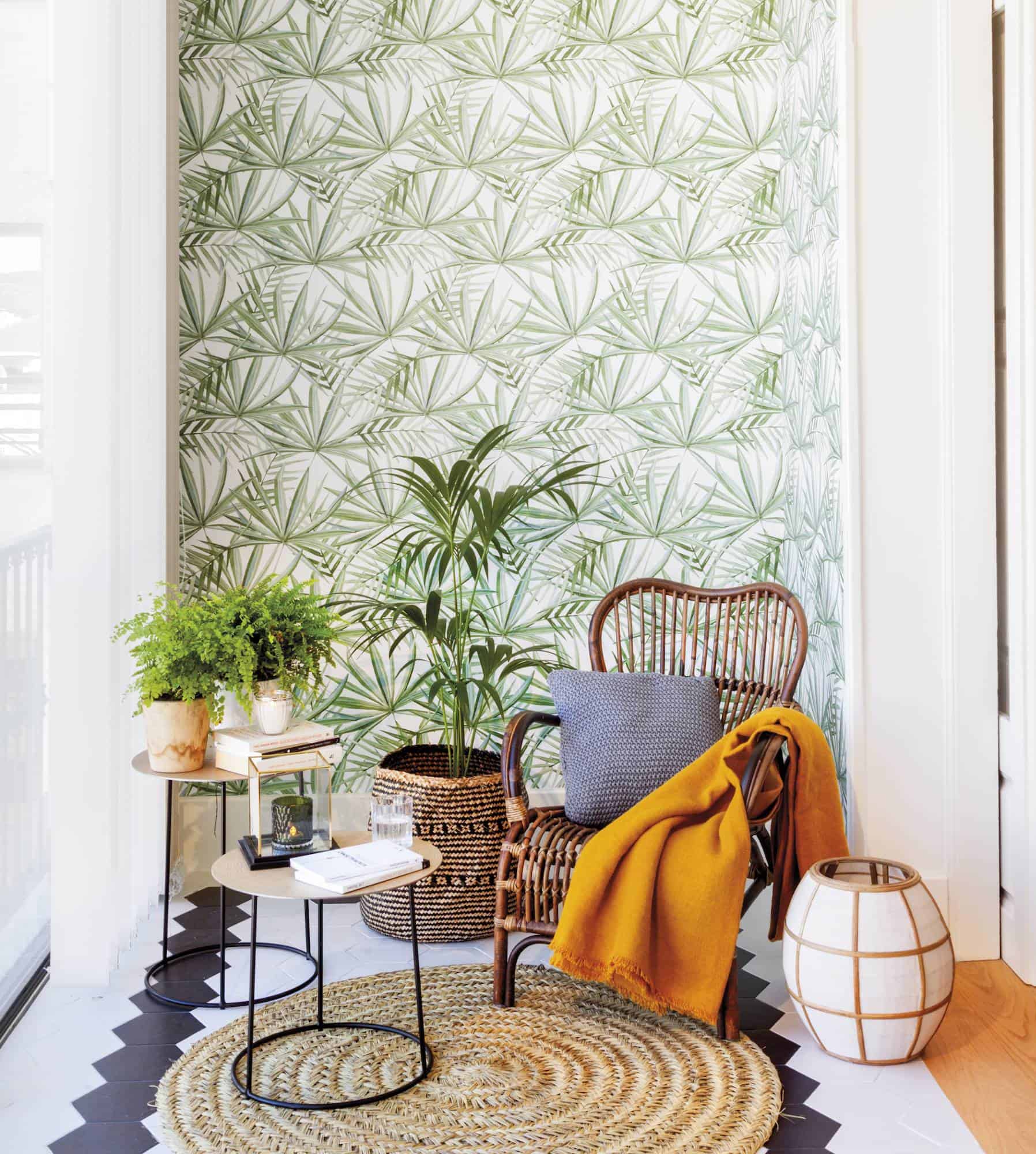
Be careful to strictly follow the trends in decoration. Following trends and adopting them at home is fine as long as you don’t abuse them. Or if it is a trend that you love and goes with you, such as vegetable fashion, jump without fear, as has been done in this reading corner. If not, better to reserve them for small details, which are easy to renew.


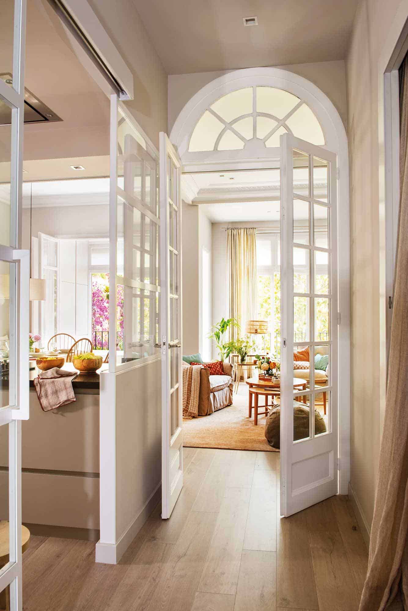
Your house is a whole, not a sum of different rooms. Keep it in mind when decorating it so that it transmits harmony within the singularity of each space. It is not about cloning the decoration, but that all the spaces share certain decorative elements that relate them. For example, the carpentry, a grocery, the floor, the paint colors… Here, the pavement and the beautiful carpentry connect the hallway with the kitchen and the living room.
The important thing is balance: don’t be afraid to mix flowers, stripes or squares, as long as they share colors. But do not overdo it mixing them because it could be too overloaded. Ideally, if the print is very attractive, like this Scottish plaid wallpaper, the rest of the textiles should be plain or with very subtle prints.
The beams are very decorative and add extra character and warmth to any space. But in small spaces, especially if the ceiling is not high, they can “weigh” too visually and dwarf the space. One solution, as has been done in this mountain show, is to paint them white or strip them. You will enjoy its aesthetics but they will be much lighter.
It is a big mistake. It is essential to anticipate in advance the type of lighting that best suits the activities you are going to carry out in each space. It is best to opt for multipurpose lighting, which you can regulate with intensity controllers depending on the amount of light you need (reading is not the same as watching TV). It combines different types of lighting: general, ambient to create atmospheres and punctual, to highlight the shelves of a bookstore or, as here, a painting.
Natural light is a good worth taking care of. Not only does it make space seem larger, but it will make it more pleasant and vivid. When distributing the furniture, do it in such a way that they do not cover the windows, or choose low pieces, as has been done in this room.
They are famous for dwarfing, especially if the space has little natural light. But in bright rooms, used sparingly and contrasted with light tones, they can even visually enlarge the meters. Anthracite gray, tan, and even black create contemporary and sophisticated environments. Look at this dining room, by painting the back wall a dark gray almost black, it is possible to give more depth to space.
In the living room, the ideal is that the carpet integrates the gathering area, as it happens in this room. For this, there is nothing like measuring the space you have to find a carpet of the right size and shape.
Think about it: it will be in skin-to-skin contact with you. Isn’t it worth investing in natural linen or cotton? It will be more expensive than a synthetic one, but its touch will be much more pleasant. If you choose designs with a low percentage of synthetics (less than 20%), you will also gain ease of maintenance and also will wrinkle less.
This website uses cookies.