By Becky Harris, Houzz
Libraries often conjure up images of dark wood millwork and the atmosphere of some old traditional gentlemen’s club. But designers are breaking libraries out of these fusty molds with glossy lacquer finishes, deep blues, fiery reds and even chartreuse. If you’re looking for something more than a traditional library look, check out these inviting reading rooms.
7 Soothing Spaces That Create Calm With Color


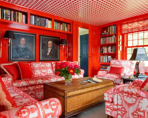
Fiery orange-red.The white backdrop of Vermont winters inspired interior designer Ramsay Gourd and his clients to go bold and warm in the library. After custom-designing the toilet to include Vermont iconography and the homeowners’ monogram, he custom-matched the lacquer color to the fabric.


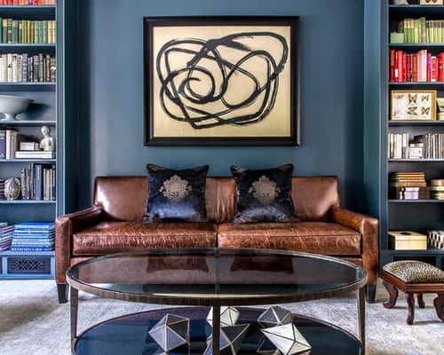
Yummy blue. This room is a lesson in what lacquer can do to a paint color. Interior designer Meredith Heron warns that a lacquer finish can look significantly different than the color you see on the paint chip. While this paint, Lead Gray by Benjamin Moore, is a charcoal gray on the chip and in other finishes, the lacquer brings out the colors that make up the gray. Because of this, it reads more “yummy blue” than charcoal in this cozy library. Heron used the same color paint for the trim in a semigloss finish and for the walls in an eggshell finish. This provides subtle differences between the three surfaces in color as well as finish.


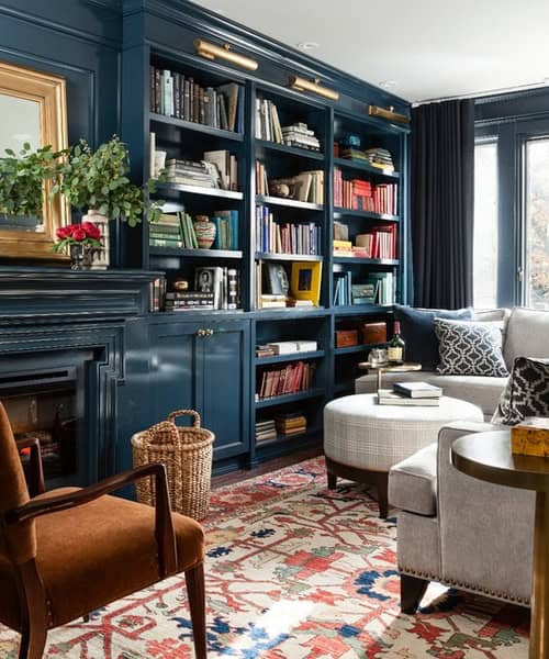
Dark Blue. Interior designer Nikki Dalrymple knew she wanted to set a moody tone in her family’s library and that the color needed to work well with the original decorative tile around the fireplace. Benjamin Moore’s Newburg Green was a match, and she used it in a lacquer finish on the walls and millwork. (By the way, lacquer or not, the color name is a bit deceiving; this paint color reads more blue than green.)
Soft green. During chilly Connecticut winters, Benjamin Moore’s Sherwood Green provides a cheery backdrop in this 1745 farmhouse. The shelves hold not only books but also mementos and collections from homeowner Ellen Allen’s travels.
Deep green. Interior designer Eugenie Niven Goodman chose Benjamin Moore’s Hunter Green to provide a lush backdrop for a gorgeous light rug and embroidered chairs in this library. It also helps the books, objects and art placed on the shelves stand out.
The paint job was completed by decorative painter Heidi Holzer.
Outfit Your Library With an Elegant Lounge Chair
Pleasingly plum. Sherwin-Williams may have named the color on these walls Chinchilla, but this library was designed around a snake named Princess, whose habitat can be seen on the right side of the photo. In addition to incorporating room for the reptile, the designers at Laura U incorporated the homeowners’ favorite color, aubergine, on the millwork and walls.
Standout chartreuse. A bold hue called Artichoke Hearts by Benjamin Moore energizes the library in the home of interior designer and store owner Suna Lock. The color brings an updated touch into the traditional 1870s Victorian architecture. A fireplace and inviting antiques encourage grabbing a book and curling up with it.
Deep ocean blue. Interior decorator Cory Connor says to check out the lighting situation thoroughly before going dark in a room. She knew this library received a lot of natural light from the windows, and she added sconces and a chandelier and painted the ceiling white to help prevent Benjamin Moore’s Newburyport Blue from overwhelming the room.
Give Your Books a Home
“I chose the color because it’s timeless, and I knew it would make the room cozy and sophisticated,” she says. “Painting out the molding and adding pops of color make it feel young and fresh, clean and modern.”
This website uses cookies.