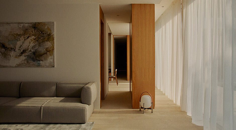
Do you know that your living room can be improved but you don’t know how? Do you feel that there is something missing or surplus and you are not clear about it? The rules in decoration are often to be broken but there are certain mistakes that we must avoid so that the decoration of the room works and makes us feel good.
The living room is the most important in the house for the time we spend in it, as it is a space for leisure and the place where we receive friends. And although style and taste are very personal, there are some minimum and common rules that your salon must comply with for it to work.
Even if your dream is to have a three-meter sofa if there is no wall or space for it, the sofa should adapt to the space and try to complete it with puffs or auxiliary seats. You can also opt for sofa models that are converted widthwise so that you can lie down as you please.
In addition to the proportions, check that the passageways work and that there are gaps between 65 and 75 cm so that the room has a good distribution.
Your living room is not the cover of a furniture catalogue so don’t be in a hurry to decorate it. It is not that you go to the first store and buy “matching” the dining room table with the chairs, the sideboard and the television cabinet. That’s very 90’s.
That we all like to enjoy a good session of Netflix-sofa-blanket but the same rule of proportion as point 1 should apply to the size of the television.
If you still prefer the size of the television to be very large, look for solutions to try to camouflage it. For example, you can lean it against a dark wall, you can surround it with floor lamps, wall sconces or the option chosen by many interior designers: you can hide it behind sliding or retractable doors so that it remains hidden when not in use.


The curtains or blinds must be white so as not to put barriers to light. If you like textiles, dress the windows with lateral falls that are located, as its name indicates, on the sides, not covering the windows.
And this is the minimum because the rule must be that there is a point of light practically in each corner. There is nothing sadder and more depressing than a room lit only by ceiling lamps.
If you like minimalism, do not confuse it with empty spaces. Minimalism requires few but important pieces, and above all, minimalism does not imply ridiculously small pieces in large spaces. (A small dining table or rug that doesn’t cover the space isn’t minimalism, it’s poor proportion.)
And on the opposite side, beware! Baroque also does not go well with standard floor sizes. Filling the room with pieces of large and ostentatious pieces is art also in small spaces. If you like excesses, include them in small doses. For example, one or two large paintings, or an important chair. If it complies with the circulation rule, it could work, but it’s a bit like matching outfits. That not everything is excessively decorated pieces.
Carpets, especially on porcelain floors, and cushions are essential to generate contrasts, to dress and distinguish the house between winter and summer and to include colours.
This website uses cookies.