THE UGLIEST COLOR IN THE WORLD
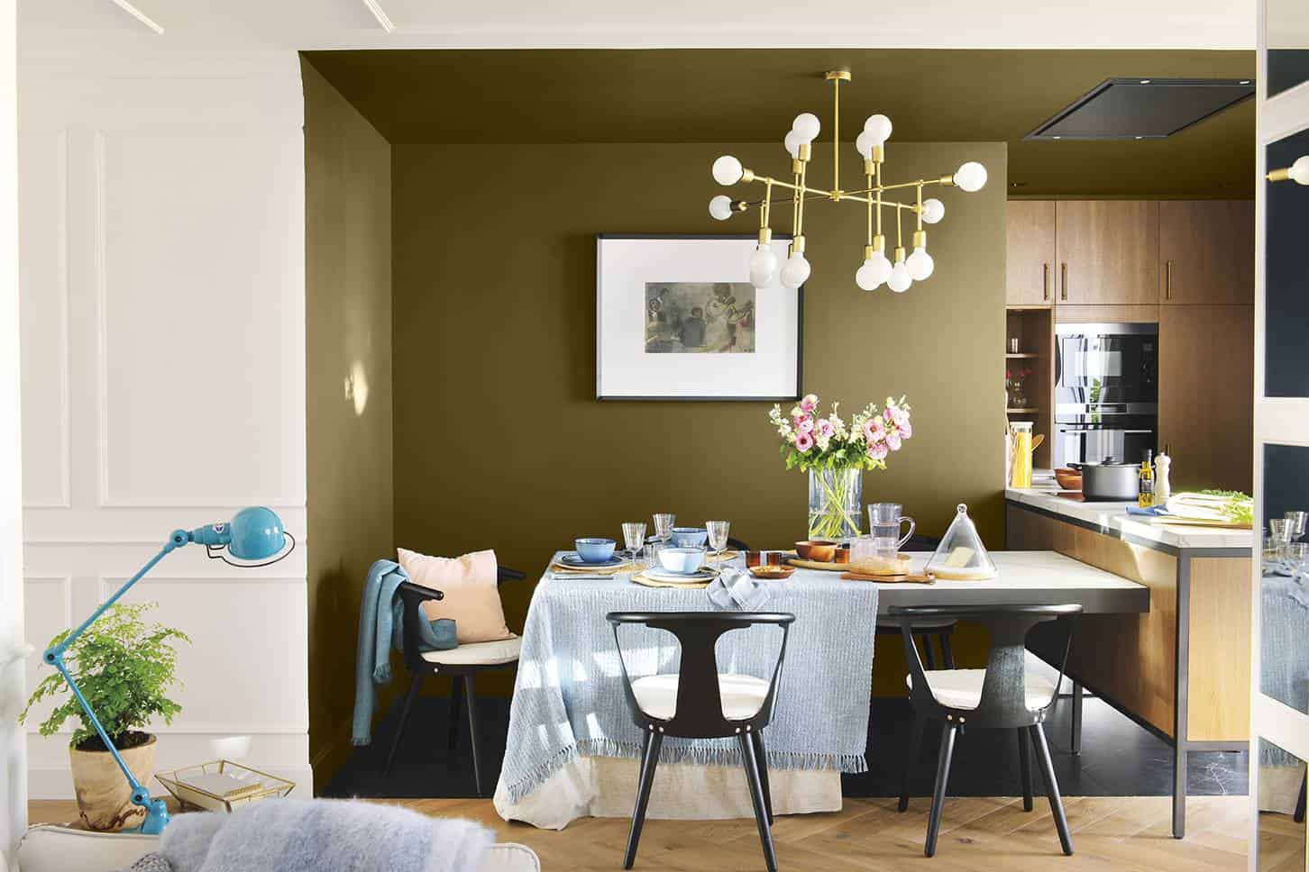
Stick with your code: Pantone 448 C. And where does it come from? In 2012, the Australian government commissioned research agency GfK Bluemoon with a rejection color for tobacco packs. And they succeeded: this greenish-brown is associated with death, dirt, tar… Runaway from it.
BE CAREFUL WITH PURE PURPLE…
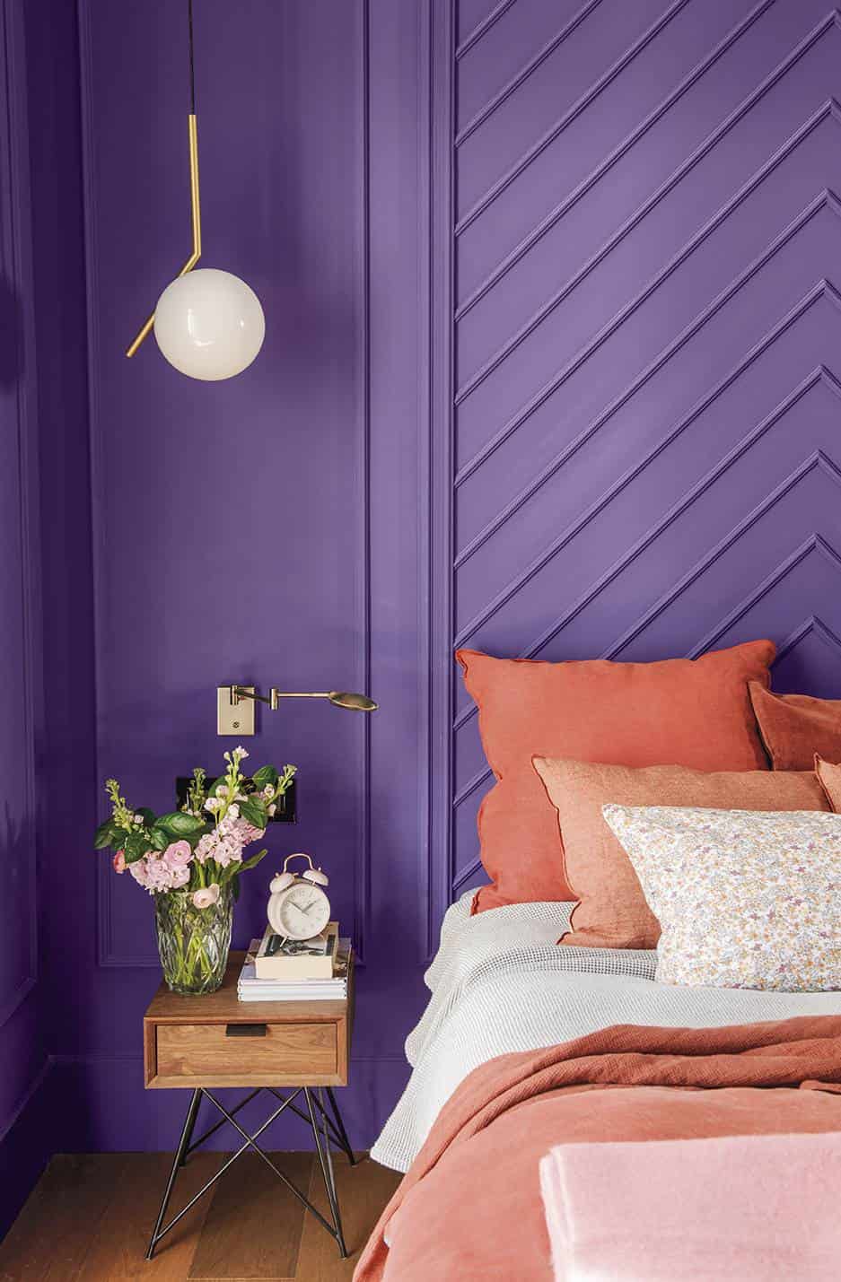
It can create harsh environments and, of course, in a bedroom, it is not the best choice. And less if you combine it with gold since the effect that this pair generates together is “dusty palatial”. If you like this range, better opt for a purple with gray, more muted.
SKY BLUE, TOO CHILDISH
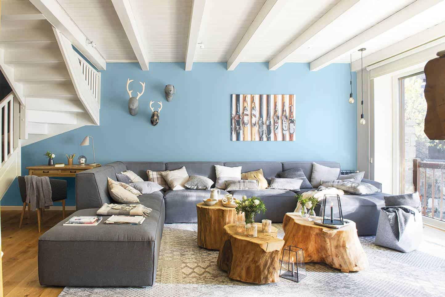
For a safe rustic living room. Or not? The beams, the decoration, the type of space, call for another more daring, more intense tone. This is too pastel for a house with a character like this, in fact, today it is for any wall. Better save it for small details.
A BOILER-COLORED BATHROOM?
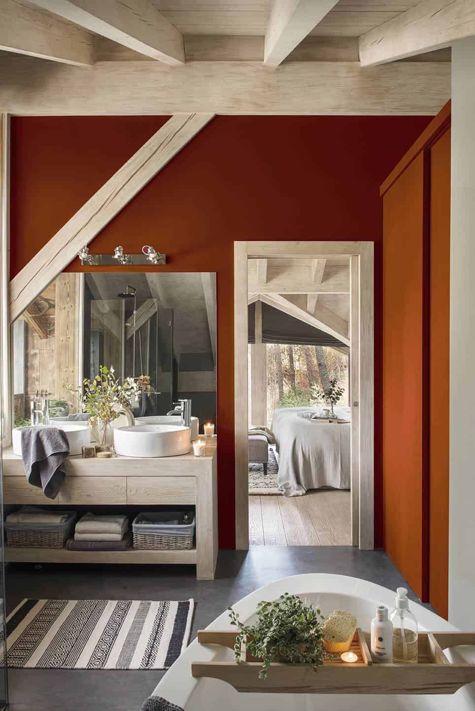
Maybe not the best choice, right? It eats up space and is too “cramped” for a stay where what you need to find is relaxation. Also, it gets dark and the bathrooms are not usually spaced with abundant light. Take it out of your chromatic pools.
STAY AWAY FROM NEON GREEN
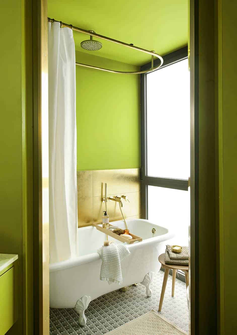
It is not that it is ugly, it is that it is a downer… If you choose elegant elements for your bathroom such as gold taps or retro pieces, neon green has no place. It shines as bright as gold and excess is never a good choice (less in a bathroom).
ORANGE YES, BUT LITTLE
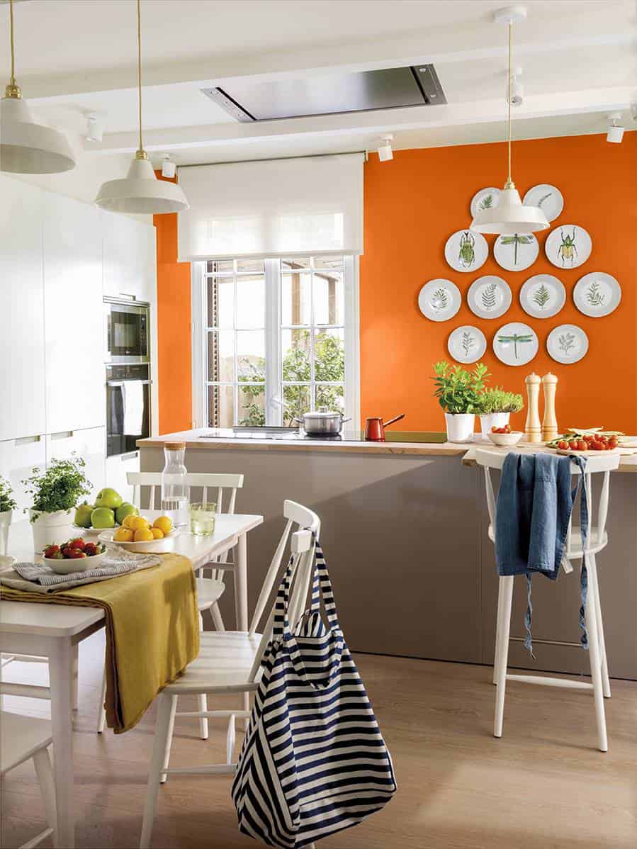
It is not an ugly color in itself unless it dominates the walls like here. Refill the space and, like other colors we have talked about, lower the level of the room. This, also, is very garish and has another power that is not convenient at all in a kitchen: it whets the appetite.

