
Interior design is one of the final stages in sprucing up your home for it to look gorgeous. On top of having state-of-the-art finishes and adorable furniture, you’d want to break up the boring walls with pieces of art.
Of course, there are different types you can choose for your home, including canvas prints, metal prints, tapestries, sculptures, framed photographs, and antiques. Also on this list are posters, which is the focus of this article.
Posters are one of the most eye-catching wall arts, as modern printing technology makes it possible to create vibrant images on paper. Also, they’re more affordable than several other wall decors and are readily available in most local and online stores. If you decide to decorate your home with posters, you’d want to apply the following tips to ensure you pull out a stunning look:
According to Artwork Archive, the online marketplace is changing the art decor game in a significant way. Art enthusiasts are now turning to online platforms to research new trends, engage with artists, and purchase art pieces. They see it as a more accessible and practical approach as opposed to visiting auction houses or local stores in person. (1)
Indeed, the more established online stores, such as Fine Art America or other similar ones, stock hundreds of thousands of artworks from independent artists spread all over the world. By shopping from them, you have a wide range of posters to choose from, unlike shopping from a local store, wherein your choice is limited to just a couple of art posters.


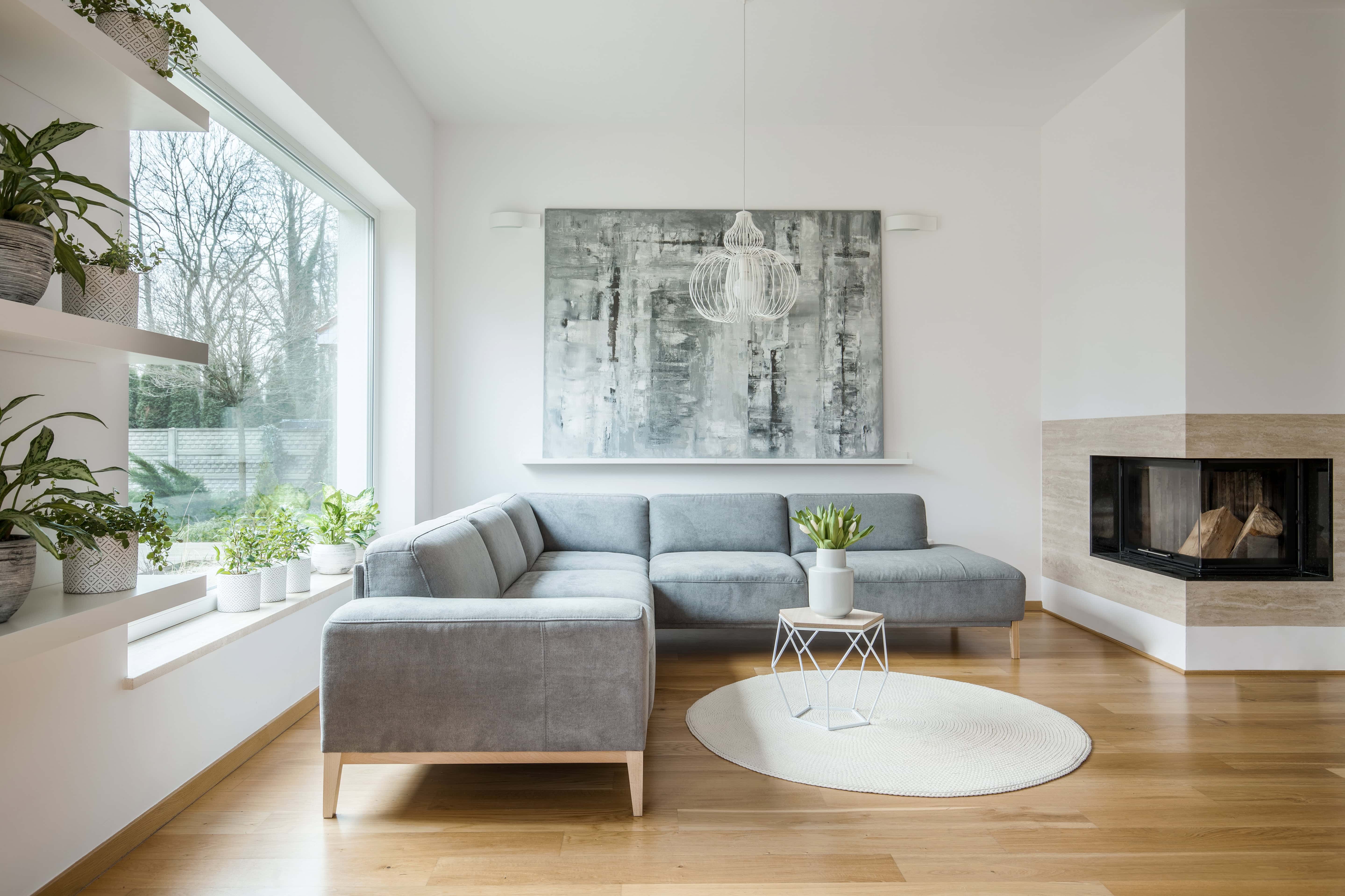
To make a big visual impact with your poster display, choose the oversized ones. Of late, renowned artists are abandoning several tiny art pieces and embracing the gigantic ones. By hanging such in your home, everyone who steps in there will notice it, whether or not they’re art lovers. And, that should be your primary intent when decorating your home with posters. (2)
So, make a point of choosing the monstrous posters when you go shopping. You shouldn’t mind their higher price tag because they’ll serve you for several decades without going out of trend.
You understand that color is one of the primary influential aspects of interior design. Indeed, your color choices determine the success or failure of your interior decor. Thus, you must aim at achieving a cohesive and pleasant look by ensuring the colors of your different design elements match. (3)
When hanging posters, it’s best to ensure that their dominant hue is part of your color palette. This is simply a combination of colors that work well together.
Some good examples are:
In art, harmony is the element that creates a sense of togetherness amongst otherwise separated parts. For instance, a waterfall poster hung next to a forest poster looks harmonious. That’s because they’re in the same subject line of natural scenery. But if you’d mixed waterfalls with face portraits, animals, buildings, and the like, the overall look would be chaotic. (4)
With that said, consider sticking to one subject matter when selecting your posters. Here are some themes you’d want to consider:
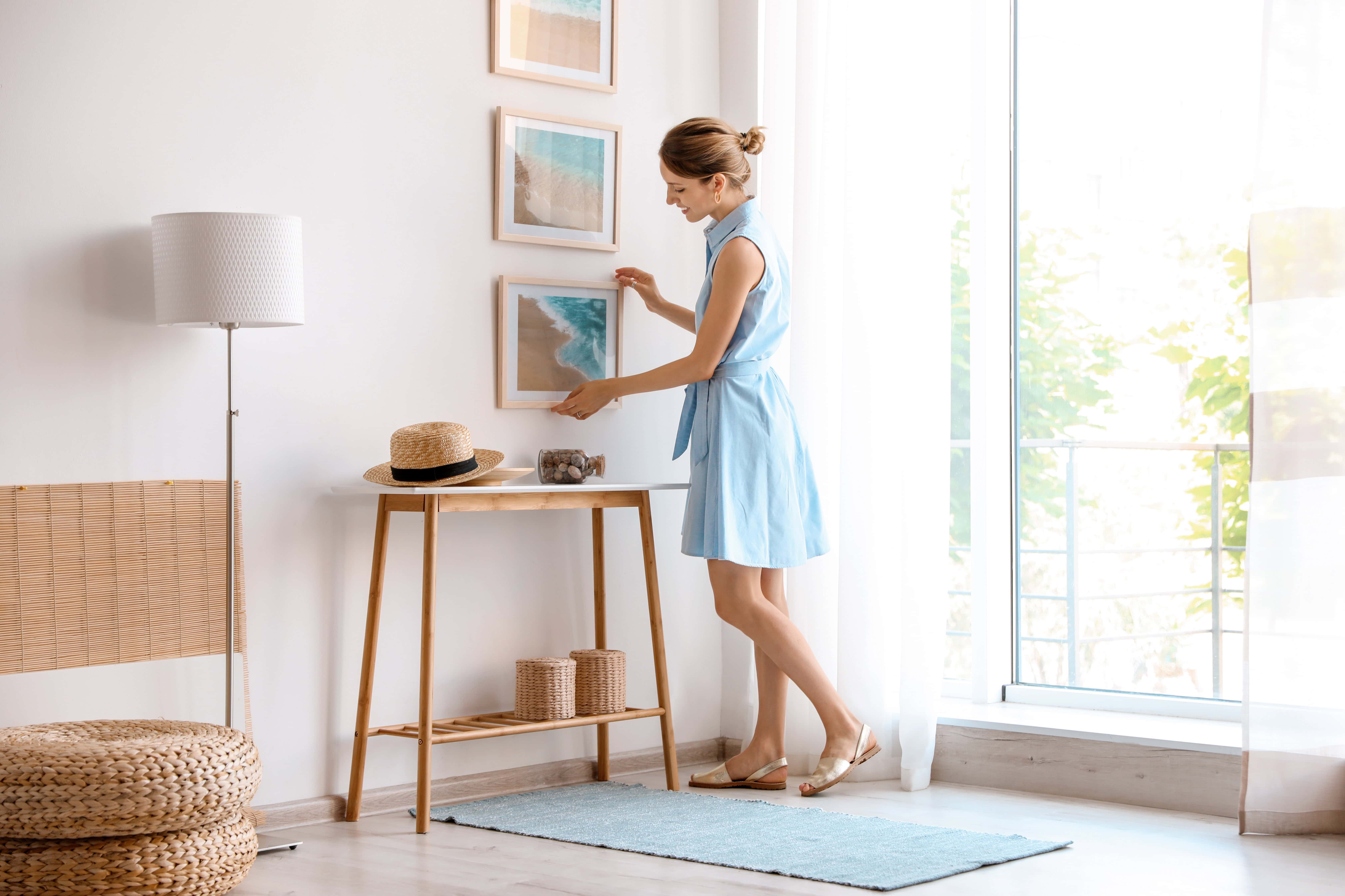
Posters are usually printed on thin paper. While hanging them in this basic form works, you’d want to make them a bit more sophisticated and cleaner by adding frames around them. Make sure to choose frames that blend well with the image on the poster. For instance, a minimalist line drawing would work well with a mono-color frame with no intricate designs.
Alternatively, you could clip them onto a wooden clipboard for a unique look. Just ensure that the posters are dimensionally smaller than the clipboard to leave a distinct border around them, which looks like a frame.
When hanging several posters together, as is the case with a gallery wall, ensure you leave spaces between the different pieces. Sticking them too close to one another makes your wall art look chaotic and disorganized.
The ideal space between art pieces hung in a group should be more than two inches, but you don’t need to go beyond six inches. Also, make a point of leaving four to eight inches between the top of furniture pieces and the bottom of the art piece. For comfortable viewing, the height from the floor to the center of the artwork should be about 1.5 meters. (5)
You now have six practical tips for decorating your interiors with posters, including where to shop, the need for big art, color coordination, choosing a theme, framing posters, and standard spacing. Use them only as a general guide and not as strict rules. It’s your creativity that’ll help pull out an impressive look.
This website uses cookies.